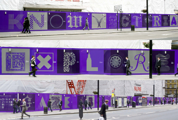
Hat-Trick Design has unveiled a series of large scale illuminated letters on a hoarding site in London’s Victoria. Each letter evokes a story particular to the area…
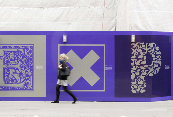
“We decided to design a typeface of illuminated letters, with each letter telling a different story for passers by to discover,” says Hat-Trick’s Tim Donaldson of the project for Land Securities.
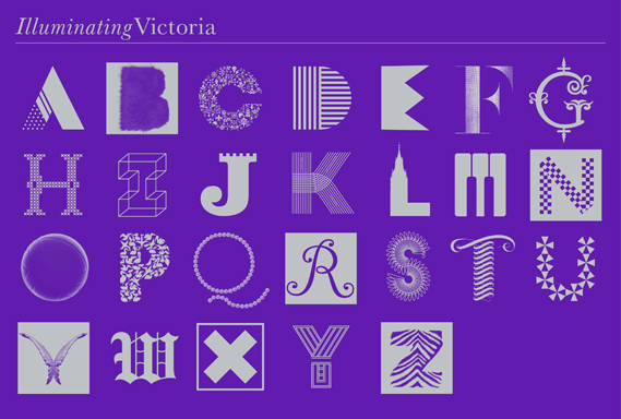
“For example ‘B’ for Busby bearskin hats, ‘P’ for Pelicans – informed by the famous story of a pelican eating a pigeon whole in St James’ Park (illustrated by Becky Sutherland) – and ‘W’ for Westminster, etc. We then used the typeface to spell out words and sentences so it could be read from further back.
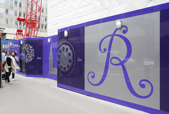
“We wanted to end up with a visually rich and eclectic set of letters to sum up the area,” he continues, “the mix of past, present and future, heritage (royalty, architecture, famous residents), culture, art, green space, wildlife and so on. The style of each individual letter was inspired by the particular story it was telling. We decided the execution could be photographic, illustrative or graphic, depending on what best communicated it, and in a visually engaging way. Each letter became a project in itself.”

To avoid repeating letters the typeface also includes alternative variations. A couple of letters were also based on, or redrawn from found letters, such as a found gothic style ‘W’ for Westminster. The use of purple and silver refers to Land Securities’ colour palette.
Some more examples of the thinking behind the letter choices: the ‘D’ for deckchairs in St James’ Park was informed by the stripes on the fabric; the ‘F’ for the local farmer’s market (famous for it’s fish) uses a ‘fishy’ F combined with a close-up of scales texture; the ‘O’ refers to the Olympics as Victoria will be hosting the beach volleyball events.
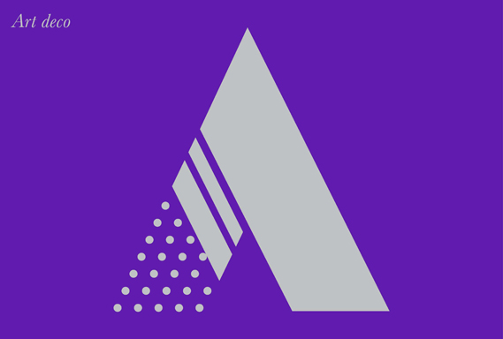
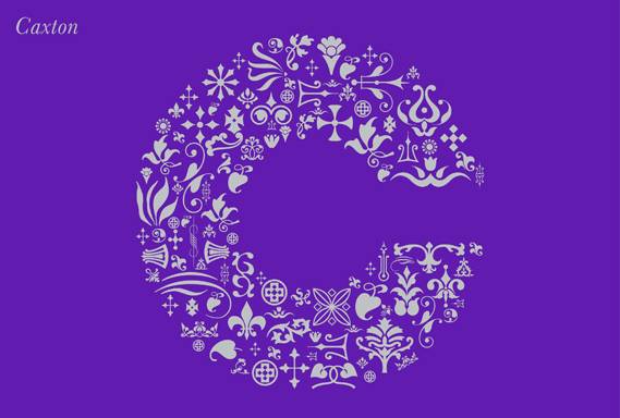
Here are a few of the individual letters, plus a complete set of 26 characters.

via CreativeReview