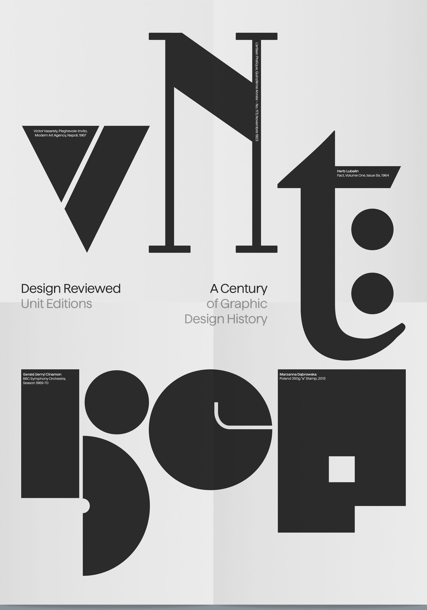
Matt Lamont’s extraordinary archive of 10,000+ printed design artefacts is heading into book form — and it deserves your attention.
If you’ve spent any time in the world of graphic design, you’ll know how fragile its history can be. Magazines go out of print. Posters get lost. The work of whole movements disappears into boxes. Matt Lamont — designer, collector, and educator based in Bradford — has spent over a decade fighting that entropy, assembling one of the most comprehensive private graphic design archives in the country.
Now, in partnership with Unit Editions, he’s bringing the best of it into a single book. Design Reviewed is currently crowdfunding on Volume, and it looks seriously special.
What is Design Reviewed?
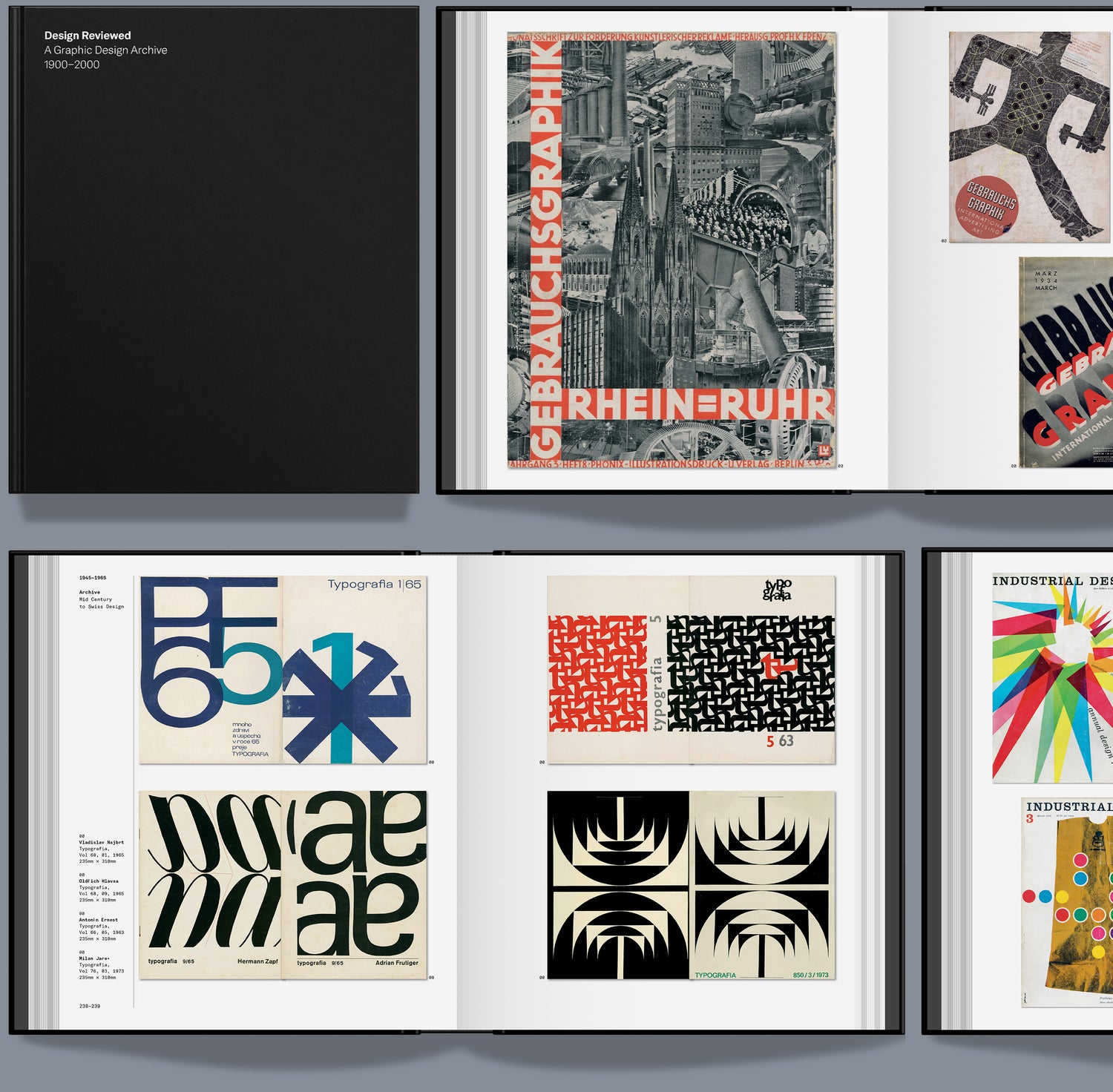
The Design Reviewed website has been quietly building for years — a digital archive cataloguing everything from rare typographic periodicals like Typographische Monatsblätter and Typografia to posters, stamps and ephemera from across the globe. Every item in the archive also has a physical presence in Matt’s Bradford studio, where it’s actively used for educational workshops, visiting lectures and as a wellspring of inspiration for working designers.
The planned book spans a century of graphic design history, from Art Nouveau and Early Modernism through to Pop and Post Modernism. Crucially, the selection isn’t driven by personal taste alone — it’s chosen to illuminate wider historical movements, ideas and approaches within the discipline.
The Book
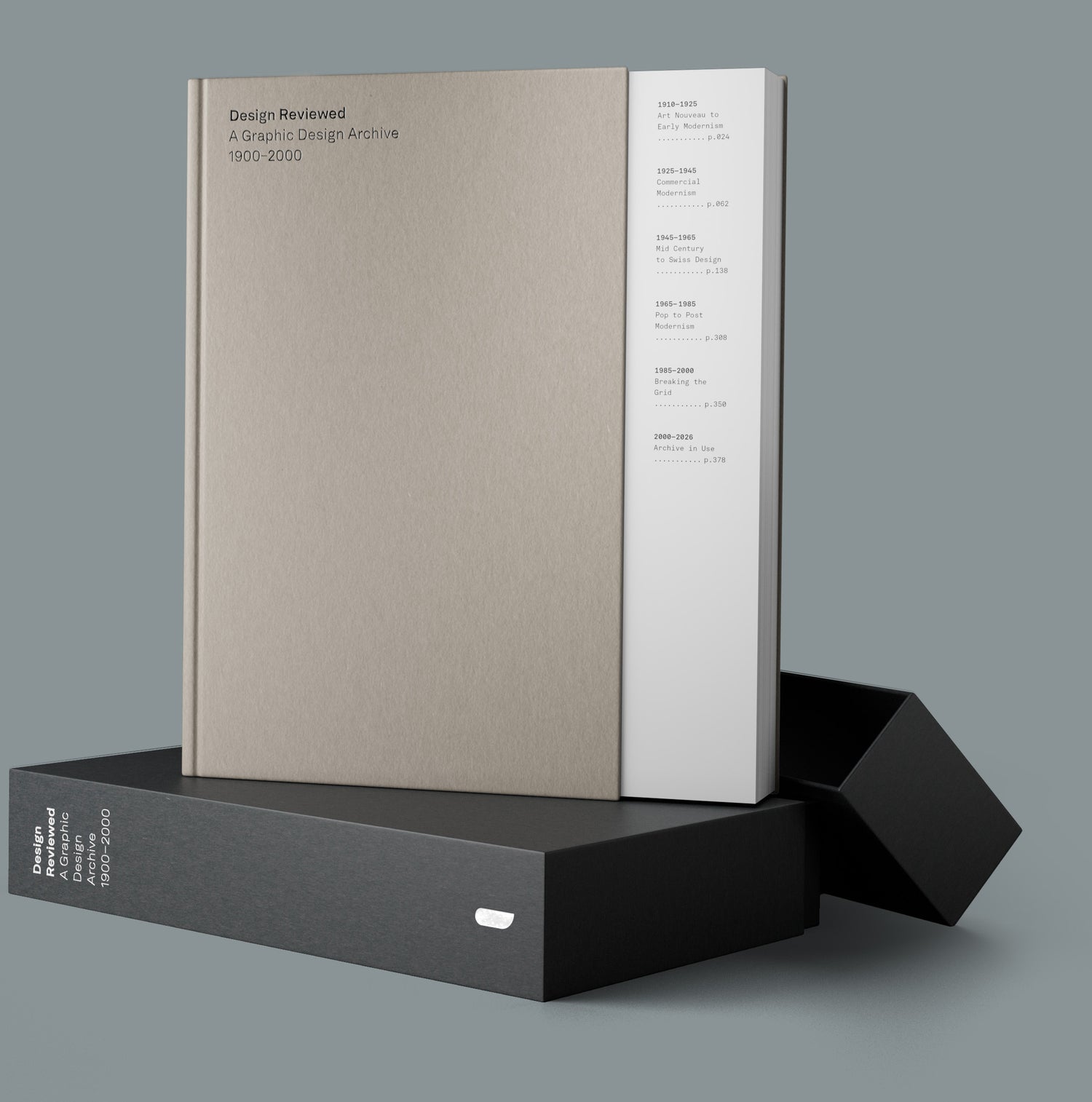
At 400 pages, hardback, 279 × 234mm, and published by Unit Editions — whose track record for beautifully produced design books speaks for itself — this looks like a genuinely serious publication. Not a coffee table novelty, but a study tool and reference work you’d actually return to. Foil typography details round out what sounds like a production to match the quality of the content.
“I hope the book can be a celebration of visual reference, a study tool and a way of bringing the archive out of the boxes and shelves and into your hands. Something you can return to again and again for inspiration and context.” — Matt Lamont
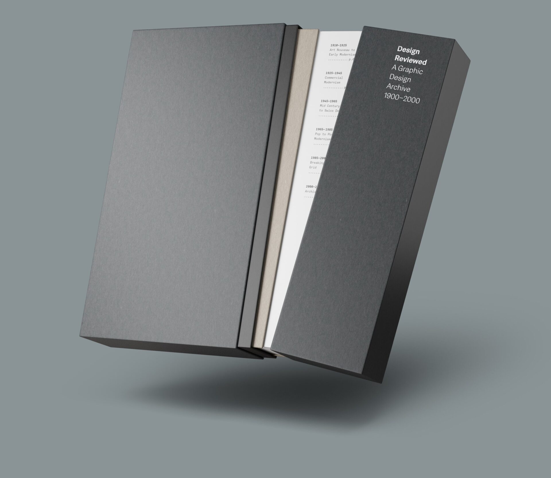
The Collector’s Edition
There’s also a Collector’s Edition housed in a shoulder-neck slipcase, with a cut-back front board that reveals the contents page, a nice touch. It comes with a full A-Z postcard set (26 cards, each featuring a letterform from the archive with designer credits on the reverse) and an exclusive A2 folded poster. Limited to 250 copies.
The campaign is 76% funded with a deadline of 29 April 2026. Estimated delivery is Summer 2027. Worth backing now if you’re interested — the Collector’s Edition in particular won’t hang around.
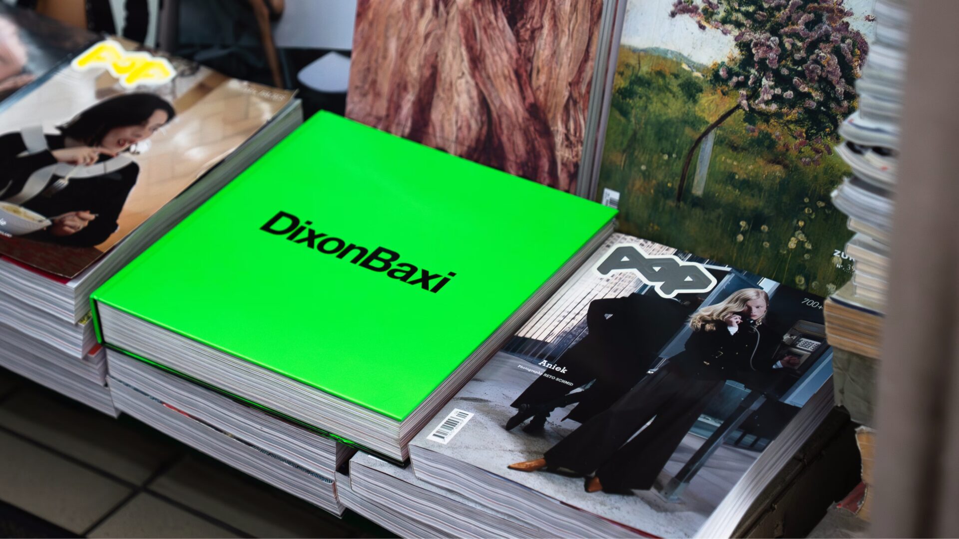
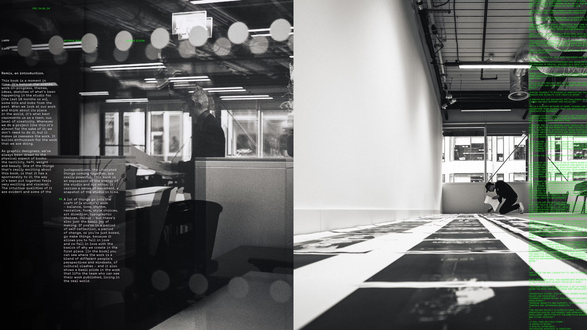
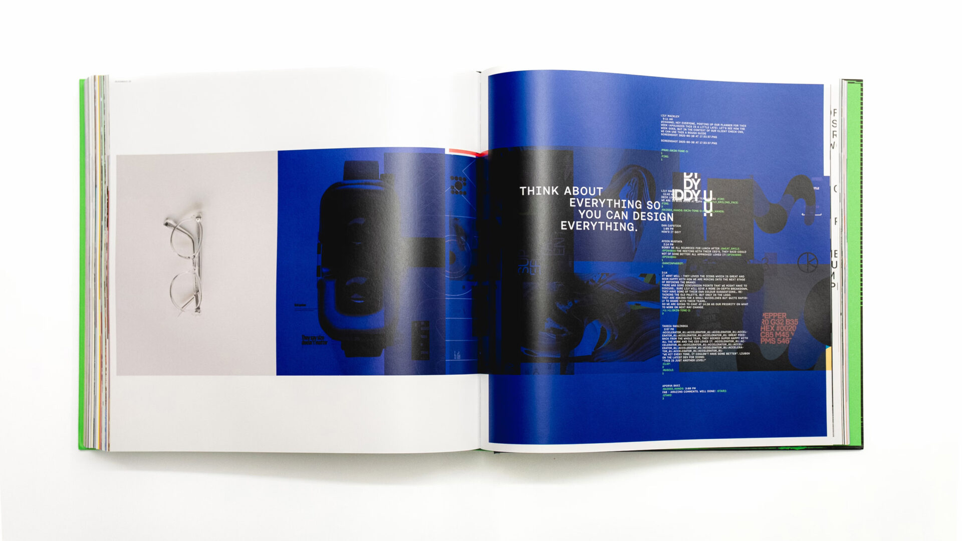
REMIX: A Raw Look Inside DixonBaxi’s Creative Studio
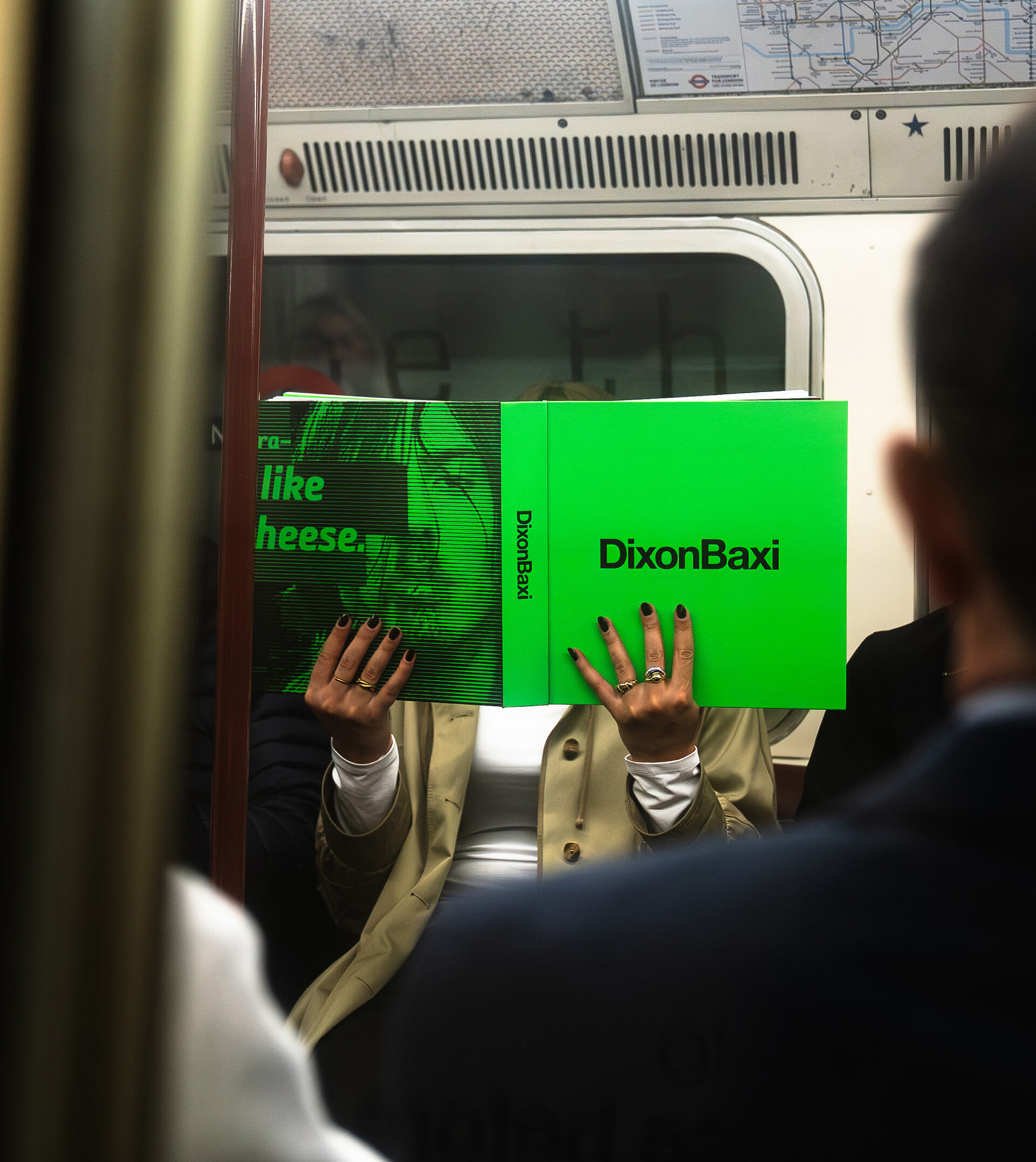
There’s something magnetic about seeing behind the curtain of a creative studio—not the polished portfolio pieces, but the messy, energetic reality of how ideas actually come to life. That’s exactly what DixonBaxi has captured in REMIX, their new 500-page manifesto that throws open the doors to 18 months inside their creative process.
More Than Just Another Design Book
REMIX isn’t your typical coffee table design book. It’s a bold, immersive experience that captures creativity in motion. Think of it as stepping directly into the studio itself—instinctive, energetic, and filled with the raw chaos that fuels great work.
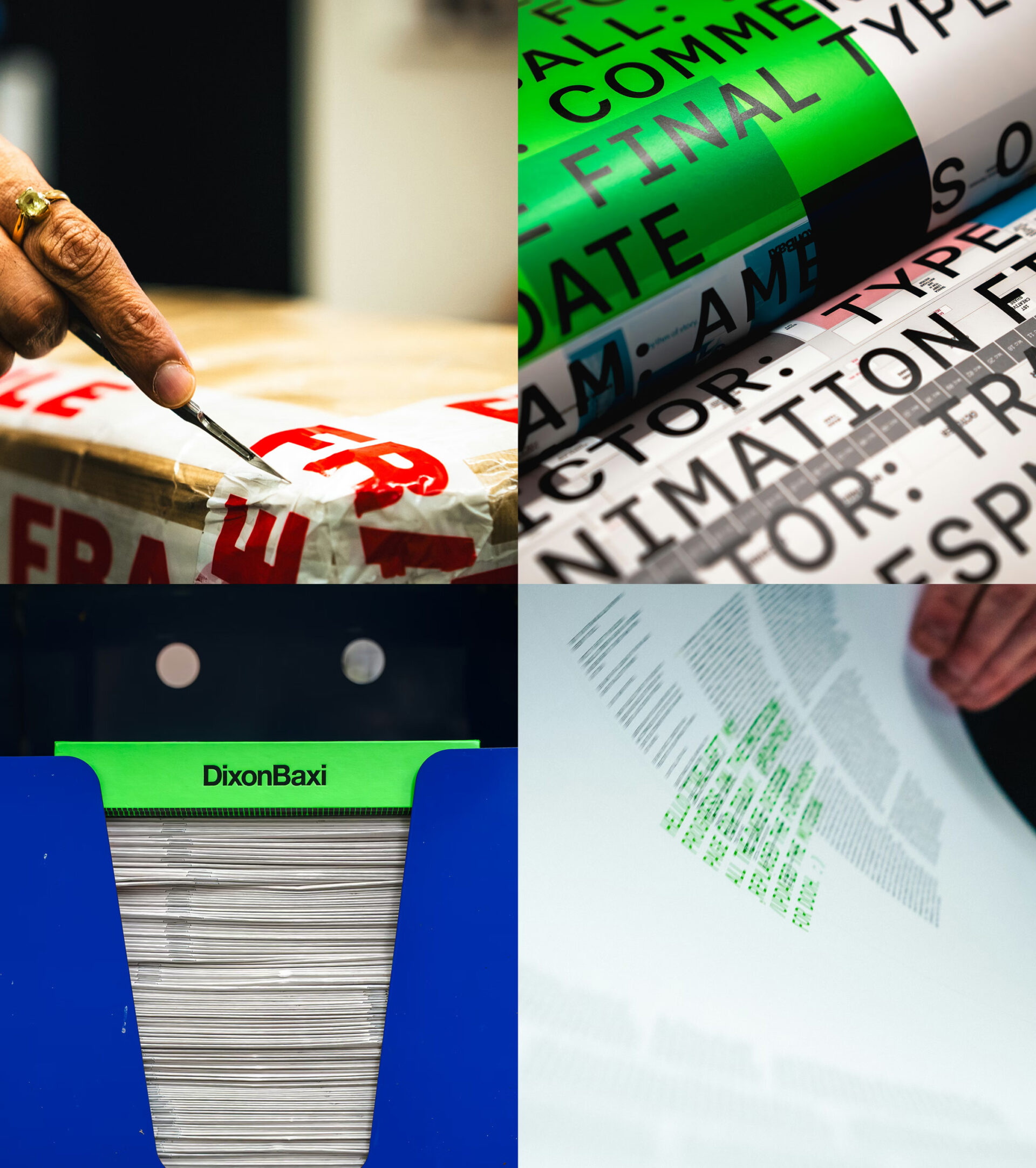
The book brings together over a thousand images spanning design work, photography, sketches, and experimental ideas. But what makes it special is how these visuals are layered with unfiltered dialogue, Slack conversations, and candid soundbites that reveal the thinking behind the making.
Process Without Filters
What sets REMIX apart is its commitment to showing the unvarnished truth of creative work. The pages are packed with:
Never-before-seen projects and experiments
Fragments of process and discarded ideas
Raw notes and conversations
Mistakes and insights side by side
Two decades of accumulated creative energy
The book features long-form conversations threading through themes of invention, studio identity, and the tension between maintaining boutique edge while scaling up. It explores what it means to design for life and celebrates the pure joy of making things.
Designed to Be Explored
REMIX is deliberately non-linear and textured—a book meant to be explored rather than simply read from cover to cover. Every page offers something unexpected: a fragment of an idea, an experiment that didn’t quite land, or a sudden insight that changes everything.
The structure is both intentional and spontaneous, capturing how creativity actually works rather than presenting a sanitized retrospective.
A Cinematic Object
The physical book itself has been crafted with meticulous attention to detail. At 300 × 300mm and weighing 4kg, it’s a substantial hardback printed on 150gsm Essential Velvet paper. The production uses CMYK plus a special Pantone 802 Green, printed by Graphius as a limited edition of just 2,500 copies.
Made in Real Time
The creation of REMIX grew organically from SuperFutures, DixonBaxi’s ongoing cycle of invention and reflection. The studio generated over a thousand pages of material, then refined it through three full dummies and countless print tests.
At one point, the team laid out every spread across their 10,000-square-foot space, editing by sight to discover unexpected connections. The result weaves together remixed visuals, Slack conversations, and recorded dialogue into something that feels both structured and wonderfully chaotic.
Who It’s For
REMIX is a manifesto for anyone who believes in bold ideas, risk-taking, and pushing past the obvious. It’s made for designers, creatives, strategists, and anyone who thrives on pursuing something new.
In a world obsessed with final outcomes and perfect presentations, REMIX celebrates the messy middle—the missteps, the intuitive leaps, the work that doesn’t always make it to the final portfolio. It’s a book to live with, to pore over repeatedly, finding something new each time.
If you care about how things are made and why, this is a rare glimpse into the creative engine of a studio at the height of its powers.
The exhibition featured large-scale works hand-printed on the largest letterpress printing press in the world.
Made using Brico – a type design system created by Oli Bentley of Split, designer, visual artist and printmaker Anthony Burrill and wood type maker, designer and printer Thomas Mayo – the works include a 12-metre wide mural, a collection of individual letters 1.5-metres tall and a photographic exhibition of works installed across Bradford and Leeds since 2021.
If you were a regular visitor to AisleOne, you’ll know what made it special, a quiet corner of the internet where good design, photography, film, and music were shared without noise. A clean page, a sharp eye, and a steady stream of things worth looking at.
AisleOne described itself as a visual journal on design, photography, film, music and culture aisleone — and for years it delivered exactly that, maintained by Antonio Carusone with the kind of consistency that’s rare in the blog era and even rarer now.
As of December 2024, the aisleone blog is no longer updated, but that doesn’t mean Antonio has gone quiet. He’s continuing to share the same kind of content through a newsletter over at his design studio, Superlunar.
Suprlunr itself is more than just a newsletter. It’s an audio design studio offering guitar effects, audio cables, plugins, books, and apparel. Suprlunr is a creative venture that reflects the same breadth of interest that made AisleOne so inspiring. The newsletter, called Sup’, is billed as an intoxicating concoction of content exploring design, art, film, and music, exactly the kind of content AisleOne operated under for years.
Head over to suprlunr.com and subscribe, it’s good to know this kind of inspiration hasn’t disappeared, it just has a new home.
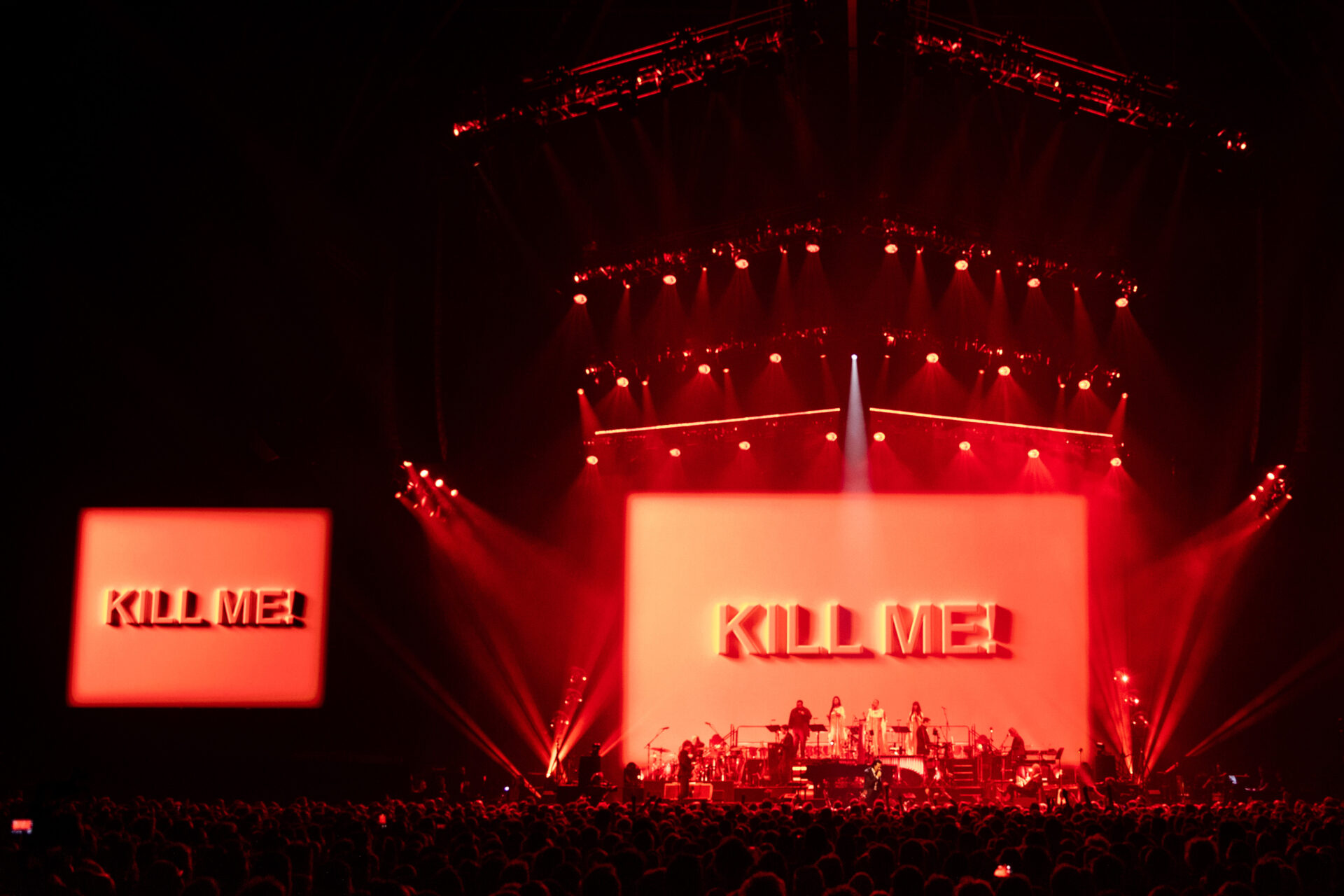
Press photography from The Wild God Tour ’24 – Copenhagen & Antwerp.
5 October ’24 – Copenhagen, Denmark – Royal Arena
Nick Cave & The Bad Seeds live at the King Arena in Copenhagen.Nick Cave & The Bad Seeds live at the King Arena in Copenhagen.Nick Cave & The Bad Seeds live at the King Arena in Copenhagen.Nick Cave & The Bad Seeds live at the King Arena in CopenhagenNick Cave & The Bad Seeds live at the King Arena in CopenhagenNick Cave & The Bad Seeds live at the King Arena in Copenhagen
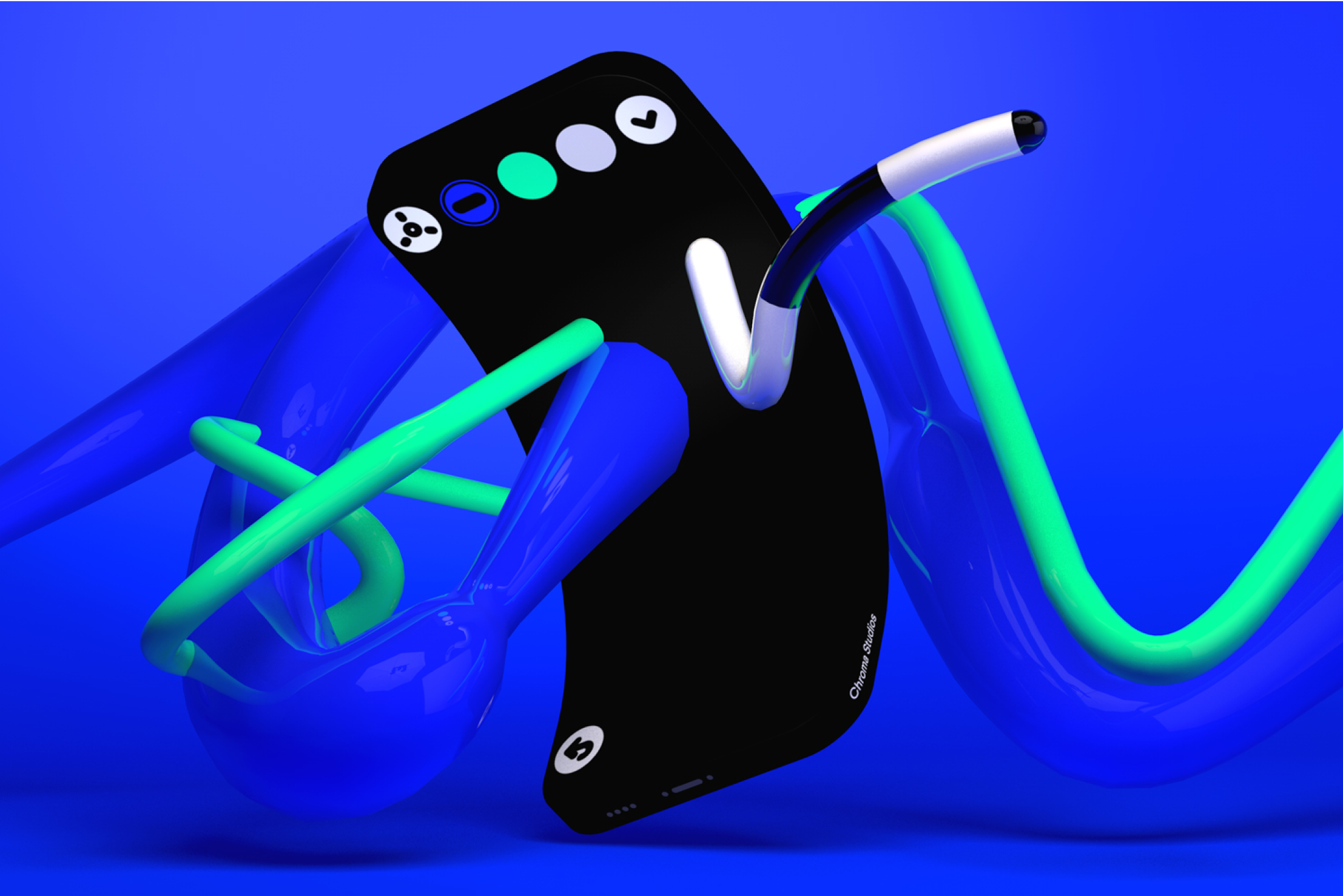
Meet Chroma, A FORMAT THAT BLENDS SOUND, IMAGE, AND GESTURES IN REAL-TIME.
➀ A multidimensional canvas to create limitless generative sound variations
➁ Unique shader capabilities to visualize sounds and gestures with realtime data
➂ Navigate sounds using gestures, either through body movements or touch
Chroma, a startup known for creating innovative audiovisual entertainment for mobile devices, has been acquired by Bronze, a London-based AI audio company. Chroma was backed by notable investors, including Pinterest cofounder Evan Sharp and Twitter cofounder Biz Stone. Bronze, founded by record producer Lex Dromgoole and composer Gwilym Gold, focuses on generative AI tools that allow artists to create dynamic, interactive music experiences.
This acquisition aligns with Bronze’s vision of blending technology with artistry, potentially leveraging Chroma’s expertise to expand its offerings in audiovisual and interactive music experiences. Both companies share a commitment to pushing the boundaries of creative expression through technology.
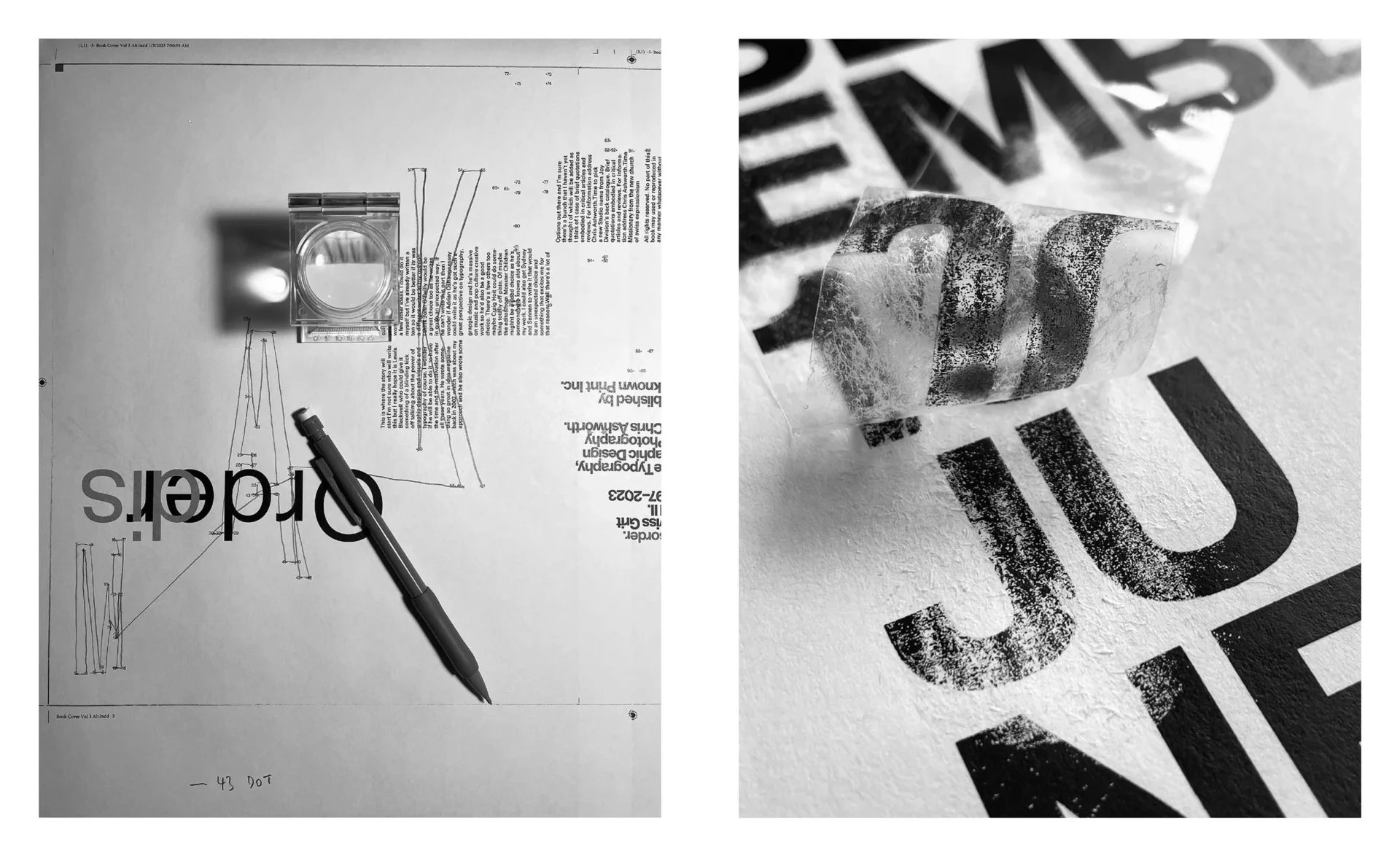
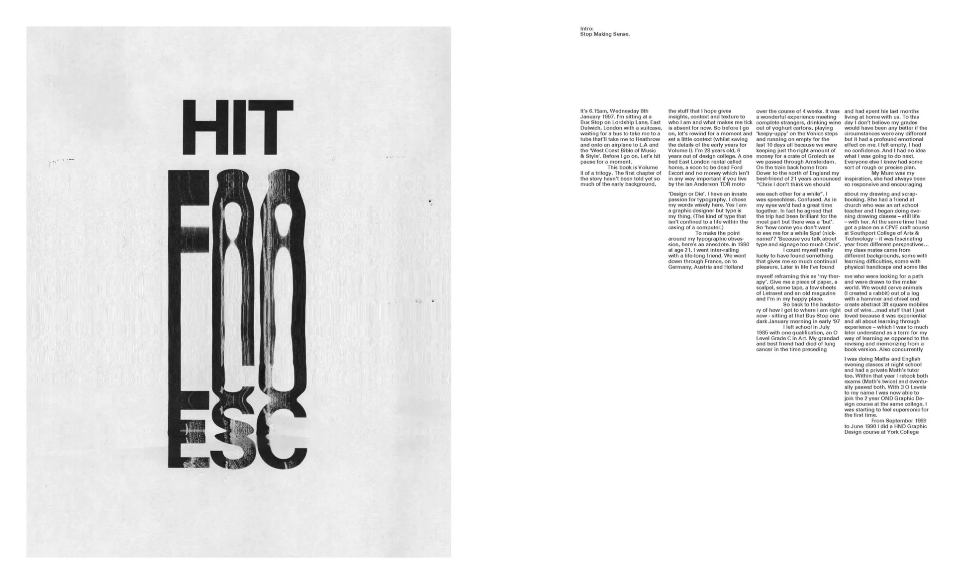
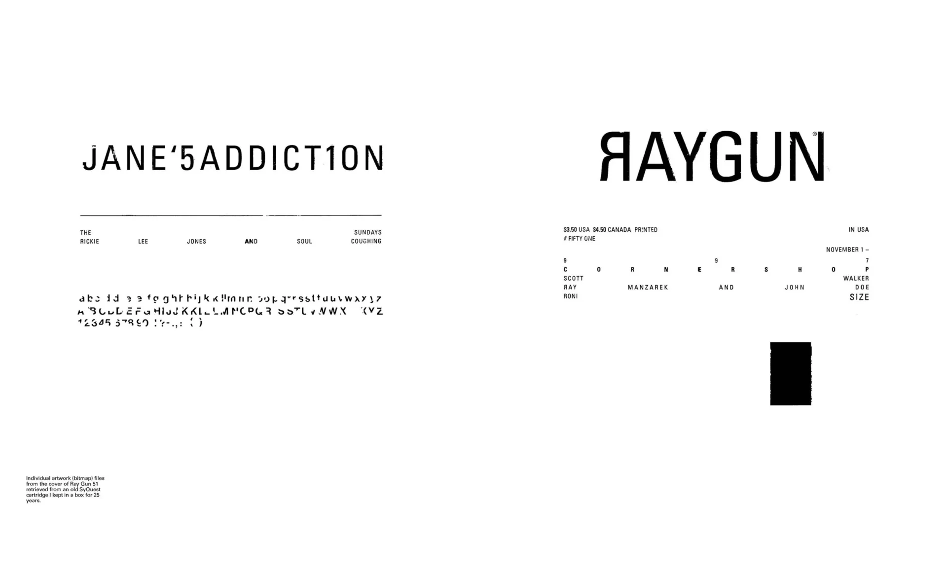
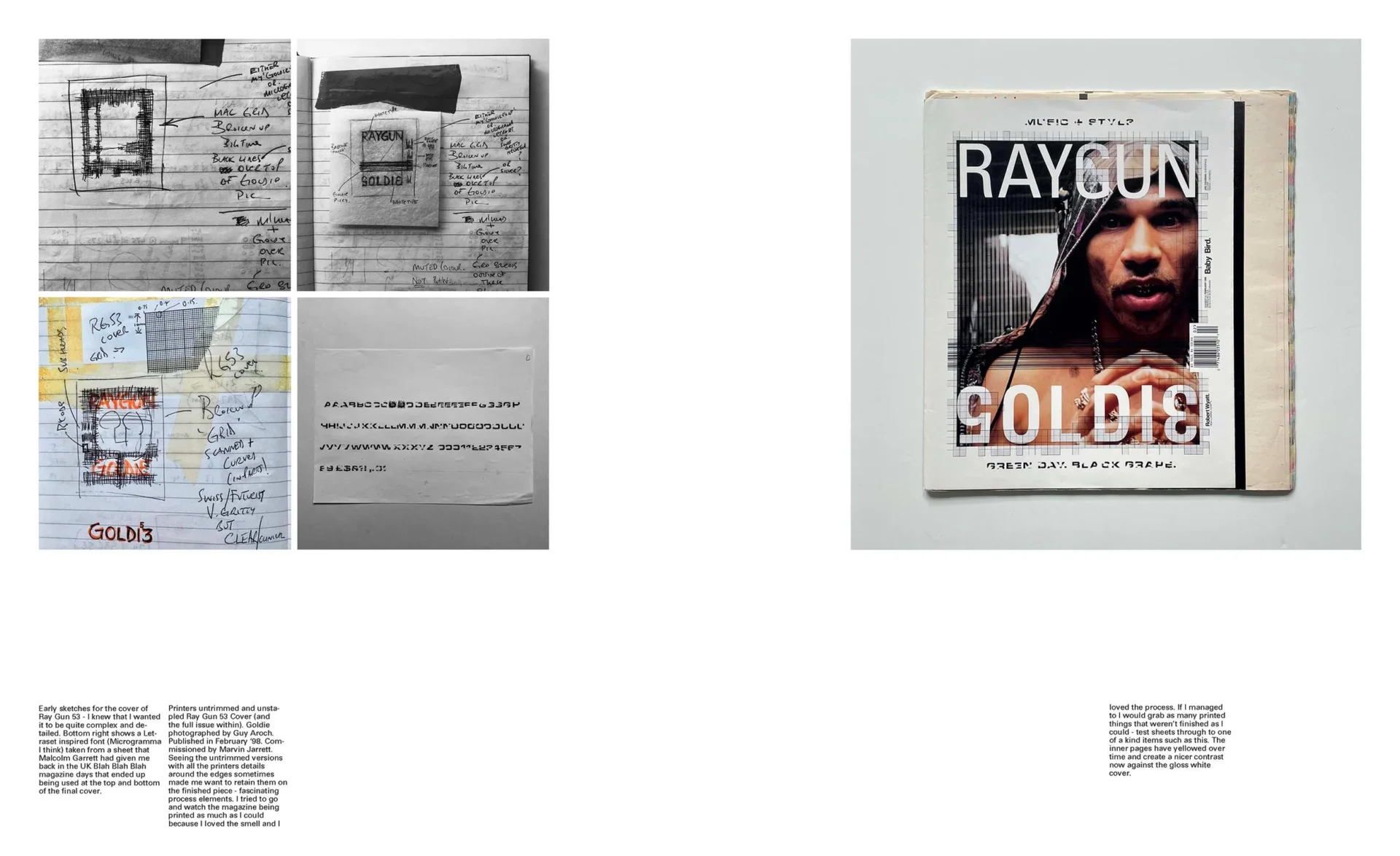
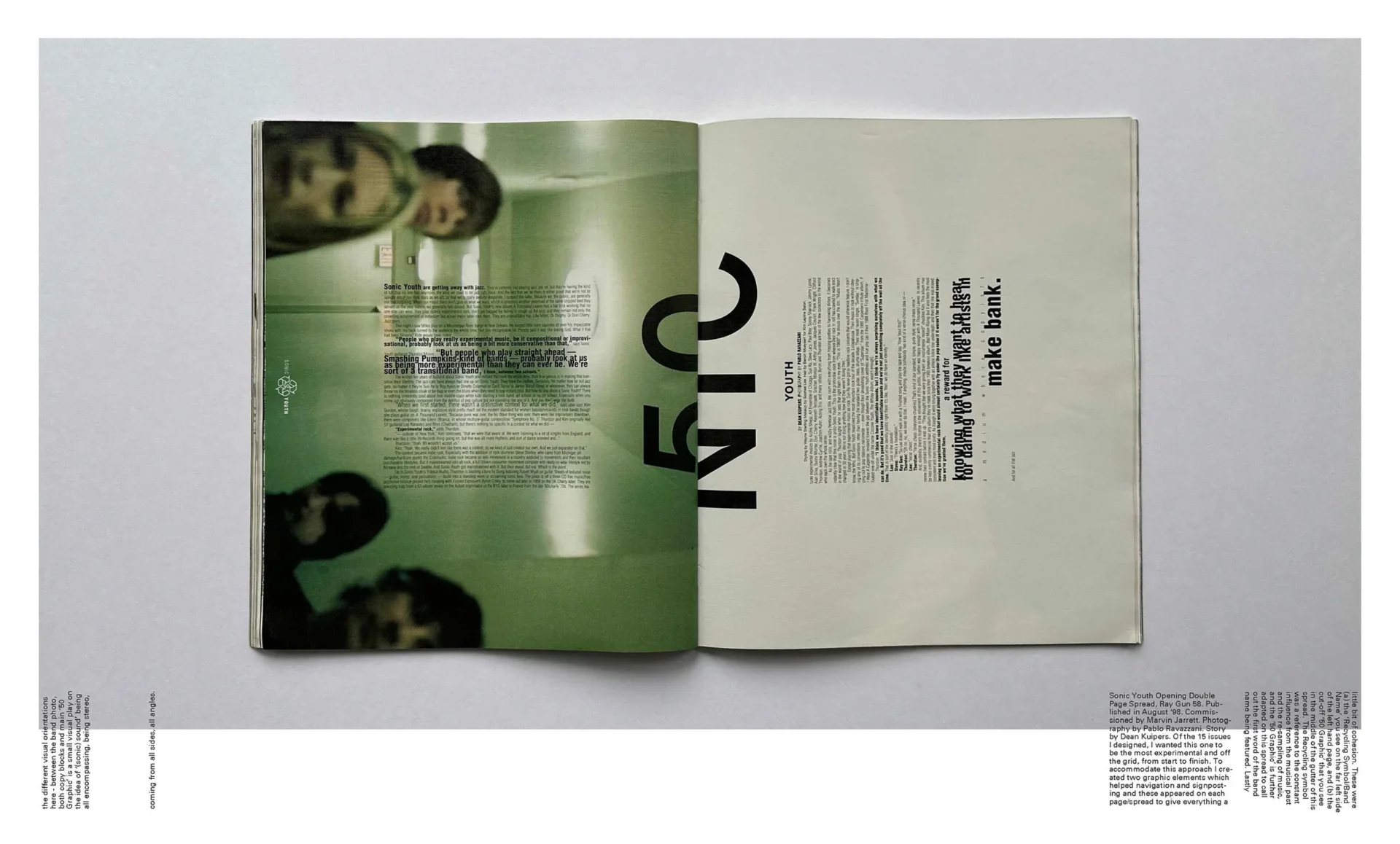
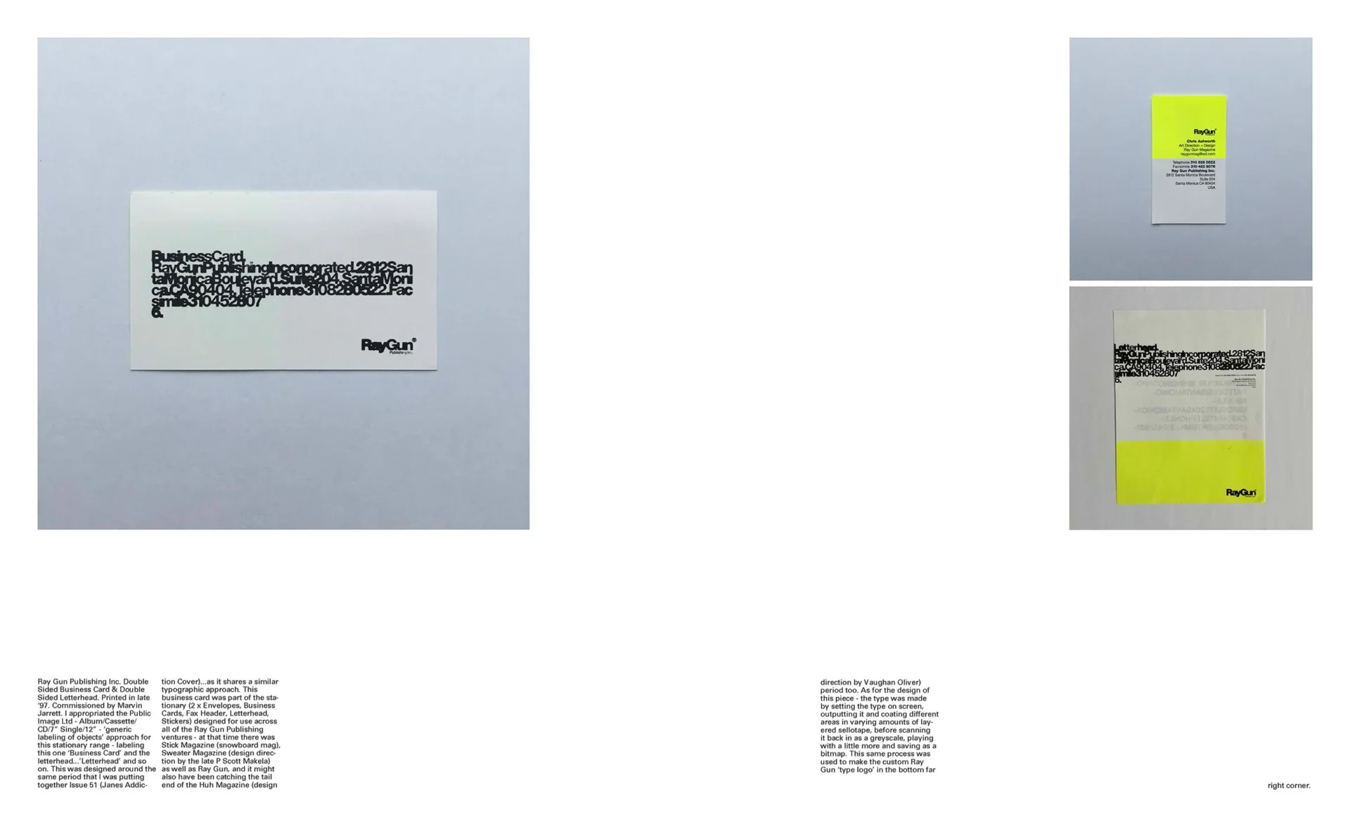
The first book dedicated to the career of a truly hands-on graphic designer, charting his ‘Swiss Grit’ approach from the influential Ray Gun magazine in the 1990s, through to his experimental type projects of the present day.
Emerging from the North of England, and nominated in 1993 by Why Not Associates as the most up and coming British graphic designer in Creative Review magazine’s annual ‘Creative Future’s’ awards, Chris Ashworth achieved design notoriety in the late 1990s at Ray Gunmagazine, the influentialLA-based ‘bible of music and style’. His early schooling in the rigours and principles of Swiss graphic design fused with the gritty vernacular of the street came together to create the sounds of the 90s in visual print form.
He has since worked with pop culture bands and brands from New Order, Michael Stipe (REM), Robbie Robertson and Bush to Nike, Diesel and Adobe as well as spending over 20 years as a Creative Director running in-house creative studios at Microsoft, Nokia and Getty Images.
He recently launched thisisme.art with his partner Nicola which sells high end apparel and one-of-a-kind original art featuring his unique handmade creative approach.
The definitive illustrated history of the cult videogame – a heart-thumping fusion of groundbreaking graphic design, architectural futurism, electronic music and high-speed racing.
Overview
WipEout crashed onto the scene in 1995, shifting games into the cultural fast lane with its unique 3D visual designs. It propelled a wondrous hit of anti-gravity, hyperspeed racing into the heart of the freshly-released PlayStation console and, over time, the series – developed by Psygnosis, later known as Studio Liverpool – grew into a cult phenomenon amongst graphic designers and gamers alike. With its club-land branding – devised by cutting-edge Sheffield agency The Designers Republic, and its on-the-pulse electronic soundtrack featuring artists such as The Chemical Brothers, The Prodigy and Orbital, WipEout was not only a racing game – it was a vehicle for art.
WipEout: Futurism chronicles the iconic game’s vision, struggles and achievements – from first conception to future plans, in a distinctive union of trailblazing artwork and graphic design. The extraordinary, and rarely seen, concept art created for the game is beautifully reproduced throughout the book, while The Designers Republic’s peerless vision for an alternative future – with its roots planted in the rich earth of sci-fi iconography – weaves its way throughout the pages, making this publication a densely packed expansion to the beloved series.
Created by Read-Only Memory and art-directed by The Designers Republic alumni Michael C Place / Studio Build, this book is for those who are well-acquainted with the delights of WipEout and for whom this futuristic, epoch-defining creation is yet to be discovered.
The Book
Working its way through the fascinating creation story and cultural footprint of the WipEout game series, WipEout: Futurism offers unprecedented access to the game’s visual archives and reveals the creative processes behind the teams, tracks, vehicles and iconography that define the series. Within these pages you will find original concept art, promotional materials, in-game photography, the monumental graphic design work of The Designers Republic and much more.
The book also includes exclusive interviews with electronic duo Orbital’s Paul Hartnoll, sound designer Loïc Couthier, writer Damon Fairclough, game director Stuart Tilley and more.
The layout showcases a specially-crafted, WipEout-inspired design – with art direction by Michael C Place, whose graphic-design roots lie in tDR during the years WipEout was created.
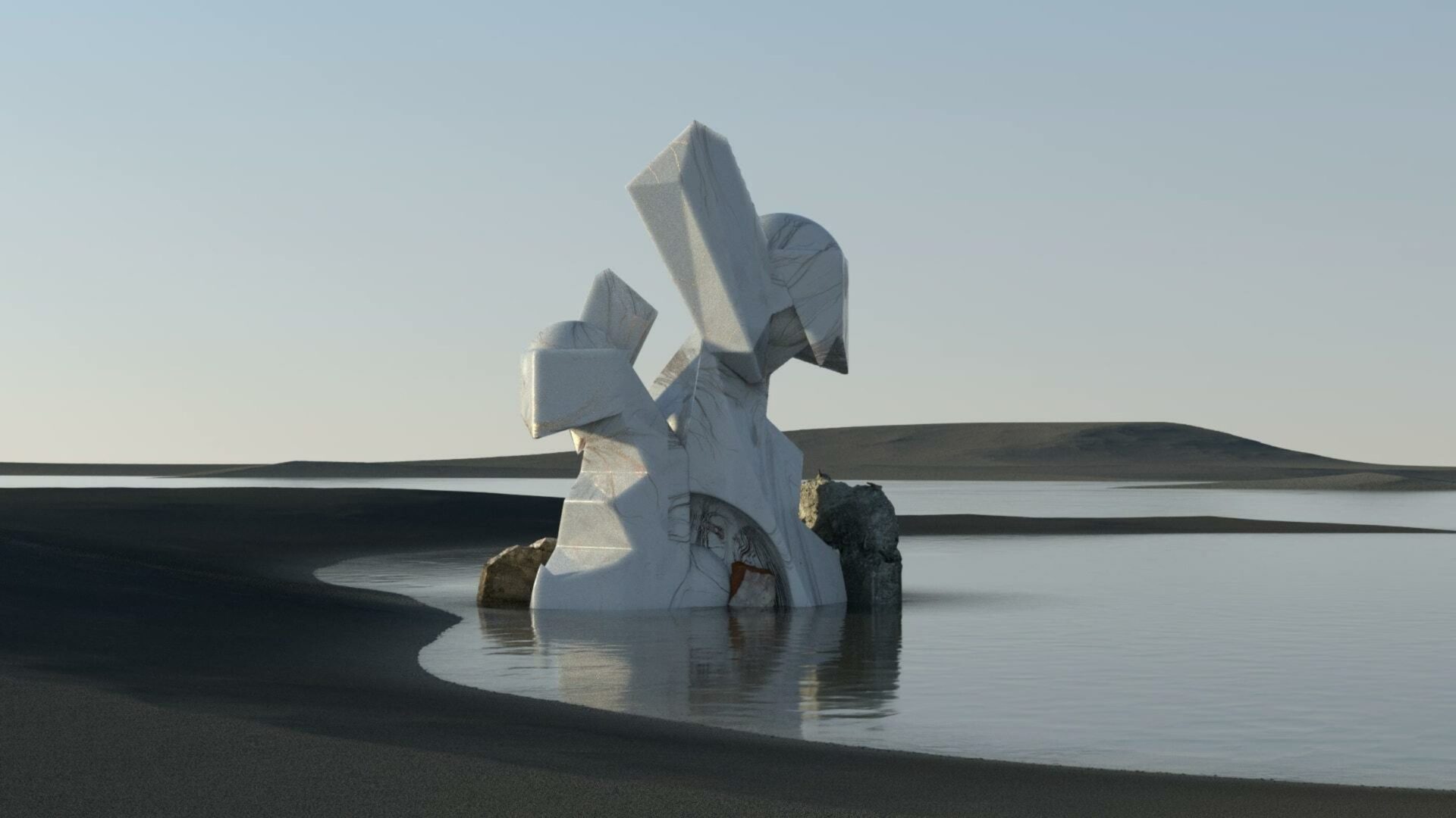
Natural sculpture formations set in seemingly impossible earth-like landscapes covered by living elements of surreal colors, each film travels through each almost at a micro level, witnessing its evolution.
The body of work delves into textural, tactile elements morphing, and interacting with each other in surreal environments. The work set off to blur the boundaries between nature and design, simplicity and complexity, in an uncompromised abstract way.