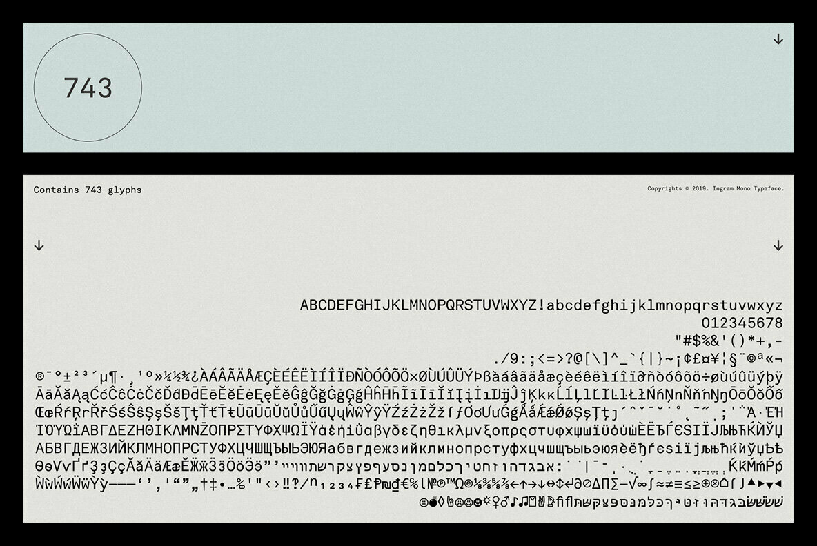
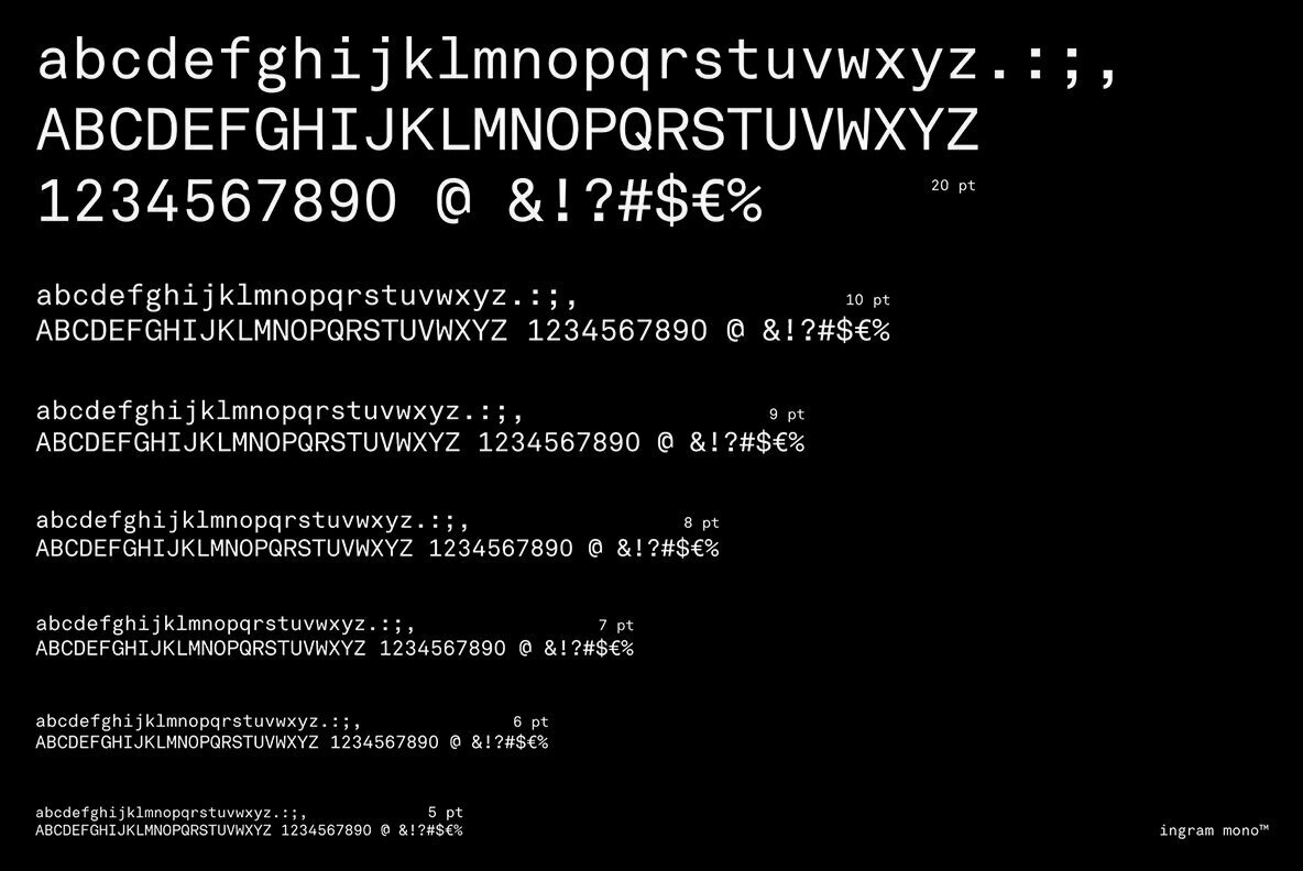
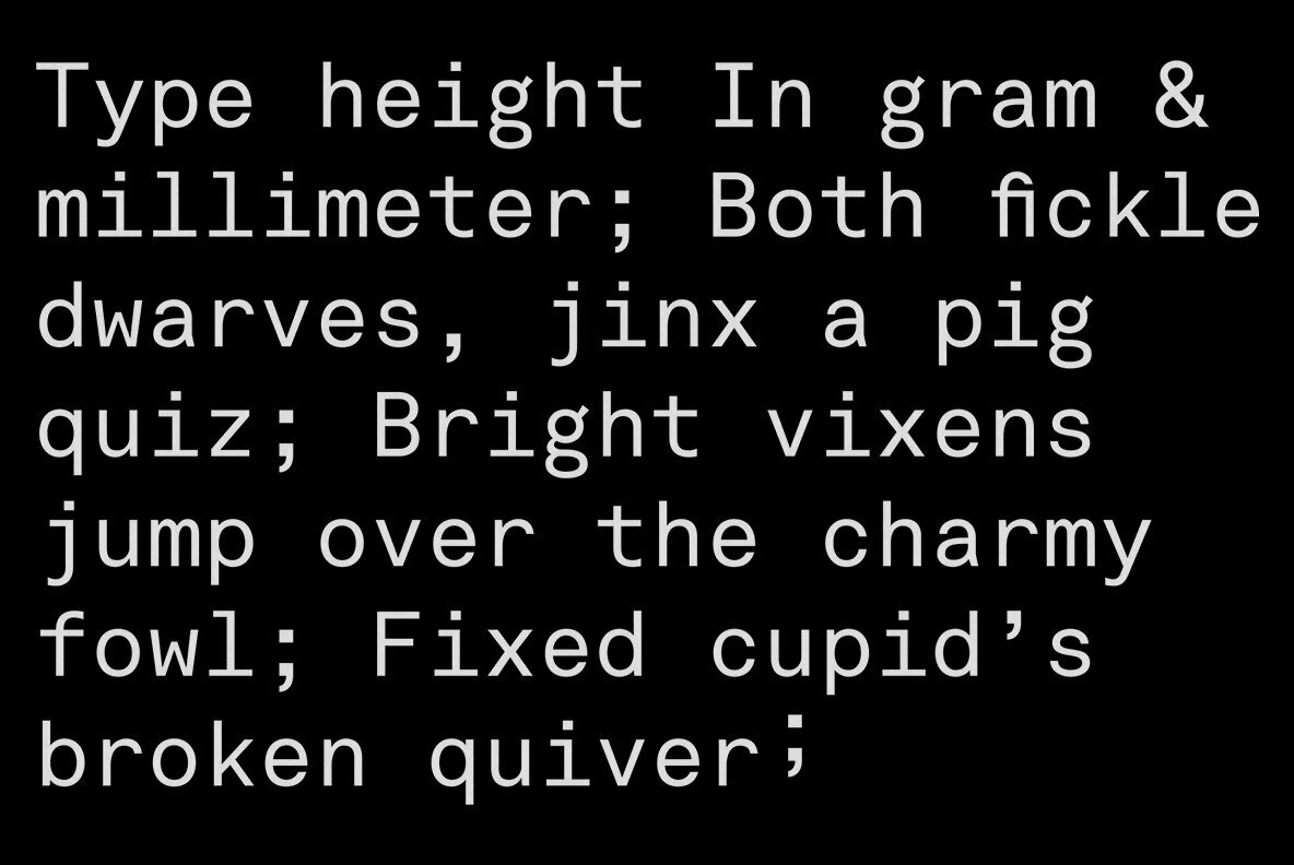
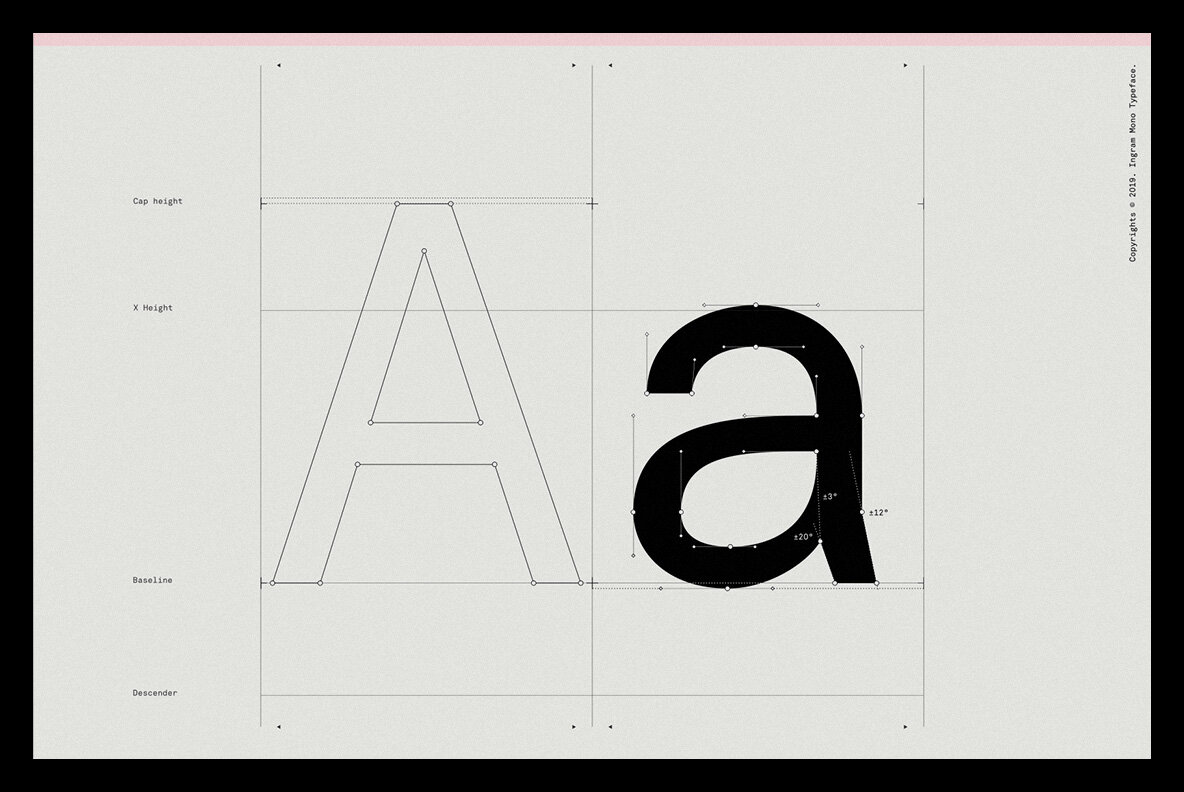
Ingram Mono is a sans serif font design published by Minor Praxis.


RM Mono is the monospaced version of RM Neue. Each character in RM Mono fits in a box of the same width (600 units).
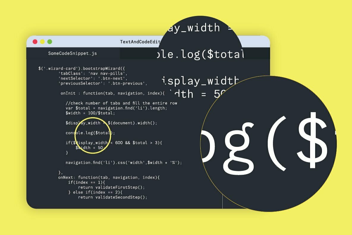
This monospaced version closely follows the original design of RM Neue and its utilitarian roots. There is an alternate single-storey ‘a’, and ‘f’ with a bottom serif as well as a new alternate ‘R’. There are arrows, fractions, superior and inferior numerals, as well as multiple geometric symbols to choose from. With the punctuation in RM Mono being a little bit oversized and the Regular weight being a little bit heavier than a usual grotesque, it could even perform well if used as a coding font.
RM Mono is available in 5 weights, ranging from Light to Black, matching the weights of its sister family, RM Neue. The extensive language support (Latin Extended A) allows type setting in most European languages written with the Latin script
As always with CoType fonts, they created a type family that functions well for graphic design purposes, like posters, logos, and booklets. RM Mono will pair very well with RM Neue to create a unique house style for any business.
FREE double sided, A2 type specimen poster and variable fonts on all Full Family purchases.
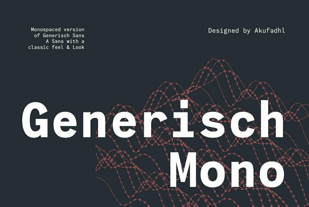


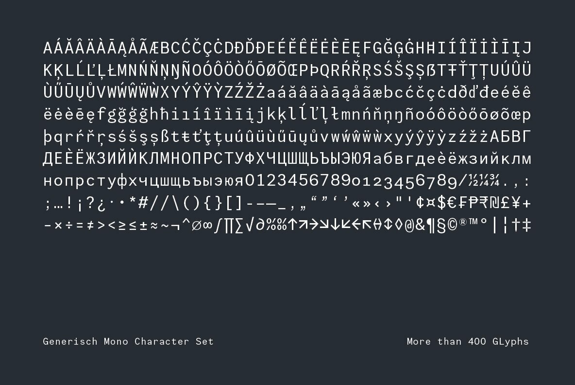

Generisch Mono is a monospaced version of Generisch Sans. Generisch – a german equivalent of generic – sans serif typeface has gain its own place among designers and earn such popularity due to its “simple” design.
Generisch is influenced by early grotesk typefaces from early 1900’s when sans was starting to get popular and used as a body type. Some old ligatures such as ch ck and ng are present in generisch (not the ct and st tho), old style numeral for better typesetting experience and more.