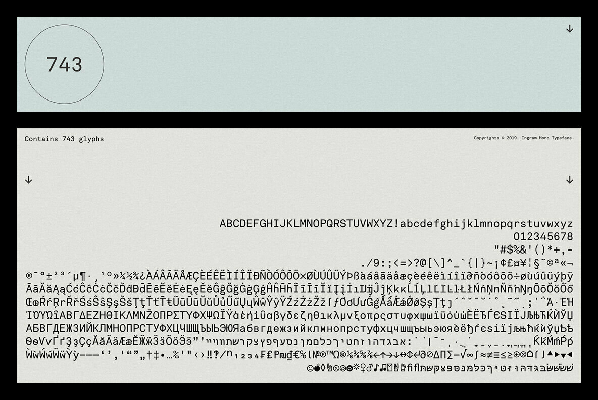
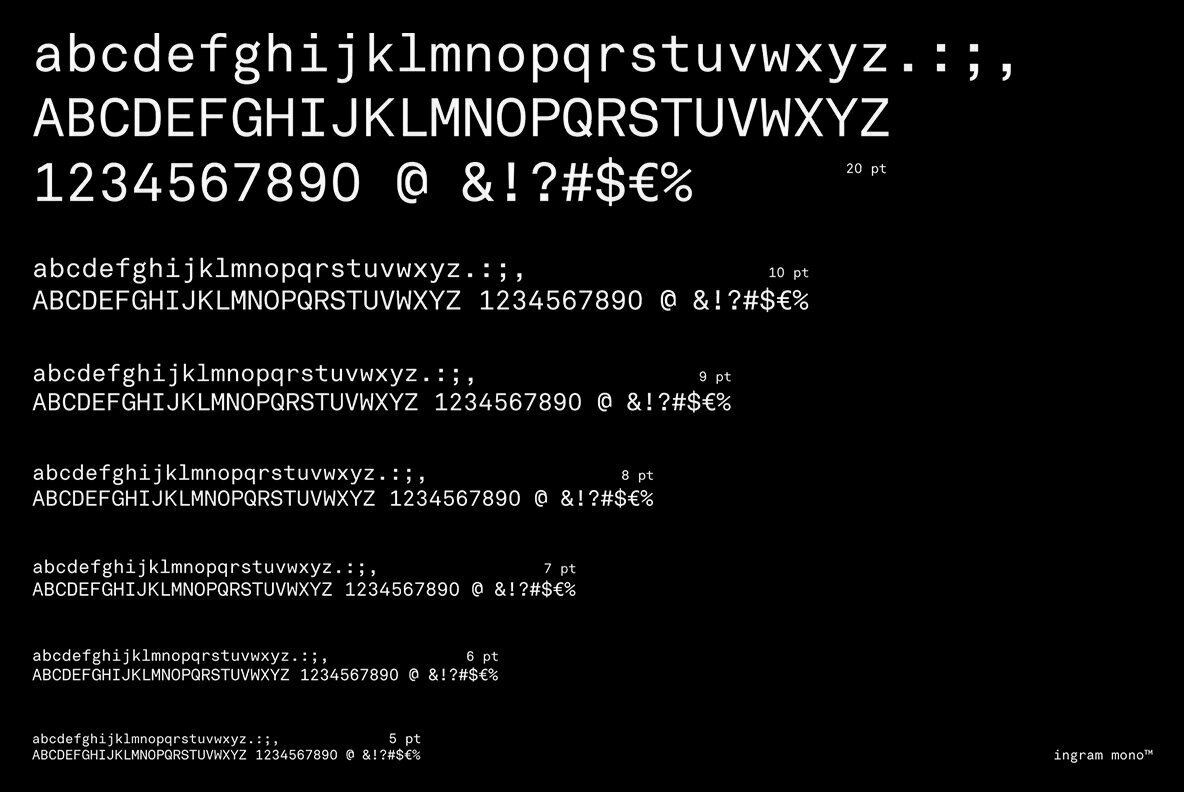
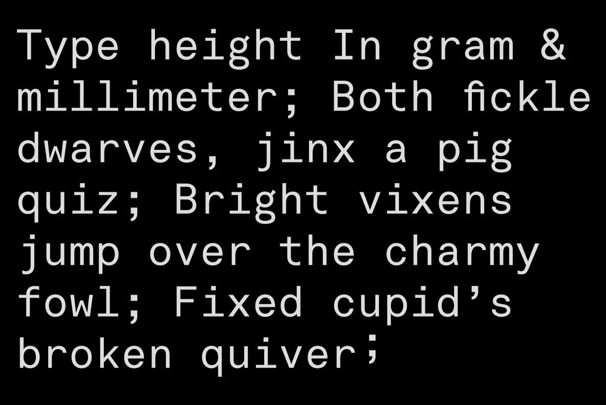
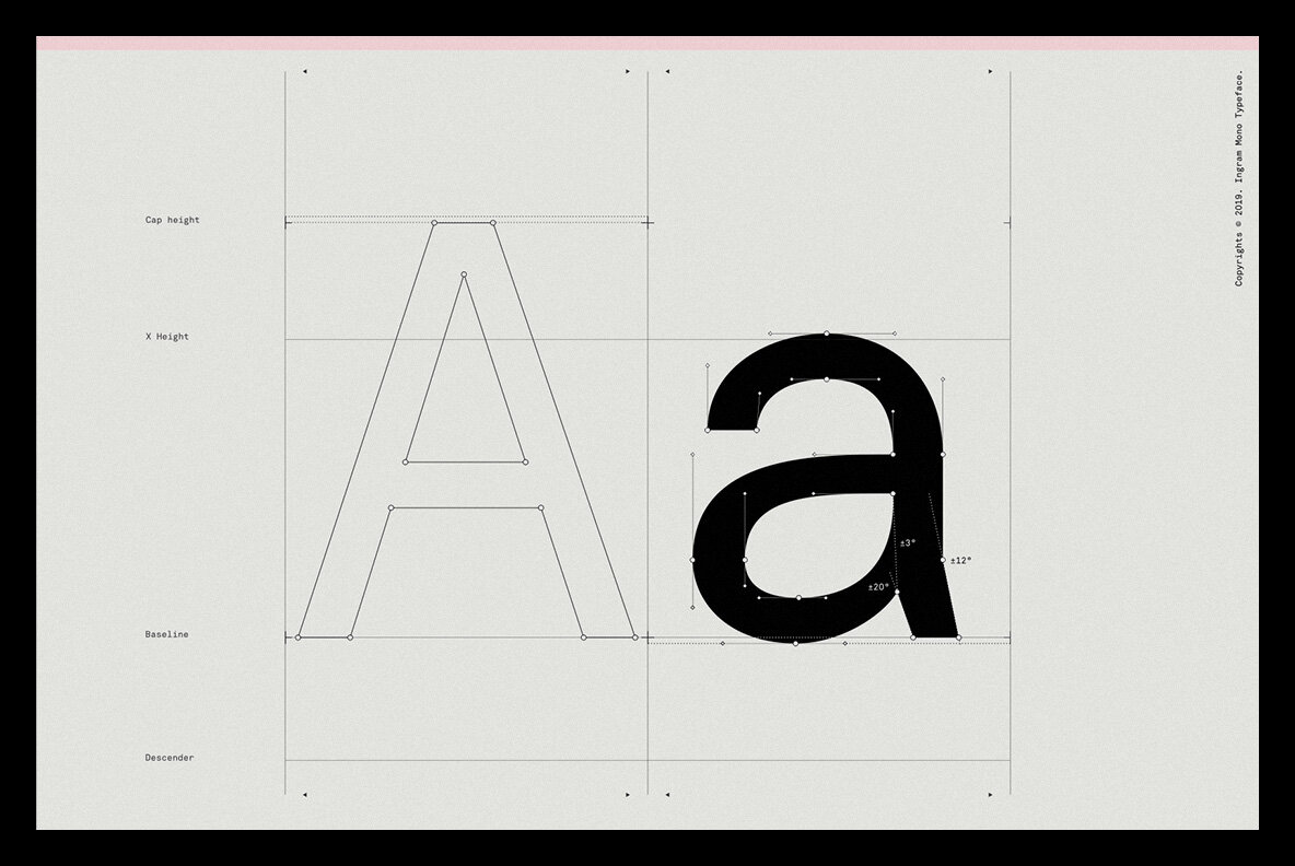
Ingram Mono is a sans serif font design published by Minor Praxis.


RM Mono is the monospaced version of RM Neue. Each character in RM Mono fits in a box of the same width (600 units).
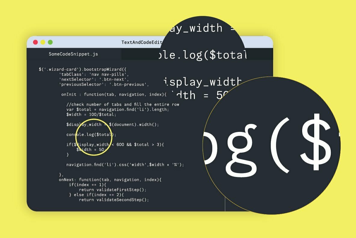
This monospaced version closely follows the original design of RM Neue and its utilitarian roots. There is an alternate single-storey ‘a’, and ‘f’ with a bottom serif as well as a new alternate ‘R’. There are arrows, fractions, superior and inferior numerals, as well as multiple geometric symbols to choose from. With the punctuation in RM Mono being a little bit oversized and the Regular weight being a little bit heavier than a usual grotesque, it could even perform well if used as a coding font.
RM Mono is available in 5 weights, ranging from Light to Black, matching the weights of its sister family, RM Neue. The extensive language support (Latin Extended A) allows type setting in most European languages written with the Latin script
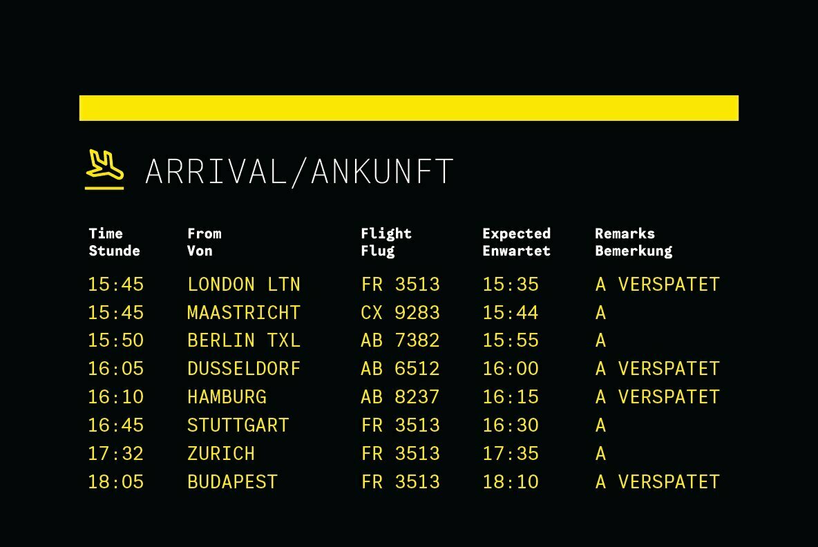
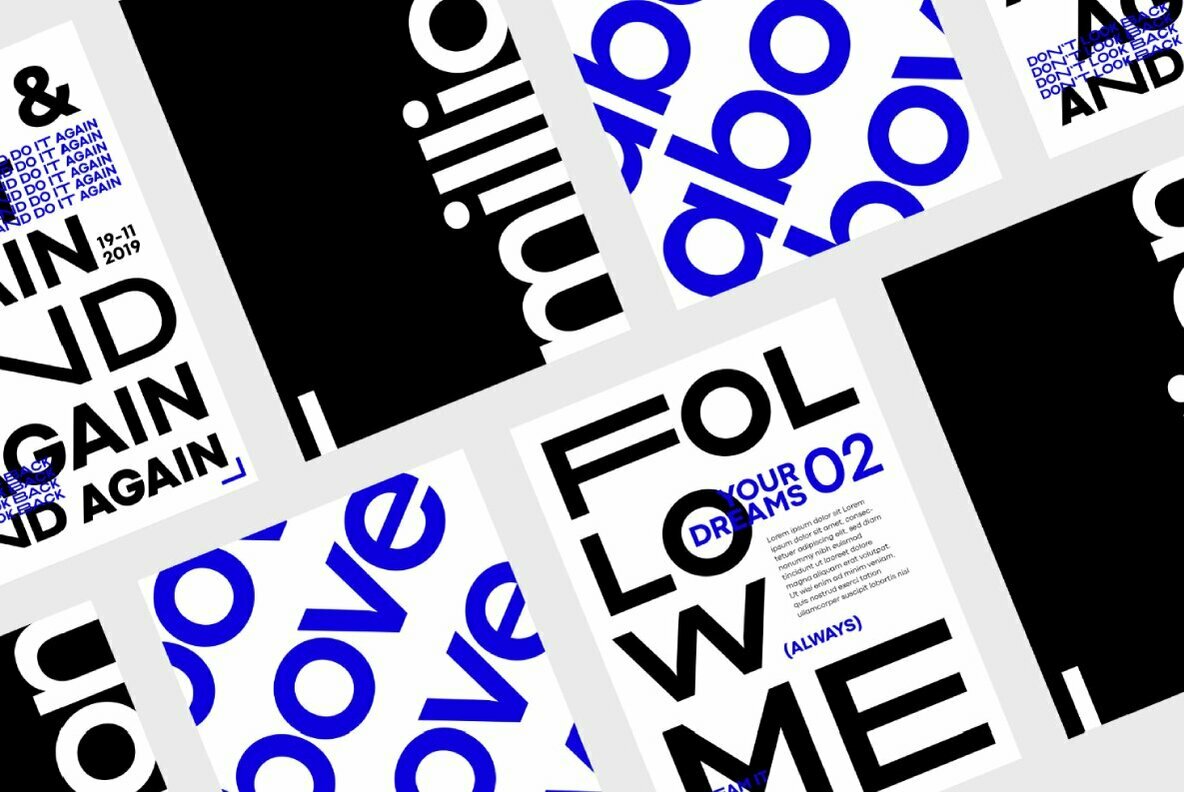
As always with CoType fonts, they created a type family that functions well for graphic design purposes, like posters, logos, and booklets. RM Mono will pair very well with RM Neue to create a unique house style for any business.
FREE double sided, A2 type specimen poster and variable fonts on all Full Family purchases.

I am participating in this years 36DaysOfType for the 3rd time. The project was briefly on hold due to Instagram blocks, but is now back on!
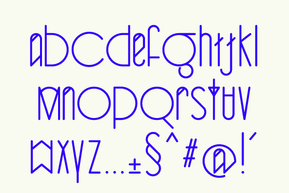
This year I am focused on producing a custom experimental typeface. I have concepts designed and will be refining and posting to Instagram day by day throughout March.
By early April OneTenEleven should have its first custom typeface!
Keep an eye on the new OneTenEleven Instagram profile here. Follow the 36DaysOfType project here.
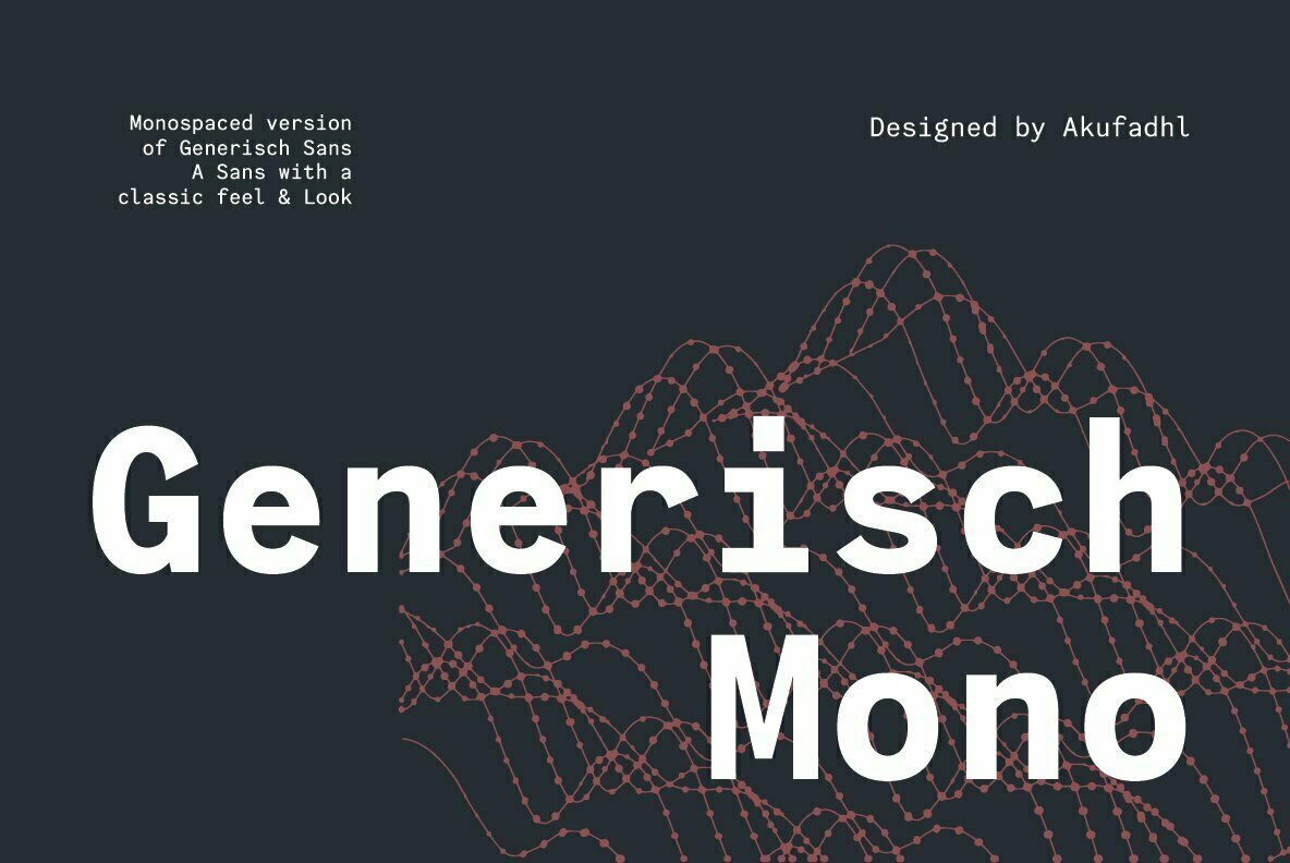


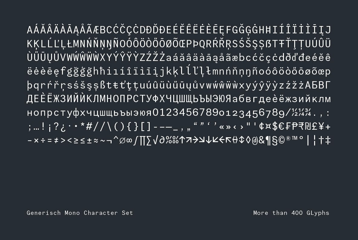

Generisch Mono is a monospaced version of Generisch Sans. Generisch – a german equivalent of generic – sans serif typeface has gain its own place among designers and earn such popularity due to its “simple” design.
Generisch is influenced by early grotesk typefaces from early 1900’s when sans was starting to get popular and used as a body type. Some old ligatures such as ch ck and ng are present in generisch (not the ct and st tho), old style numeral for better typesetting experience and more.
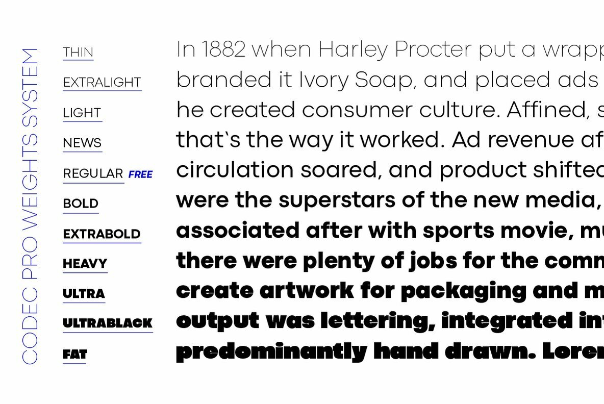
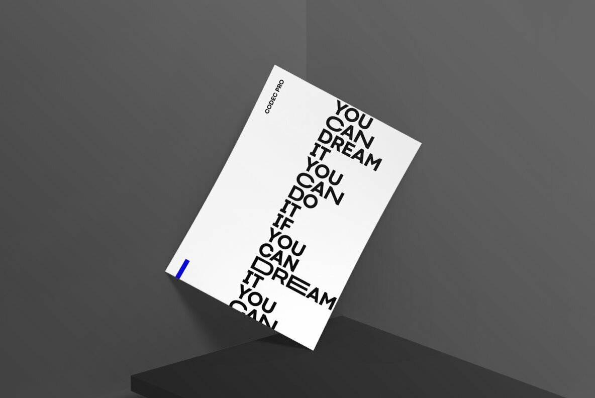
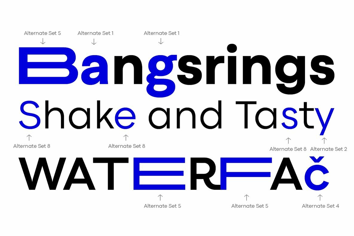
Codec Pro is the newest incarnation of the Codec family, developed in 2017 by Francesco Canovaro, Cosimo Lorenzo Pancini and Andrea Tartarelli as a research on the subtleties and the variations on the theme of the geometric sans-serif design.
The original typeface has been completely redesigned and expanded to feature a wide range of eleven weights, from the hairline thin to the bulky fat, while the character set has been extended to include not only latin, cyrillic and greek but also arabic, farsi and urdu scripts.
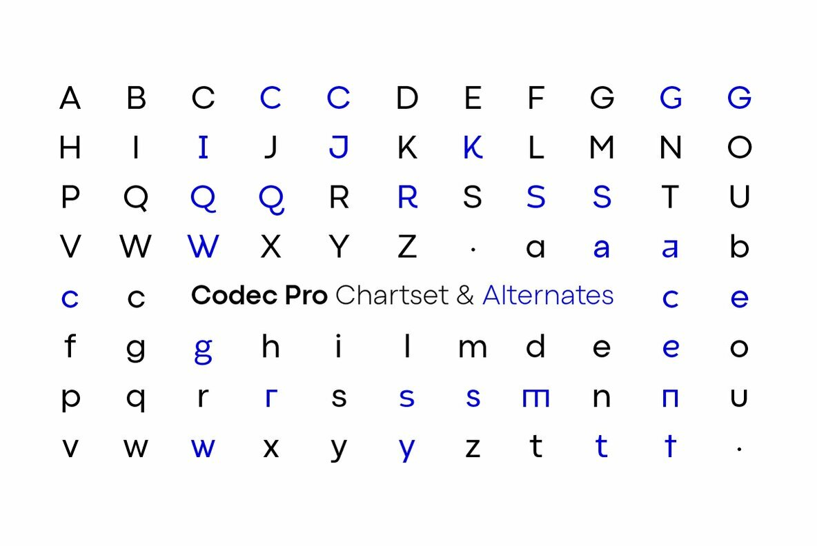
A veritable swiss-knife for the designer, Codec Pro also includes a wide range of alternates and stylistic sets that cover all the subfamilies and the moods of the original type system. So while the standard set (Codec Cold) has terminals cut parallel or perpendicular to the baseline, emphasizing geometry for a more construceted look, stylistic set 4 (Codec Warm) uses open diagonal cuts and humanist shapes to give the typeface a gentler, warmer feeling. Set 3 (Codec Cold Logo) comes alive with funky ligatures, while Set 5 (Codec Warm Logo) stretches uppercase characters horizontally for a dynamic, unexpect effect
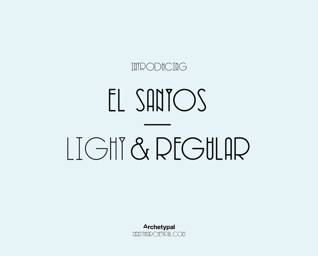


Designed in late 2011, by fellow Leeds designer Si Billam. El Santos is a beautifully simple yet elegant typeface. Perfect ellipses contrast narrow uprights creating a unique decorative equilibrium within words, sentences and paragraphs.