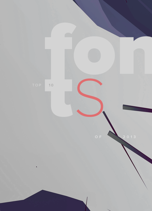
A nice selection of top 10 fonts 2013 has been posted over at YWFT on the blog. For all typography lovers its well worth taking a look. Check out the collection here or purchase at www.youworkforthem.com
A nice selection of top 10 fonts 2013 has been posted over at YWFT on the blog. For all typography lovers its well worth taking a look. Check out the collection here or purchase at www.youworkforthem.com
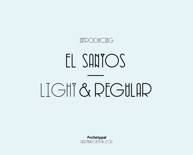


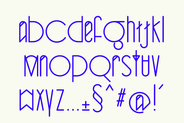


Designed in late 2011, by fellow Leeds designer Si Billam. El Santos is a beautifully simple yet elegant typeface. Perfect ellipses contrast narrow uprights creating a unique decorative equilibrium within words, sentences and paragraphs.

Known for his experimental style and hands-on approach to pushing type to its limits, Ward bridges the gap between illustration and typography,exploring the notion of word as image. His work tells stories with an inventive use of type and typography, bringing words to life; an approach he took literally for this year’s Creative Review Annual cover, for which he teamed up with an immunologist and actually grew a microscopic letter ‘A’ from pollen cells.
Often favouring this organic and scientific approach, when commissioned by Discover Magazine to produce something for their 30th Anniversary cover, he used a magnetic ink – called Ferrofluid – containing tiny suspended particles that react to magnets to create a kind of fluid
stencil of the number 30.
Another key piece uses what he dubs ‘kinetic typography’. The words ‘You Blow Me Away’ were screenprinted on sheets of glass which were then blasted with ballbearings & pool balls and photographed to capture it at various stages of its destruction.
For more of Craig’s work check out – http://www.blinkart.co.uk/#artist/craigward