Blog.OneTenEleven

Design + Motion

Memories Book Preview

00267136135172a133b102c1

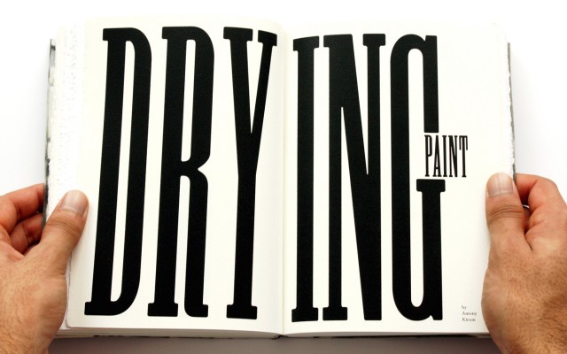
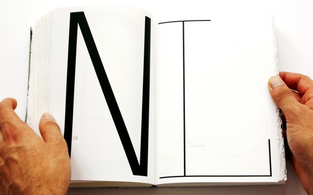
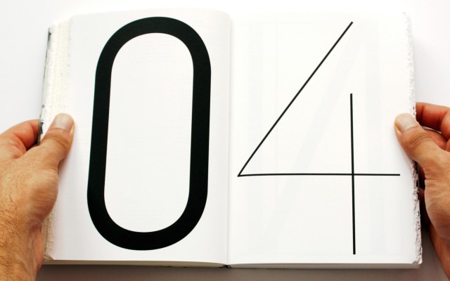
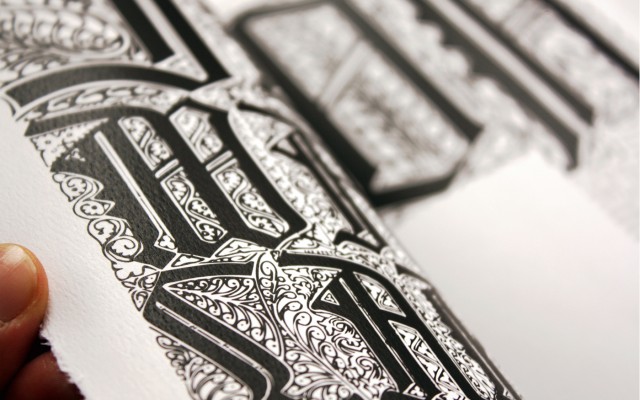
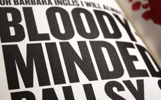
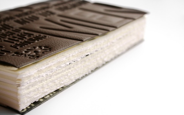
Memories team member Rishi Sodha has created a special edition of the Memories book. Using the stories and images we have in so far, he has assembled a prototype of Memories with an incredible faux leather embossed cover, and bound it by hand. Pushing his layout skills to the max and printing it on a luscious, pulpy paper stock, he’s created a marvellous object and shown just how awesome the images our artists have created will look in print.

Unfortunately, this wondrous creation won’t be available to buy, however we are moving on with the final version with the aim to make as much as we can for Maggie’s Cancer Care Centres. The prototype has given us loads of printing and layout ideas to hopefully apply in the on-sale version of the book.

Keep track of the project over at http://memories.subism.co.uk/

Also featured on www.designweek.co.uk

DixonBaxi: Join the Dots

db-join-the-dots

London based DixonBaxi is an independent creative agency working with some of the worlds most interesting companies across TV, advertising, print, digital and the ways they overlap. DixonBaxi has put together this poster series called Join the Dots … “a celebration of the spirit of collaboration … A single dot, each representing one collaborator, each a connection to another. Each collaborator is given a template of a dot in a fixed position on an A2 portrait poster. Each interpreted this in their own way.”

Some incredibly talented artists involved including; Lost In Space, Kultnation, Chris Labrooy, Onur Senturk, Jimmy Yuan, Mate Steinforth, Tavo Ponce, Mauro Gatti and many others.

Onesize: New Reel

Onesize Reel 2010 from Onesize on Vimeo.

Dutch Motion Design and Directing studio Onesize have put up their latest reel and its as impressive as always. Music and sound design by Jeff Dodson.

I’m sure you’ve seen their reels in the past, but in case you haven’t, also check out their previous year’s reels. Each one is just as outstanding.

Official music video for Stateless’ new single “Ariel” by Field. A digital dance exploring the eternal struggle of good and evil. Animated in Houdini.

Have a look at the making of at vimeo.com/16619572
More info at field.io/project/stateless-ariel

Dance Improvisation by Dominic North.
Commissioned by Oscar & Ewan.

“Ariel” will be available Nov 22 on Ninja Tunes, from the forthcoming album “Matilda”, out Feb 2011.
ninjatune.net/ninja/release.php?id=1742

A birthday present for Godard

jean-luc
Today is Jean-Luc Godard’s 80th birthday. To honour their hero, design studio Atelier Carvalho Bernau has created the Jean-Luc typeface which is available for free from their website

The typeface is based on the lettering used in the title sequences for the films. “We didn’t find out who originally made the lettering for these two movies,” they say. “Some speculate it could have been Godard himself – Godard’s interest in graphic design and typography is clear, with many of his other films employing such strong typography-only titles and intertitles.”

You can download the font here

New-new trend?

:N*: One of the best conceptual title sequence, which seems to be the new-new trend for creators to shine, is the recent FOTB titles by Nando Costa. Surreal monochrome ambiance set the tone. Organic matters with bouncing or magnetize elements are strung together in a darkish yet dauntingly beautiful collage.

It won’t disappoint.

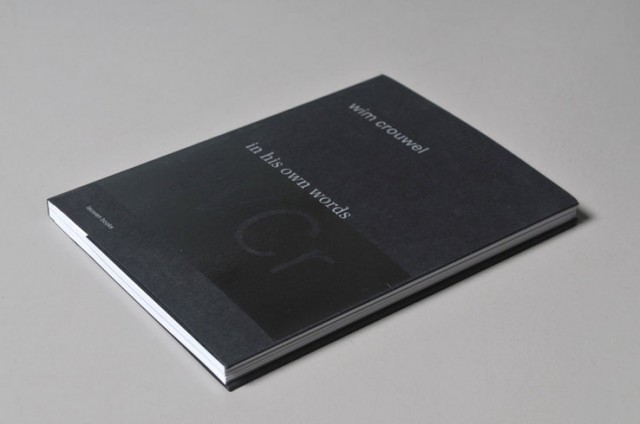
Wim Crouwel ‘in his own words’ by Toon Lauwen

Crouwel_words1

Another nice gem now available by the wonderful folks at Typotheque, this looks like a beauty and surely one for all to digest as time and capacity allow. Here is a bit of text from Typotheque:

Wim Crouwel ‘in his own words’ presents a selection of lectures and articles delivered by Wim Crouwel between 1973 and 2006. Crouwel’s texts, who has lectured all over the world, document a lengthy and important career as a designer (professor and museum director) that spans from the early postwar years until the first decennium of the 21st century. The book mirrors a highly committed professional: a pragmatist, critical observer and at some decisive points: a utopian even. The outgoing/diplomatic character of Crouwel, who has always dressed immaculately, is shown in a small portfolio of portraits, made by different photographers over a period of almost sixty-five years.

‘Edits’ by Edit

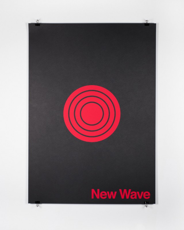
Acid-House_29 Industrial_35 New-Wave_37

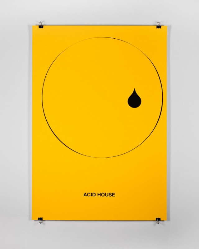
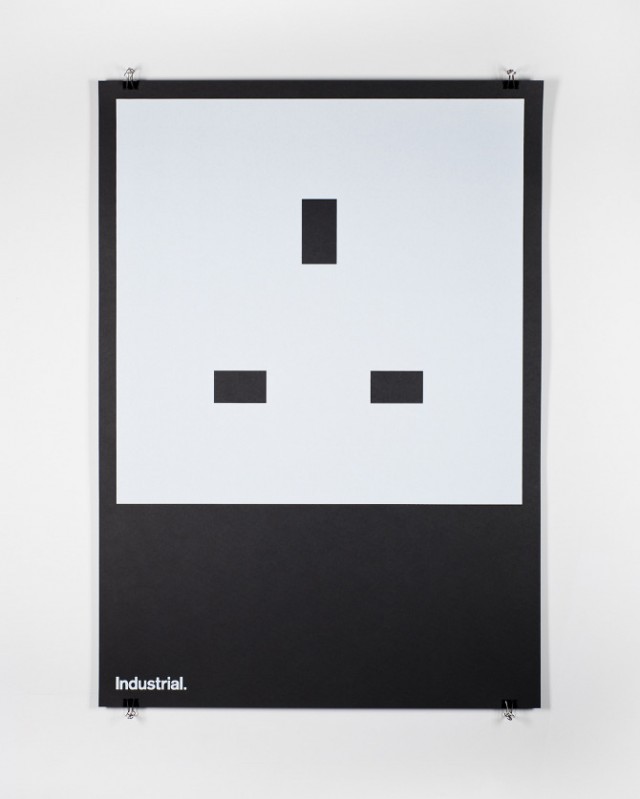
‘Edits’ is a poster series curated by Edit — each designer was asked to represent a musical genre using one shape and one type (stating the genre). Available for pre-order, now!

Posters are A1 size and very limited.

Participants:
Bas Koopmans
Collective Approach
Duane King
Hey Studio
Manual Creative
Mark Boyce
Leterme Dowling
Nitzan — Edit
Sane & Able
Studio Makgill
Toko
Trevor Jackson
This Studio

www.editsbyedit.co.uk

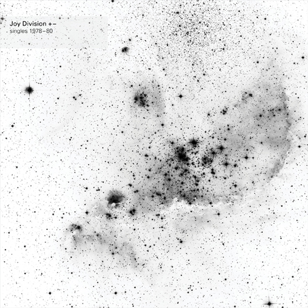
Joy Division +- by Howard Wakefield with Art Direction by Peter Saville

joydiv-single

Project
Joy Division +- Box set

Design
Howard Wakefield with art direction by Peter Saville

Photography
Prudence Cuming and Nick Turner – Hubble NGC 346 SMC Courtesy Spaceimages

Link
parriswakefield.com