Matt Lamont’s extraordinary archive of 10,000+ printed design artefacts is heading into book form — and it deserves your attention.
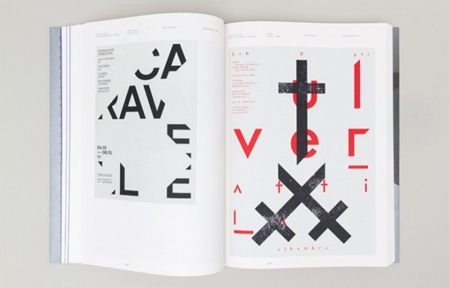
If you’ve spent any time in the world of graphic design, you’ll know how fragile its history can be. Magazines go out of print. Posters get lost. The work of whole movements disappears into boxes. Matt Lamont — designer, collector, and educator based in Bradford — has spent over a decade fighting that entropy, assembling one of the most comprehensive private graphic design archives in the country.
Now, in partnership with Unit Editions, he’s bringing the best of it into a single book. Design Reviewed is currently crowdfunding on Volume, and it looks seriously special.
What is Design Reviewed?
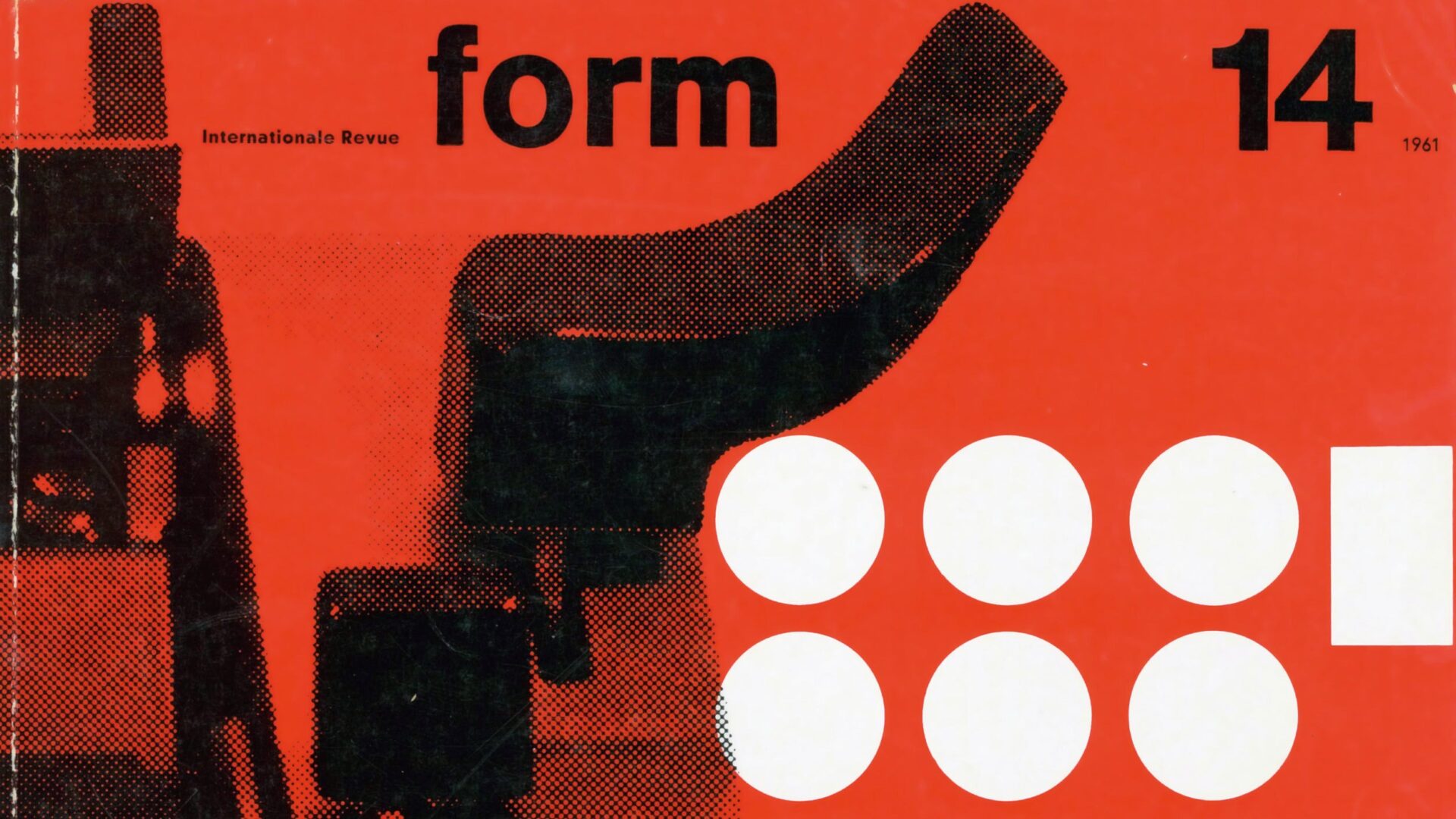
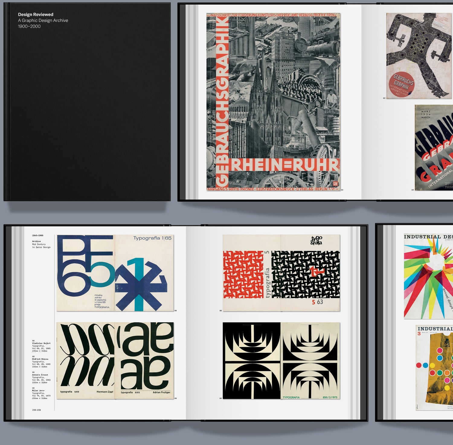
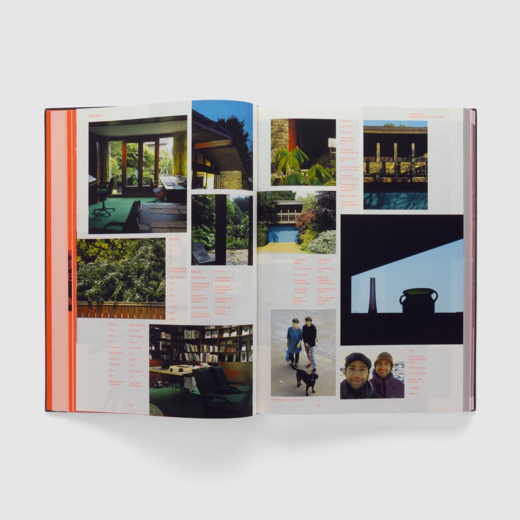
The Design Reviewed website has been quietly building for years — a digital archive cataloguing everything from rare typographic periodicals like Typographische Monatsblätter and Typografia to posters, stamps and ephemera from across the globe. Every item in the archive also has a physical presence in Matt’s Bradford studio, where it’s actively used for educational workshops, visiting lectures and as a wellspring of inspiration for working designers.
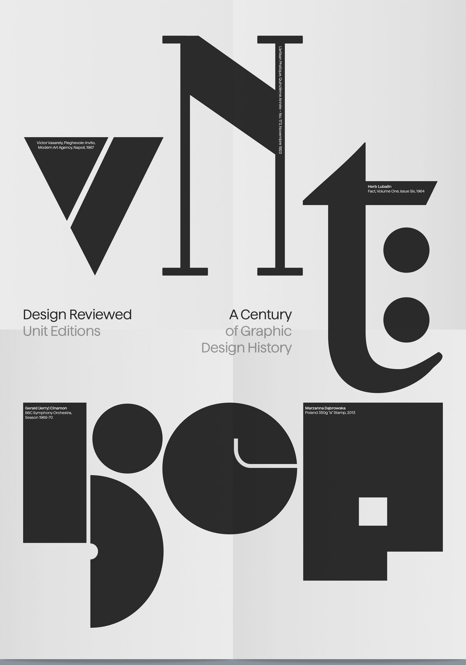
The planned book spans a century of graphic design history, from Art Nouveau and Early Modernism through to Pop and Post Modernism. Crucially, the selection isn’t driven by personal taste alone — it’s chosen to illuminate wider historical movements, ideas and approaches within the discipline.
The Book
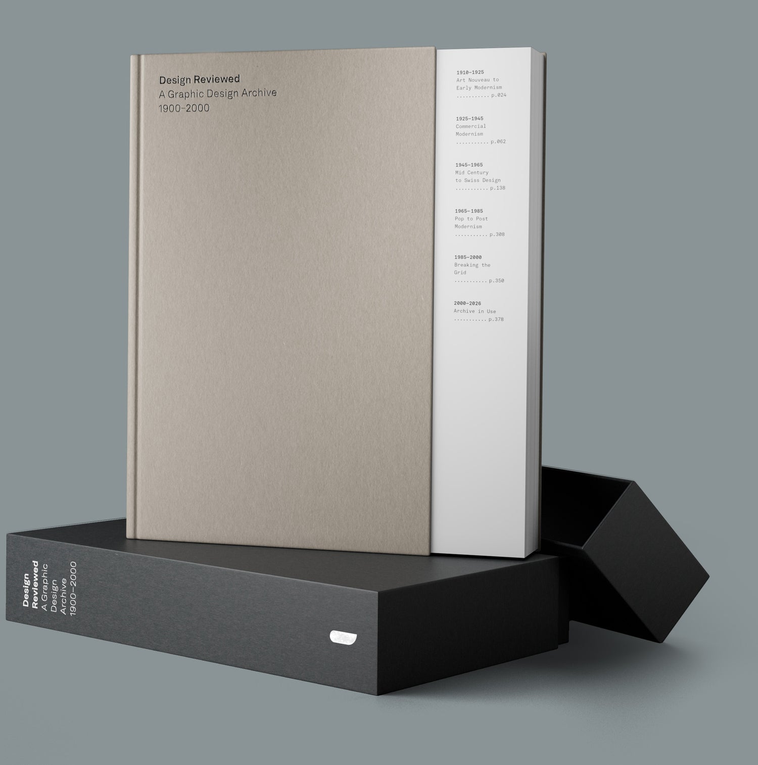
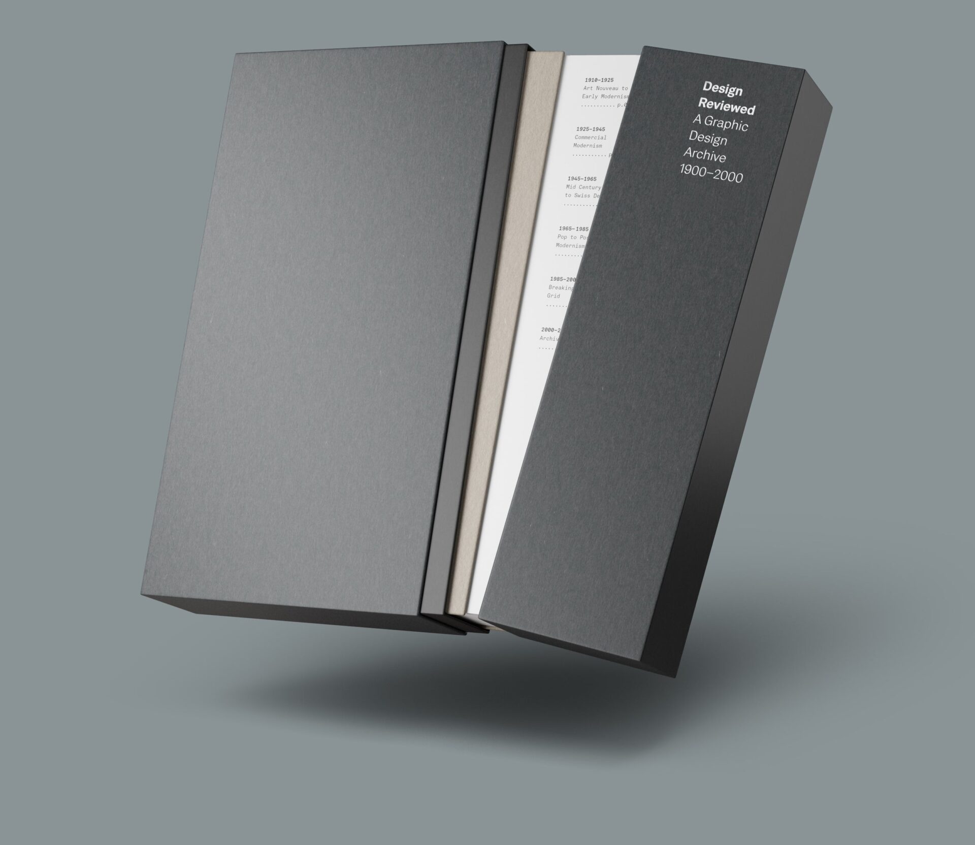
At 400 pages, hardback, 279 × 234mm, and published by Unit Editions — whose track record for beautifully produced design books speaks for itself — this looks like a genuinely serious publication. Not a coffee table novelty, but a study tool and reference work you’d actually return to. Foil typography details round out what sounds like a production to match the quality of the content.
“I hope the book can be a celebration of visual reference, a study tool and a way of bringing the archive out of the boxes and shelves and into your hands. Something you can return to again and again for inspiration and context.” — Matt Lamont
The Collector’s Edition
There’s also a Collector’s Edition housed in a shoulder-neck slipcase, with a cut-back front board that reveals the contents page, a nice touch. It comes with a full A-Z postcard set (26 cards, each featuring a letterform from the archive with designer credits on the reverse) and an exclusive A2 folded poster. Limited to 250 copies.
The campaign is 76% funded with a deadline of 29 April 2026. Estimated delivery is Summer 2027. Worth backing now if you’re interested — the Collector’s Edition in particular won’t hang around.
The ultimate typographic experiment – 7,762,392 typefaces from one of the world’s foremost typography studios.
MuirMcNeil makes typefaces that work in mysterious but mathematical ways. Using methods that are entirely contemporary, though they can seem arcane, they explore ‘parametric design systems’. And there is something about their commitment to a punchy, practical, systems-based approach that communicates far and wide.
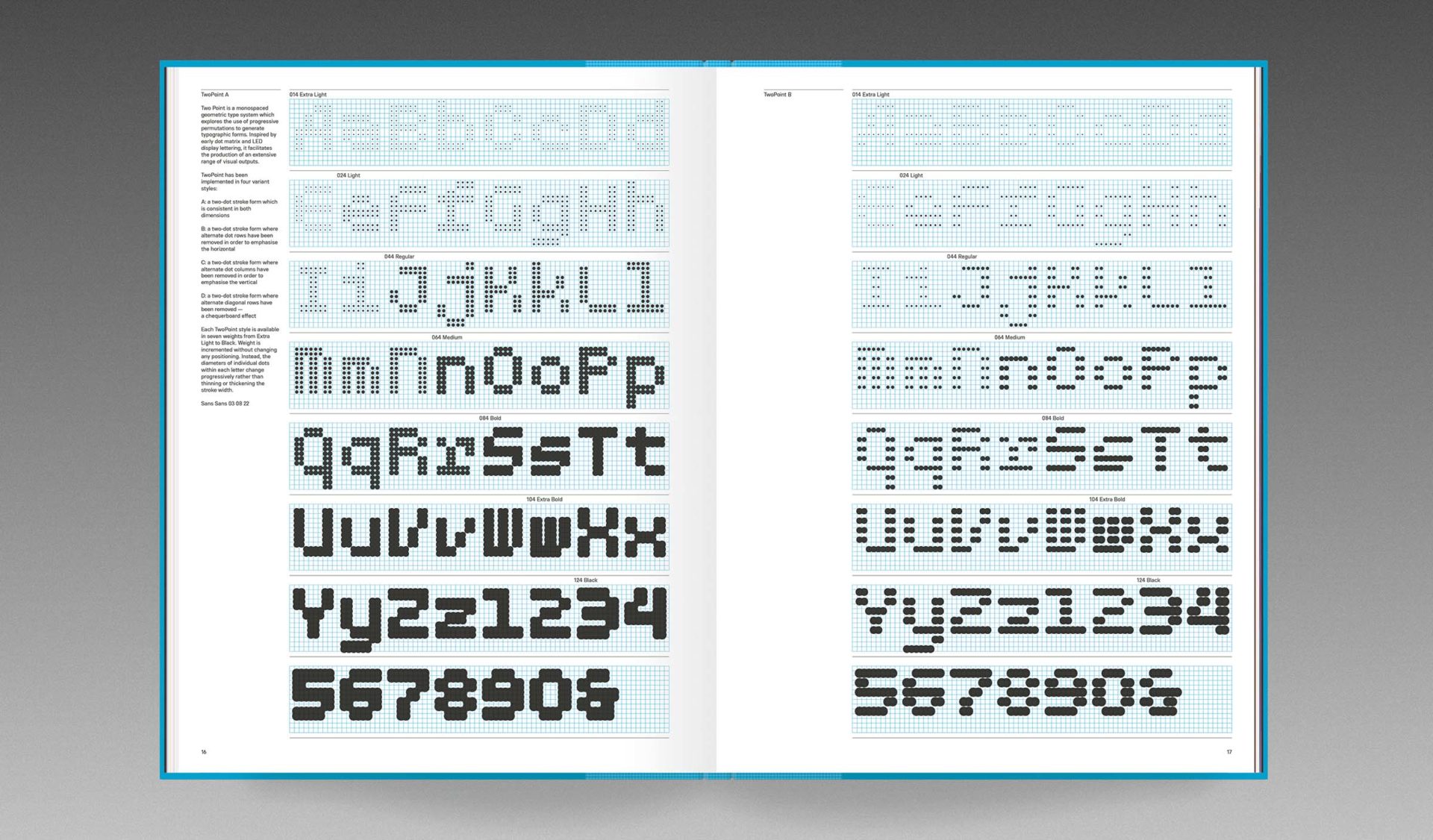
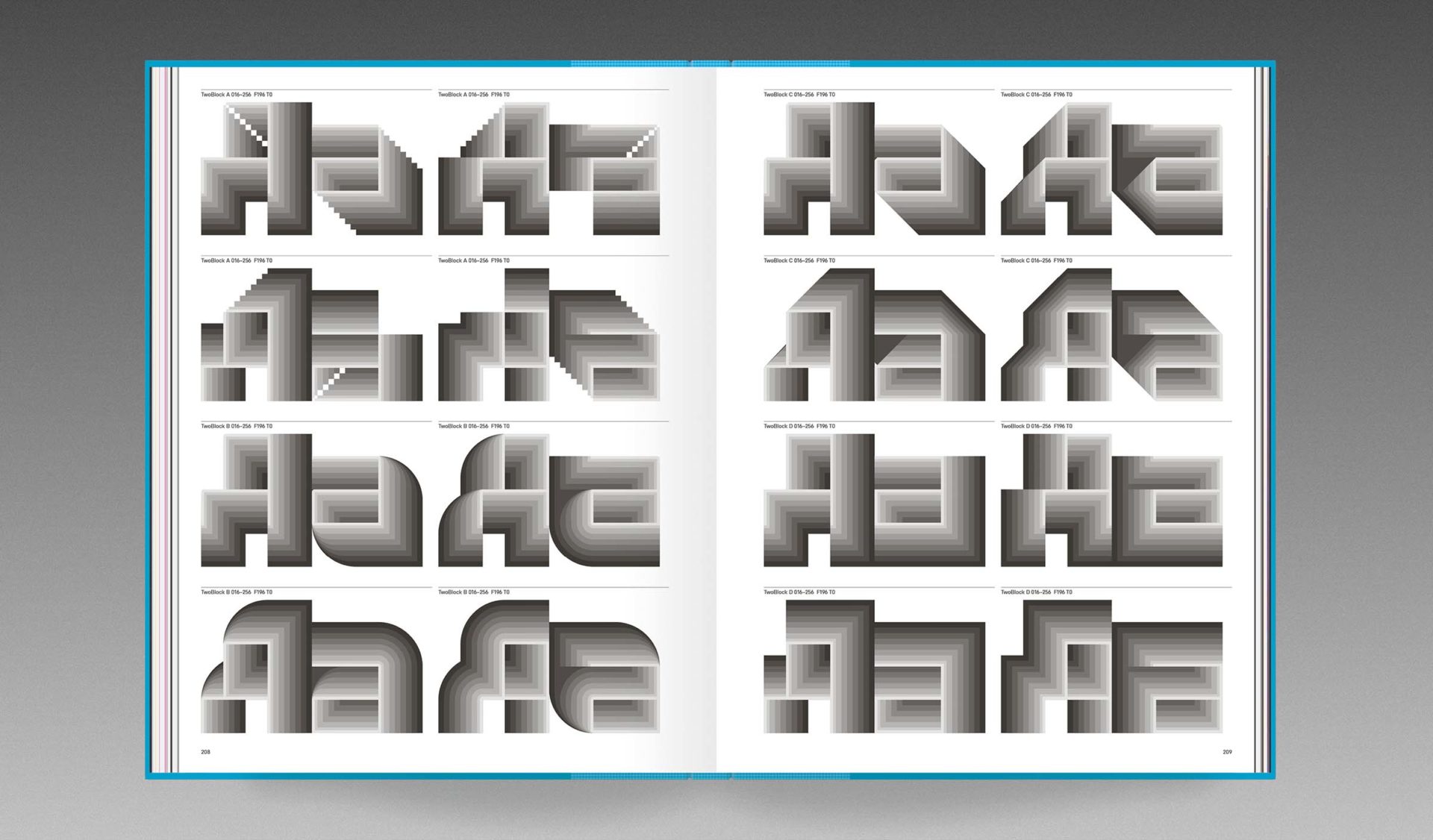
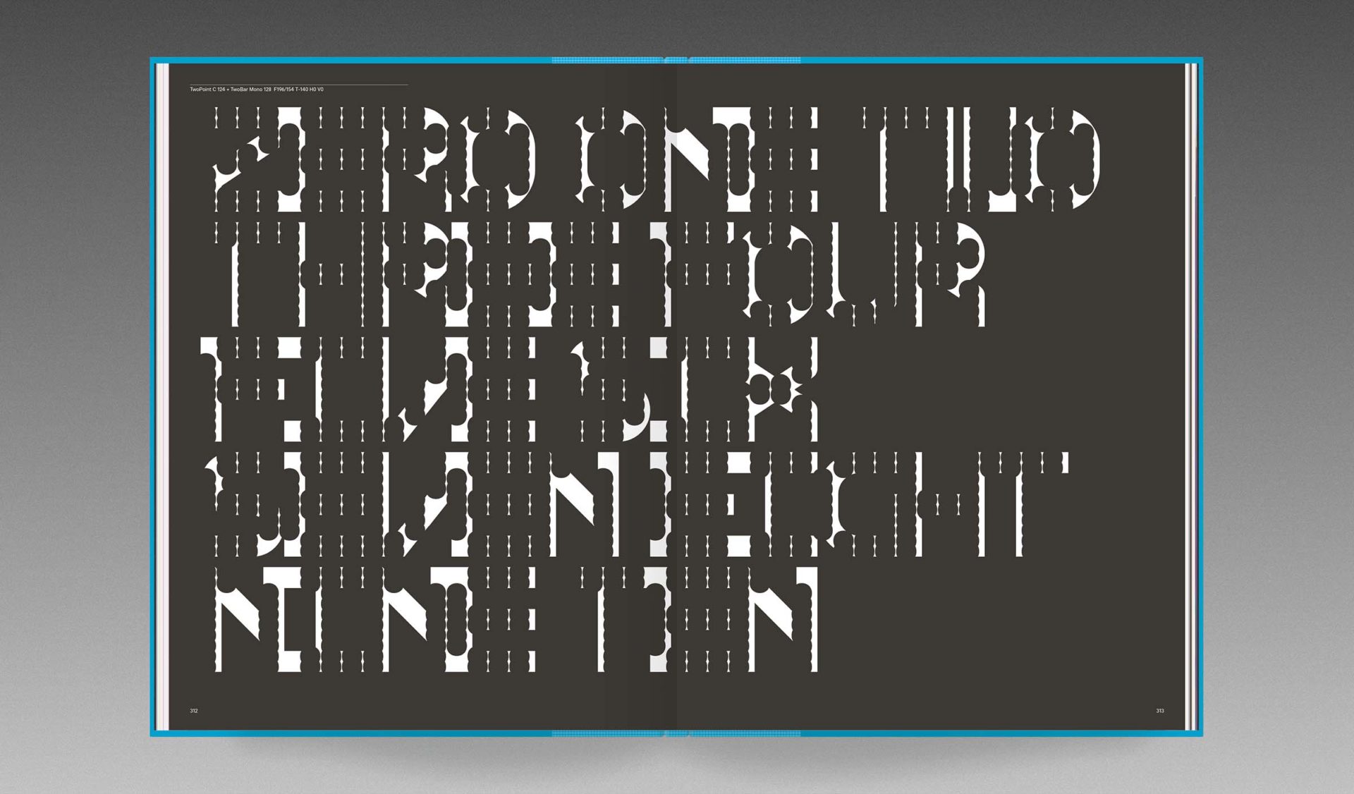
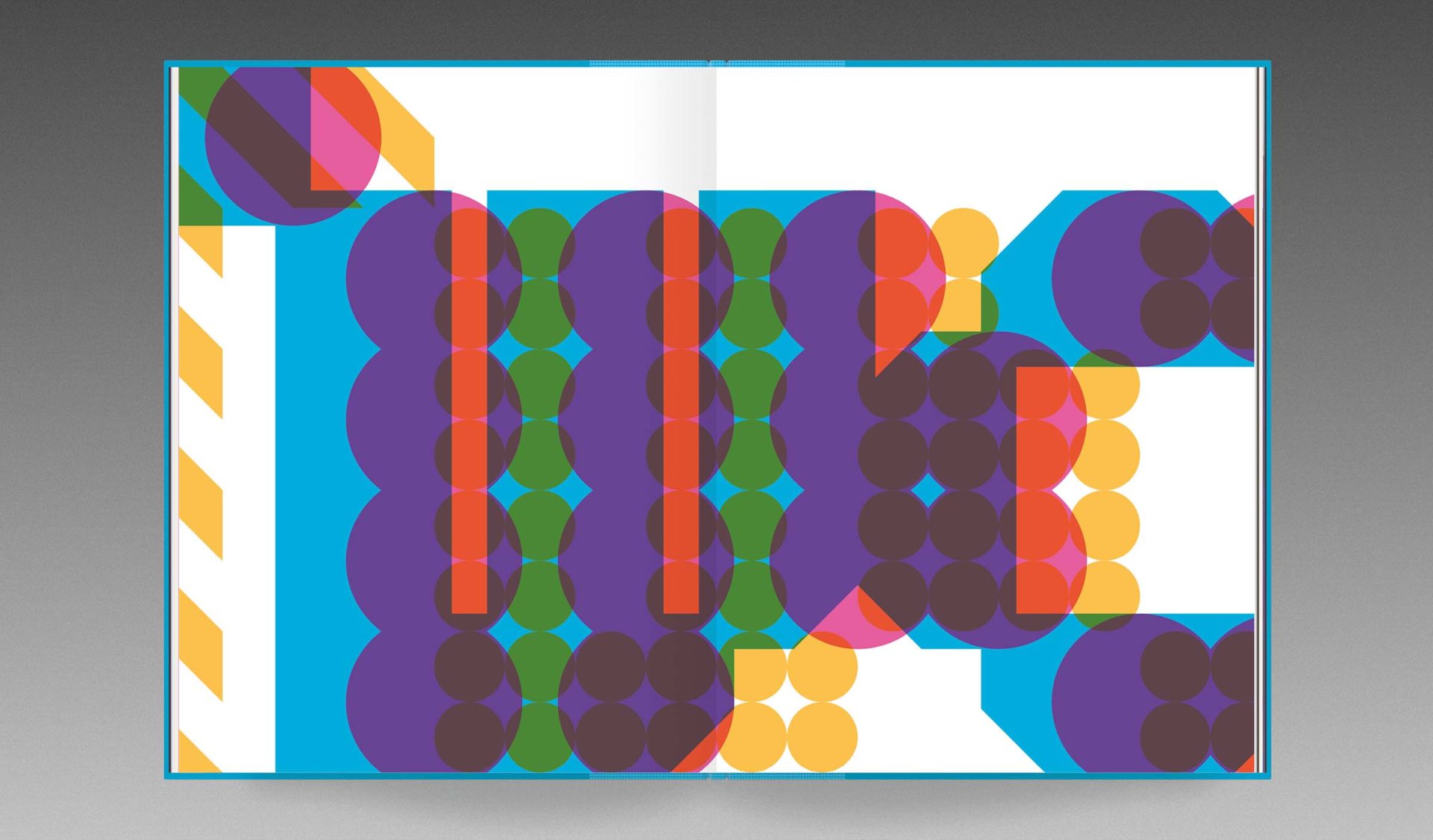
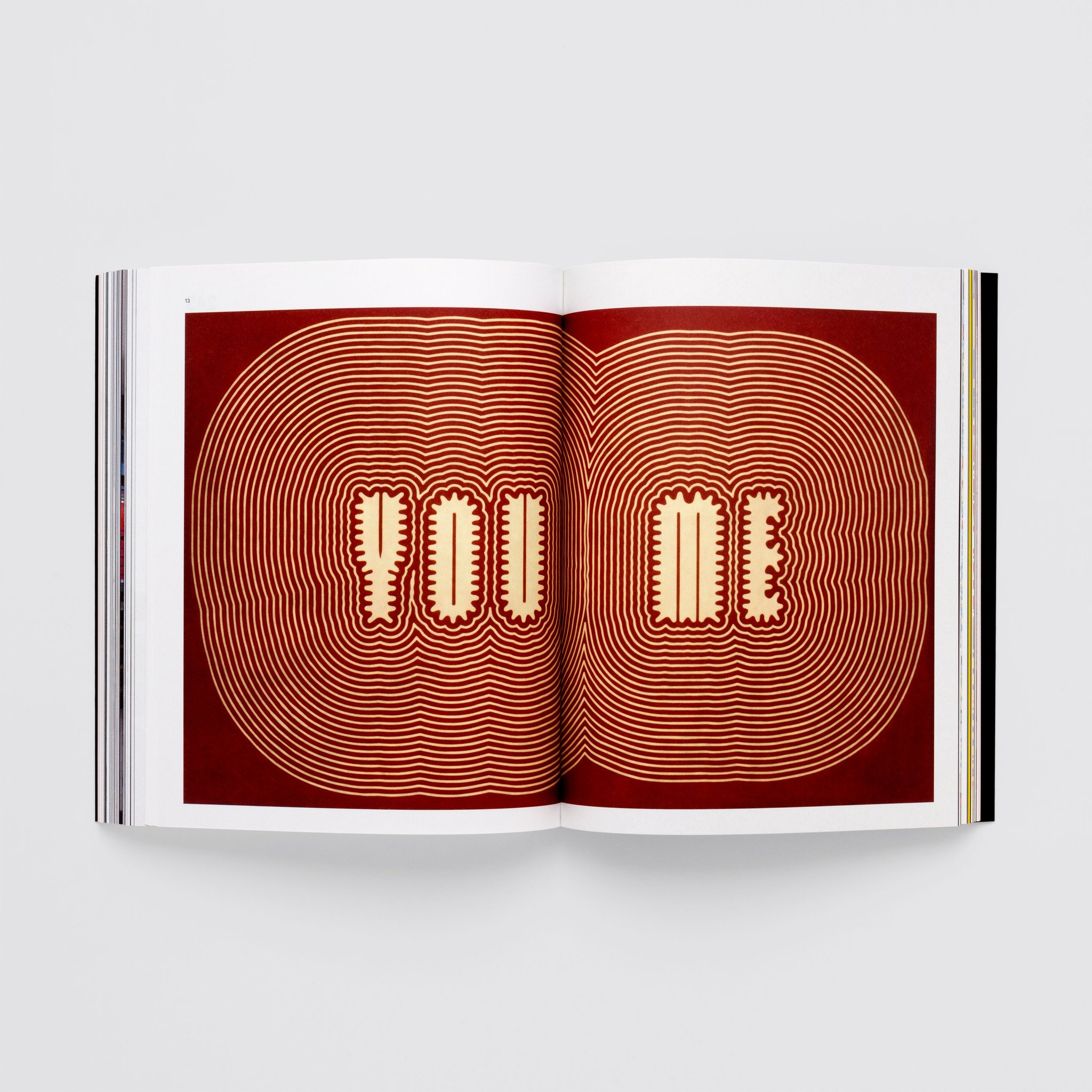
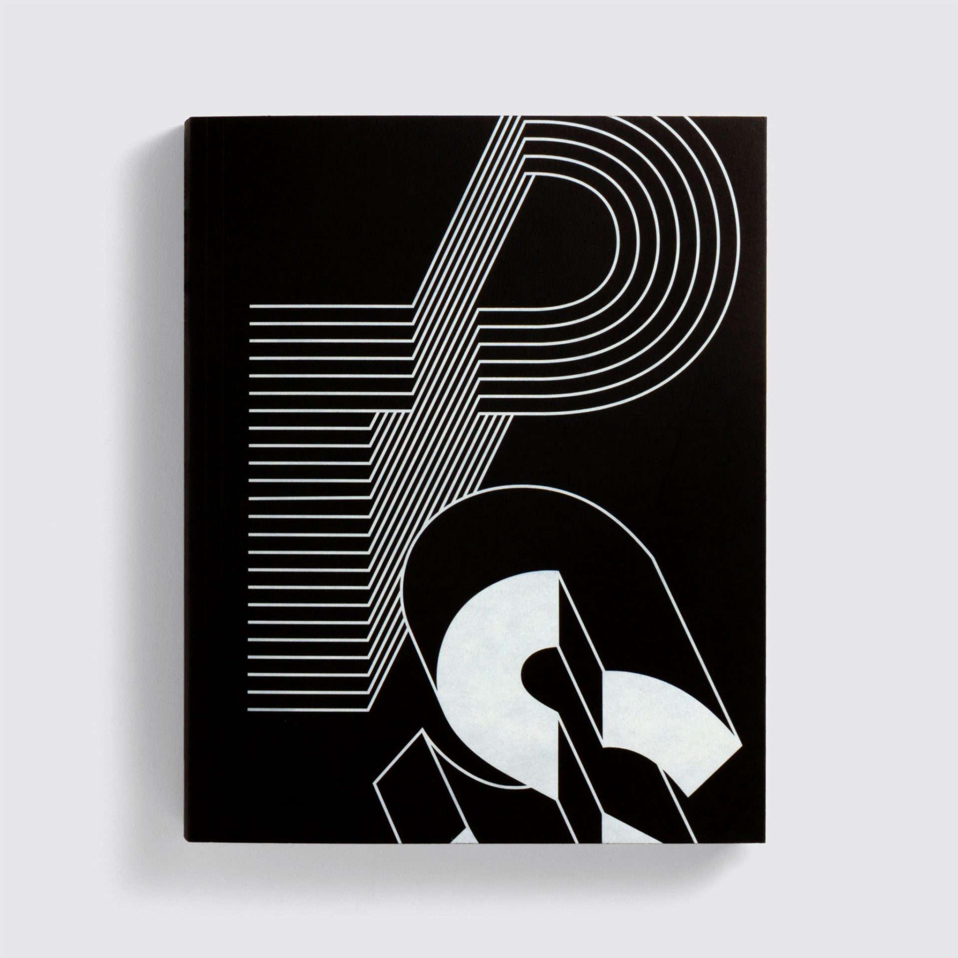
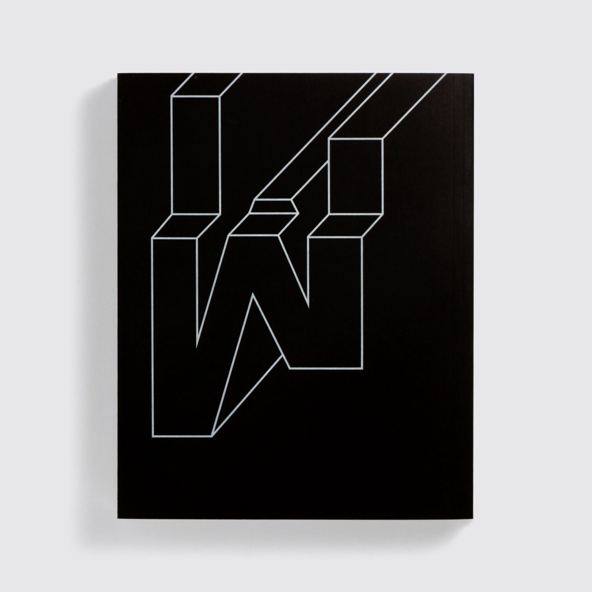
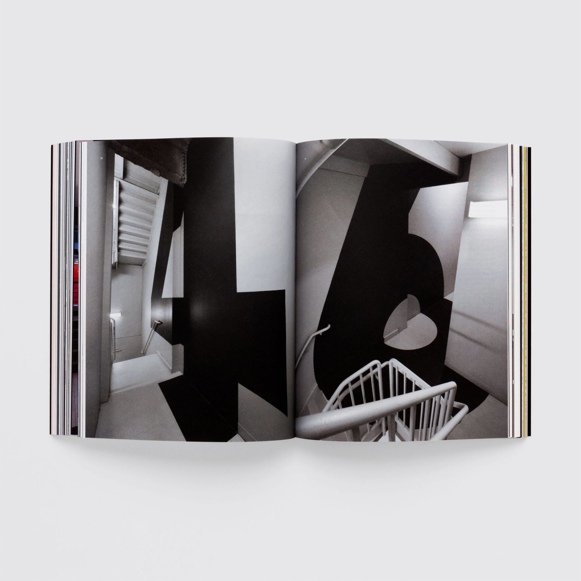
Founded in 2009 by Paul McNeil and Hamish Muir, MuirMcNeil was established to explore the use of systematic methods in graphic design, typography and moving image. Their first publication, System Process Form, is a detailed survey of their Two type system, an extensive collection of geometric alphabets in which every stroke, shape, letterform and word is designed to correspond and collaborate in close harmony. Far from a mere catalogue of typefaces, this publication is a powerful demonstration of the beauty of analytical approaches to form-giving for visual communication, one that embraces both micro and macro views, and one whose end results can be as spectacular as they are unexpected.
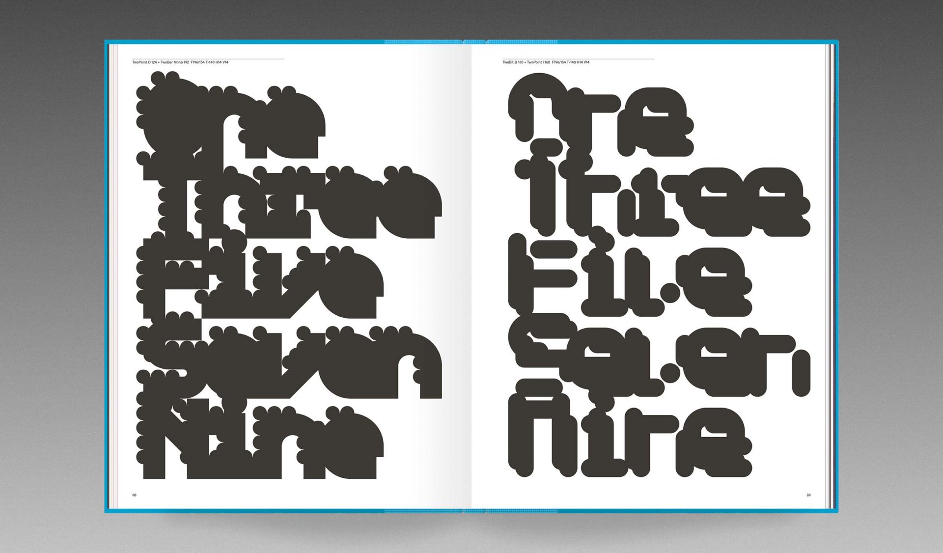
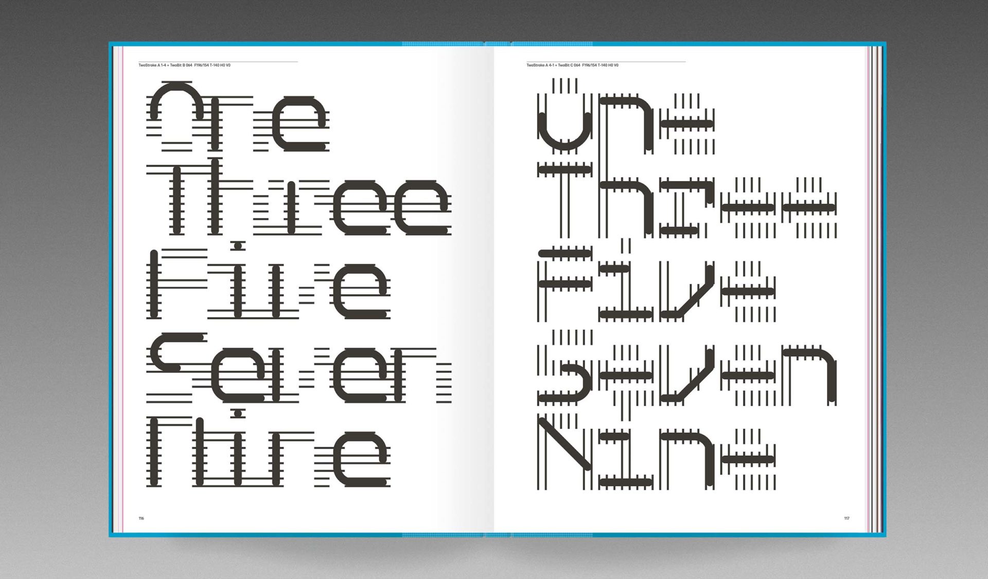
Driven by numbers, rules, conditions and permutations as well as design decisions and collisions, the Two type system is a continuously evolving body of work both analog and digital, algorithmic and fortuitous, predefined and wildly unpredictable. The system comprises eight family groups, designed not as independent alphabets but as features of an expansive design space in which individual glyphs interact as variable components. A standard grid determines positioning for both shapes and spaces with every element aligning precisely, so that the superimposition of any pair of the system’s 198 modular fonts will result in a single unique instance from 39,204 possible combinations. Selected examples of these combined forms are displayed in System Process Form, along with many even more exuberant outputs composed from the millions of options afforded by the combinations of three layers.
In the editions here, exclusive to Volume, System Process Form reveals how design can be liberated from the narrow confines of individual ideas, intentions or expressions, leaving the designer free to discover infinite new organisms rather than being obliged to invent them.
Aesthetics are usually considered a set of principles concerned with the nature of beauty, but for both of us, systems are aesthetically beautiful in themselves.
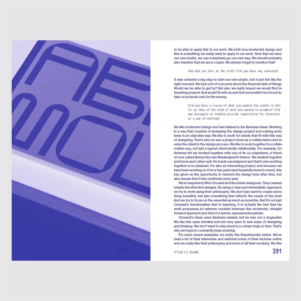
Studio Culture Now is the essential guide to setting up, running and developing a design studio. It offers bang up-to-date advice and guidance for designers working in a world of rapid change.
Featured studios include:
Atelier Dyakova, Champions Design, Civilization, Design by Toko, DIA, ÉricandMarie, Formist, Google Design, GUNMAD/Or Type, Hansje van Halem, Helmo, Hey Studio, Hubertus Design, Jade Purple Brown, Julia, Morcos Key, My Name is Wendy, Neubau, Office of Craig, OK-RM, Parámetro Studio, Peepshow, ps.2, Regular Practice, Sara De Bondt studio, Sarah Boris Studio, Studio Rejane Dal Bello, Vrints-Kolsteren, WeShouldDoItAll, YesYesNo.
Having backed the project on Kickstarter look out for my name in the book!
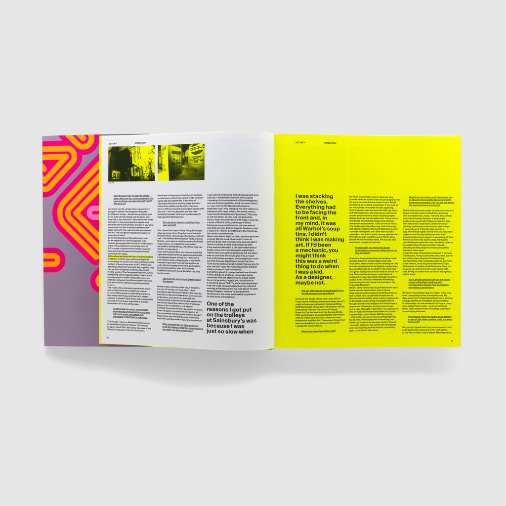
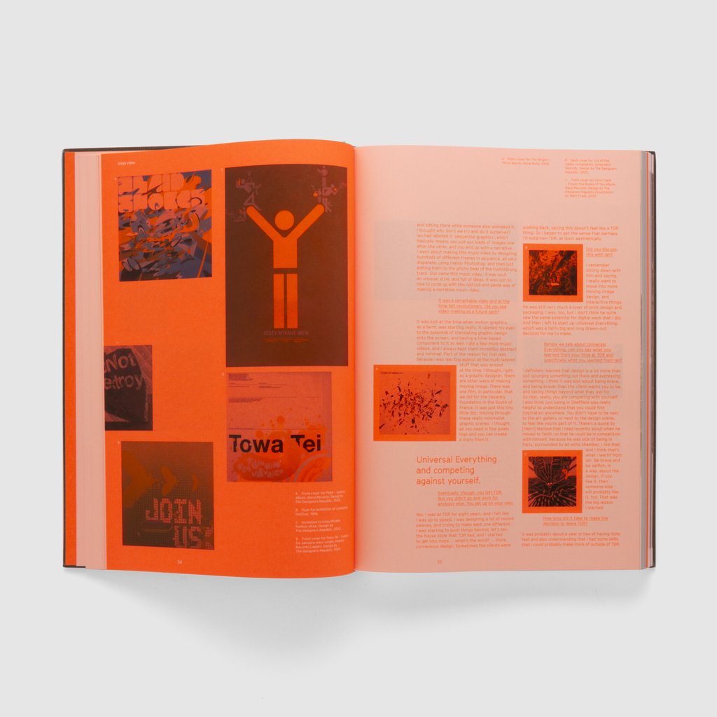
The Designers Republic, led by founder and born rebel Ian Anderson, has shaped graphic communication over the past 30 years. It has done this through gravity-defying client work, revolutionary self-initiated projects, and provocative gestures.
Under Anderson’s idiosyncratic leadership, TDR™ pioneered the idea of a design group with attitude. More like a band than a design studio, they changed the dynamic between client and design group, and uniquely, they acquired a following beyond the graphic design tribe.
Now, for the first time in book form, Ian Anderson explores his studio’s output, its concepts, its processes and its influence on a generation of graphic designers.
Dismissed by some as “stylists”, Anderson demonstrates how the work of TDR™ is underpinned by conceptual thinking. The book delivers a unique insight into why TDR™ work looks the way it does, and provides a guide to the studio’s modus operandi.
I was lucky enough to grab a bundle from KickStarter and have my name featured in the book!
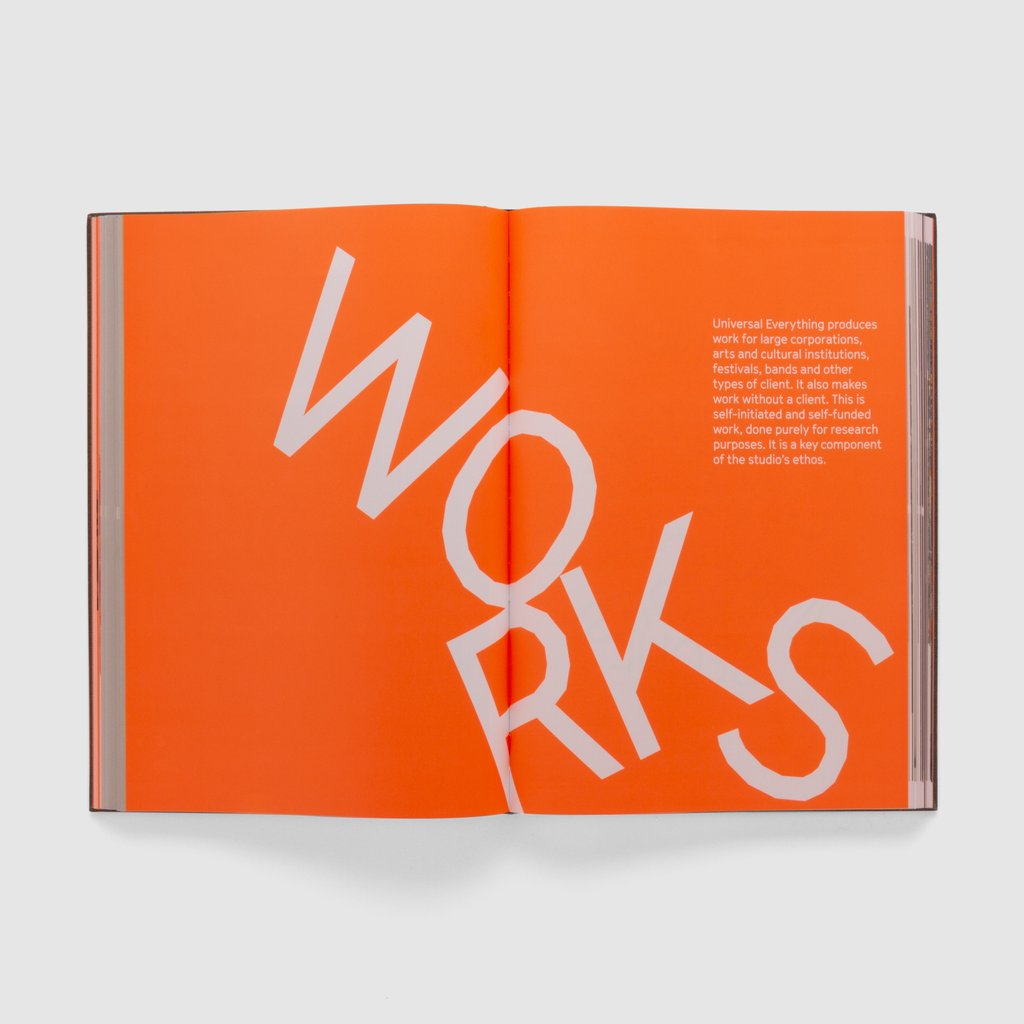
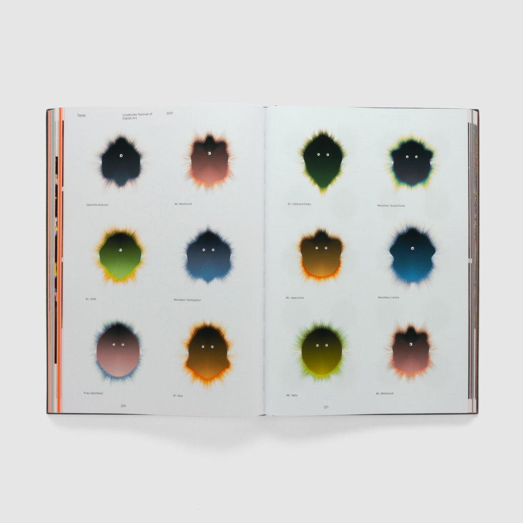
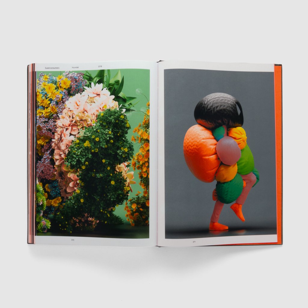
Matt Pyke, founder and creative director of Universal Everything, calls his studio a “digital art and design collective”. And after 15 years of revolutionary work in the digital realm, UE has its first book – What is Universal Everything?
Considered one of of most influential graphic designers in the world, Paula Scher served as the first female principle at Pentagram.
If you are a fan Unit Editions have an amazing Mongraph covering Paula’s early days in the music industry through to her logos for global corporations and cultural institutions.
Looks like another stunning book from Unit editions. I have just pre-ordered this as an addition to the studio bookcase.
Type Only celebrates a current trend in typography: type unsupported by illustration or photography. In other words, typography and letterforms on their own – solus.
Through the work of around 100 graphic designers from around the world, Type Only explores the communicative and emotive power of type when used in isolation.