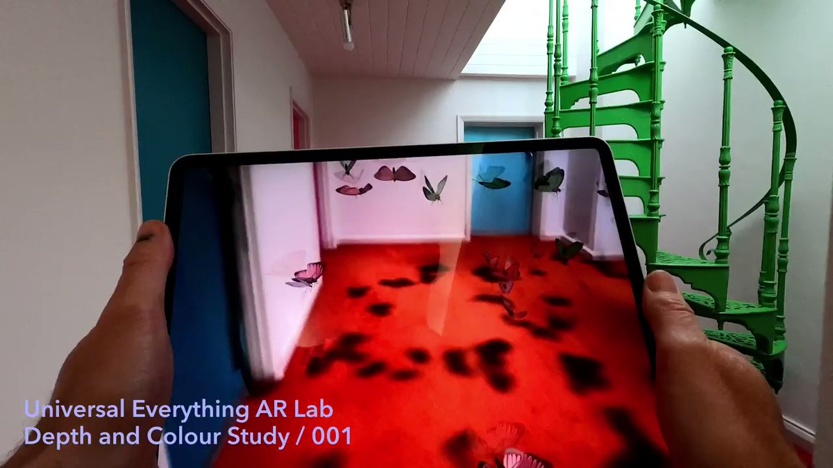
Universal Everything has been exploring the unique capabilities of the iPad Pro LIDAR depth camera as part of its recent experiments in augmented reality.
These studies explore the potential of AR depth and colour to create next-level spatial interactions which connect deeply to your surroundings.
I am participating in this years 36DaysOfType for the 3rd time. The project was briefly on hold due to Instagram blocks, but is now back on!
This year I am focused on producing a custom experimental typeface. I have concepts designed and will be refining and posting to Instagram day by day throughout March.
By early April OneTenEleven should have its first custom typeface!
Keep an eye on the new OneTenEleven Instagram profile here. Follow the 36DaysOfType project here.
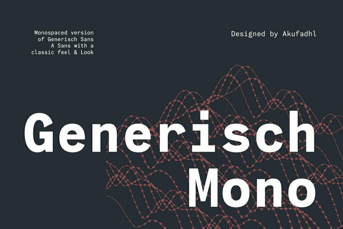
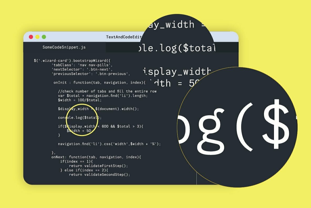
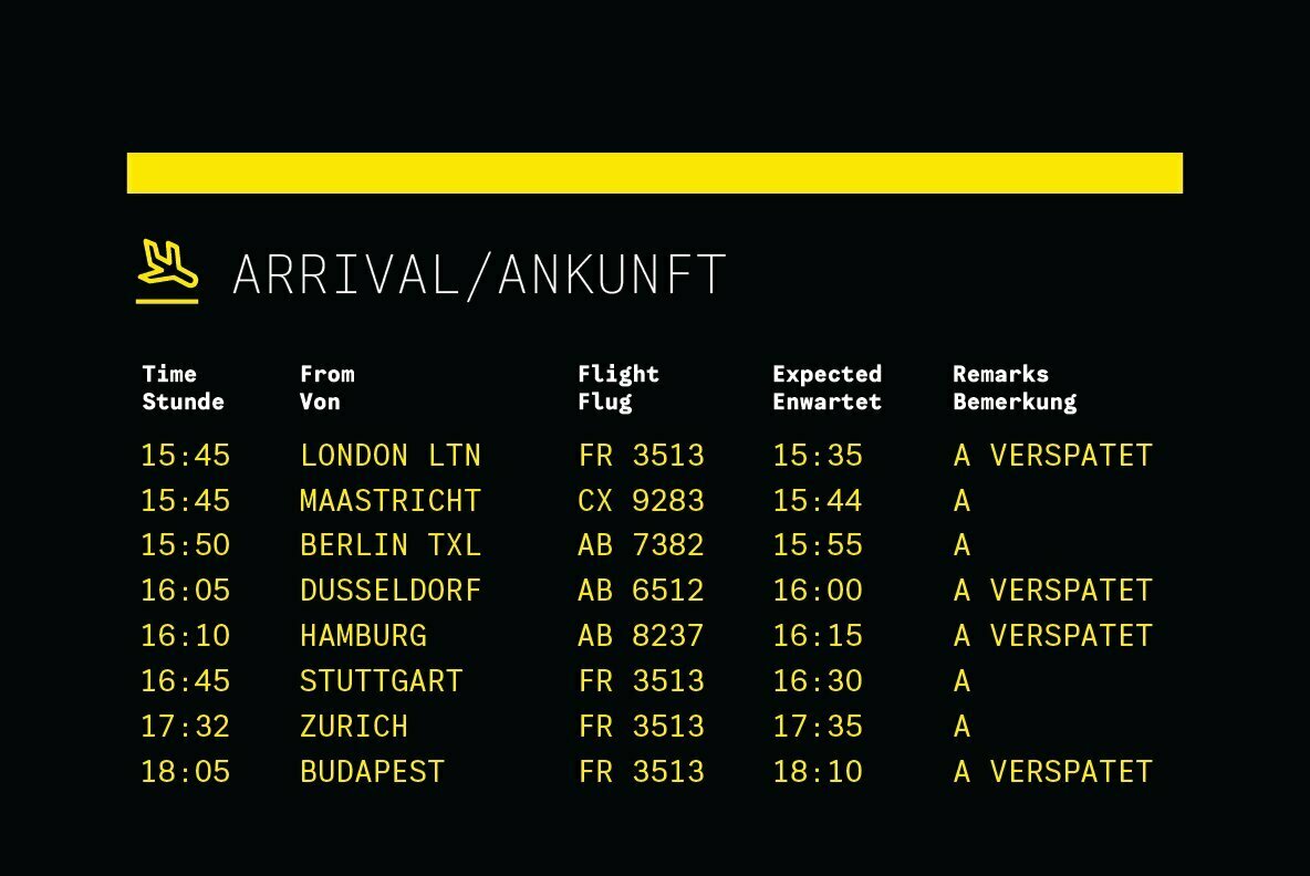
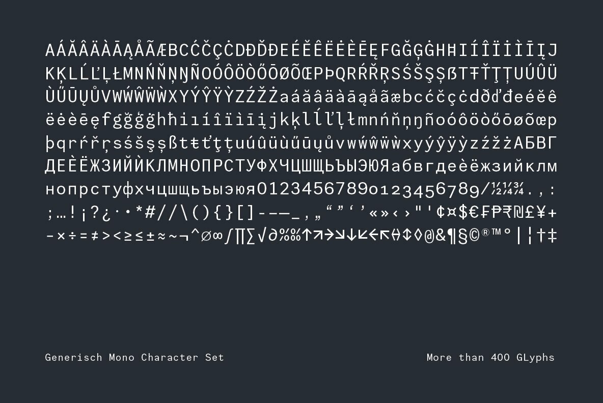
Generisch Mono is a monospaced version of Generisch Sans. Generisch – a german equivalent of generic – sans serif typeface has gain its own place among designers and earn such popularity due to its “simple” design.
Generisch is influenced by early grotesk typefaces from early 1900’s when sans was starting to get popular and used as a body type. Some old ligatures such as ch ck and ng are present in generisch (not the ct and st tho), old style numeral for better typesetting experience and more.
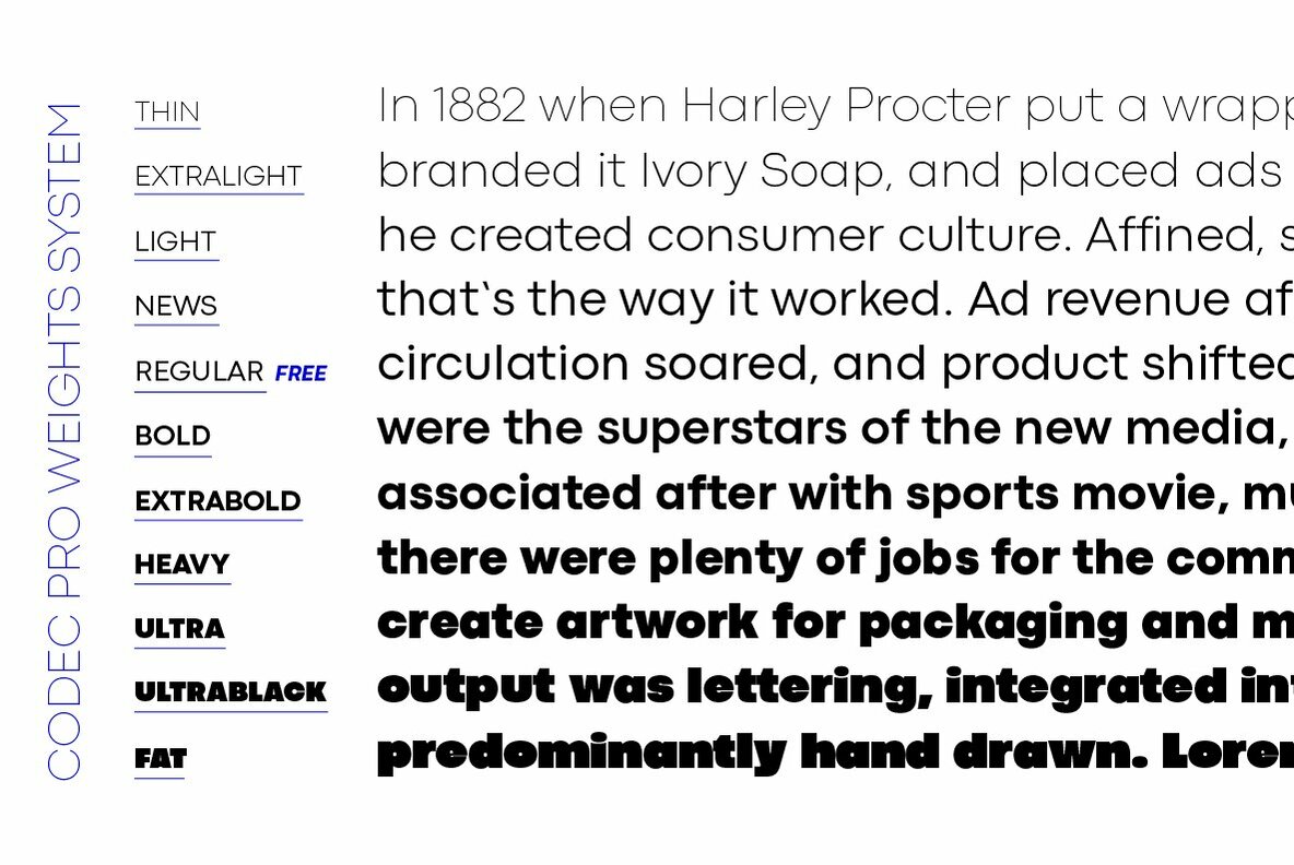
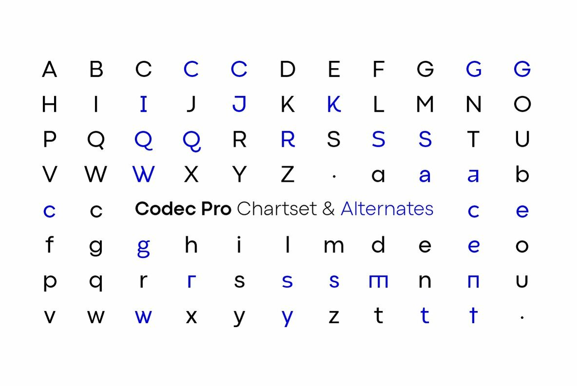
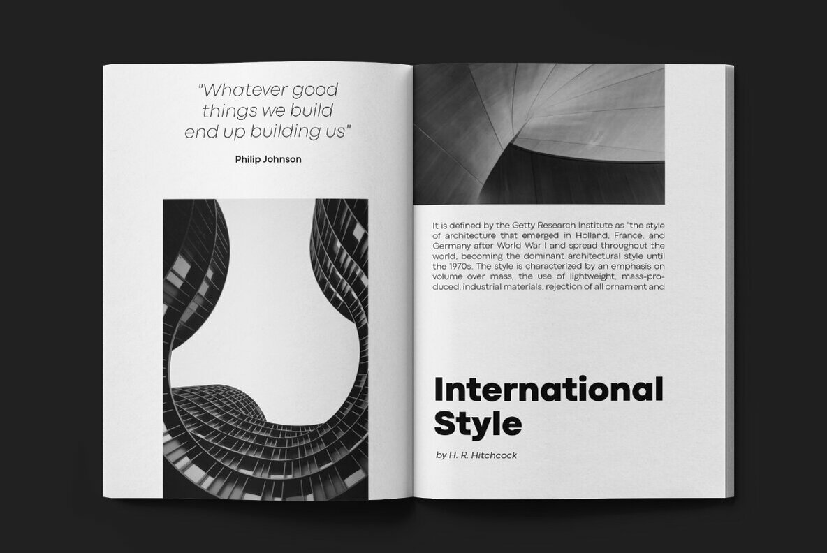
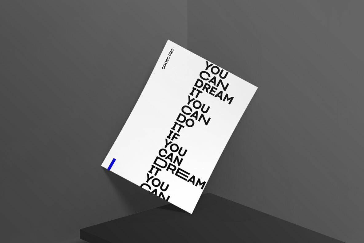
Codec Pro is the newest incarnation of the Codec family, developed in 2017 by Francesco Canovaro, Cosimo Lorenzo Pancini and Andrea Tartarelli as a research on the subtleties and the variations on the theme of the geometric sans-serif design.
The original typeface has been completely redesigned and expanded to feature a wide range of eleven weights, from the hairline thin to the bulky fat, while the character set has been extended to include not only latin, cyrillic and greek but also arabic, farsi and urdu scripts.
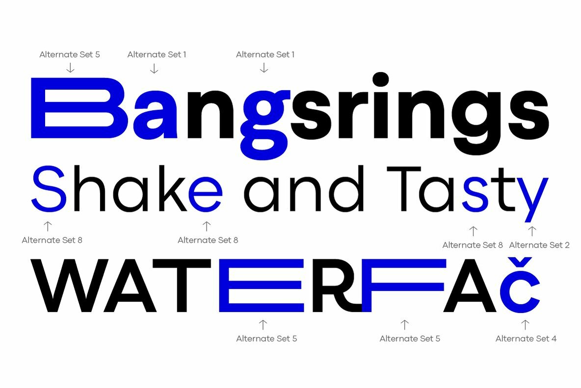
A veritable swiss-knife for the designer, Codec Pro also includes a wide range of alternates and stylistic sets that cover all the subfamilies and the moods of the original type system. So while the standard set (Codec Cold) has terminals cut parallel or perpendicular to the baseline, emphasizing geometry for a more construceted look, stylistic set 4 (Codec Warm) uses open diagonal cuts and humanist shapes to give the typeface a gentler, warmer feeling. Set 3 (Codec Cold Logo) comes alive with funky ligatures, while Set 5 (Codec Warm Logo) stretches uppercase characters horizontally for a dynamic, unexpect effect
After being part of the cables.gl private beta programme, I have been experimenting with the platform over the last few months, to say I have been impressed is an understatement.
Cables is the creative code platform I have been waiting for.
Cables is a tool for creating beautiful interactive content. With an easy to navigate interface and real time visuals, it allows for rapid prototyping and fast adjustments.
You are provided with a set of operators, such as mathematical functions, shapes, materials and post processing effects.
The platform is now open for public beta. Sign up here.
Find my Cables profile online here. I will be continuing exploring cables throughout 2020 so keep an eye on my profile.
Created using Cinema4D & Rendered in Cycles4D, with minmal post in After Effects.
I challenged myself to learn some of the new tools insydium’s latest release of X-Particles. xpExplosiaFX & xpFlowField were utilised to control the direction of the cloud simulation. Custom shaders were created with Cycles4D using the Point Density Texture node.
The scene was back lit with Cycles lights and volumetric lighting added with the Cycles Volume Scatter node.
The Designers Republic, led by founder and born rebel Ian Anderson, has shaped graphic communication over the past 30 years. It has done this through gravity-defying client work, revolutionary self-initiated projects, and provocative gestures.
Under Anderson’s idiosyncratic leadership, TDR™ pioneered the idea of a design group with attitude. More like a band than a design studio, they changed the dynamic between client and design group, and uniquely, they acquired a following beyond the graphic design tribe.
Now, for the first time in book form, Ian Anderson explores his studio’s output, its concepts, its processes and its influence on a generation of graphic designers.
Dismissed by some as “stylists”, Anderson demonstrates how the work of TDR™ is underpinned by conceptual thinking. The book delivers a unique insight into why TDR™ work looks the way it does, and provides a guide to the studio’s modus operandi.
I was lucky enough to grab a bundle from KickStarter and have my name featured in the book!
Inspiring motion work from Dia for A-Track, a DJ and record producer.
Dia created a typographic identity system as the foundation for all design. A range of unique artwork created for varying assets working within a set of typographic driven parameters. From the more minimal expression of the brand seen in the website and tour flyers to a maximal expression illustrated in album covers and live show visuals.
Matt Pyke, founder and creative director of Universal Everything, calls his studio a “digital art and design collective”. And after 15 years of revolutionary work in the digital realm, UE has its first book – What is Universal Everything?