The first book dedicated to the career of a truly hands-on graphic designer, charting his ‘Swiss Grit’ approach from the influential Ray Gun magazine in the 1990s, through to his experimental type projects of the present day.
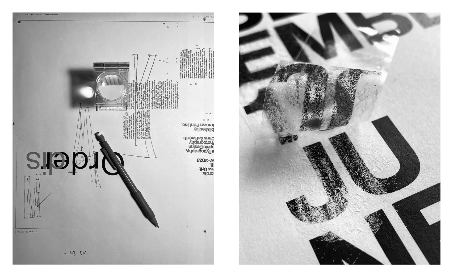
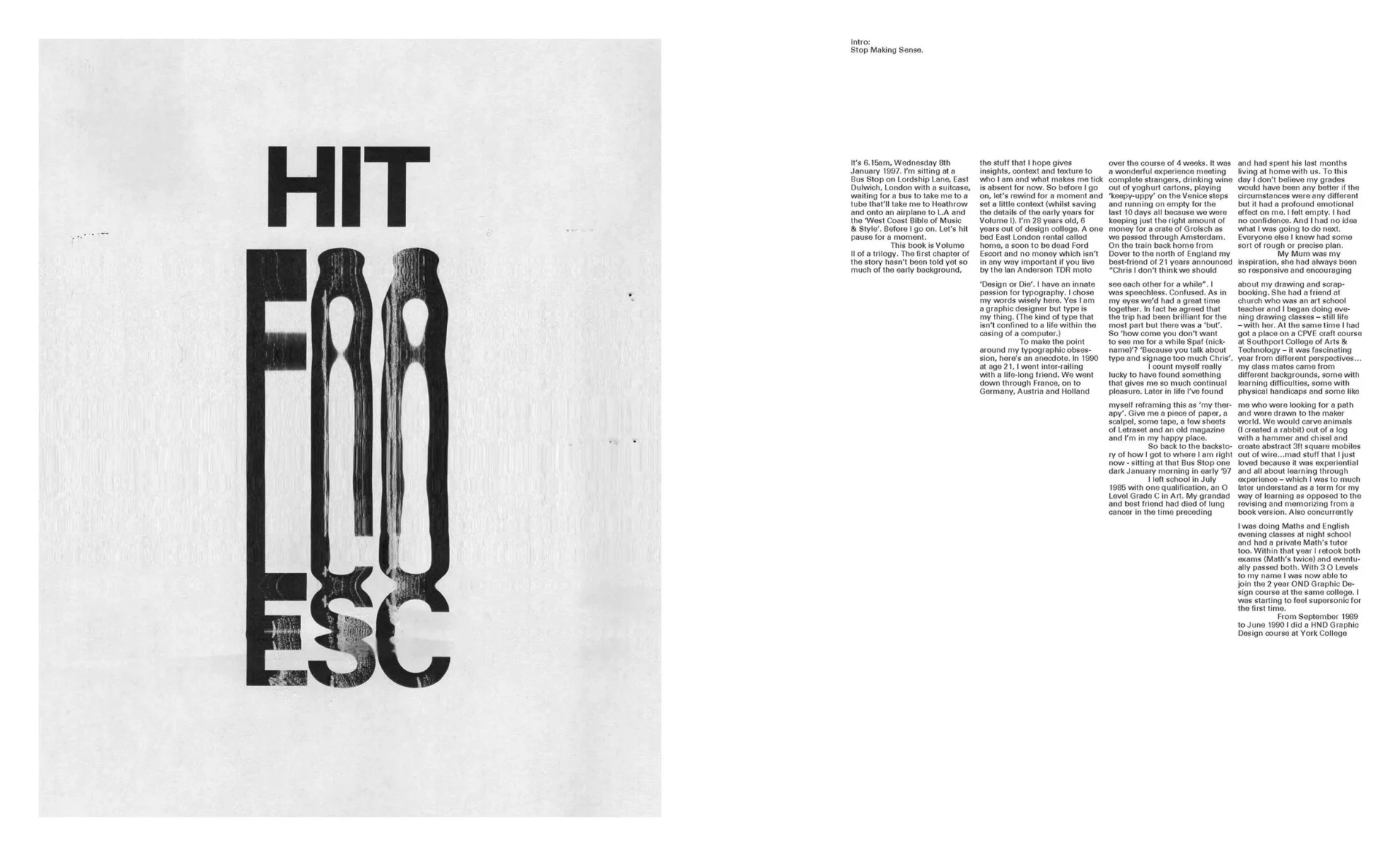
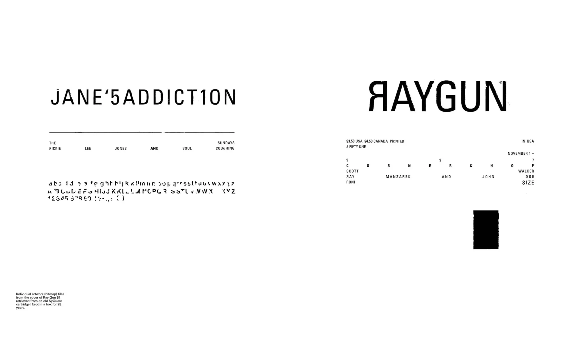
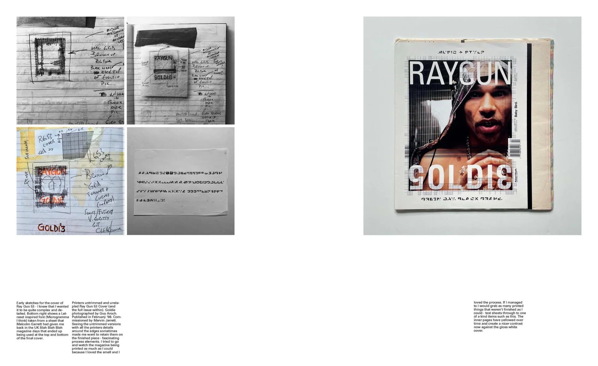
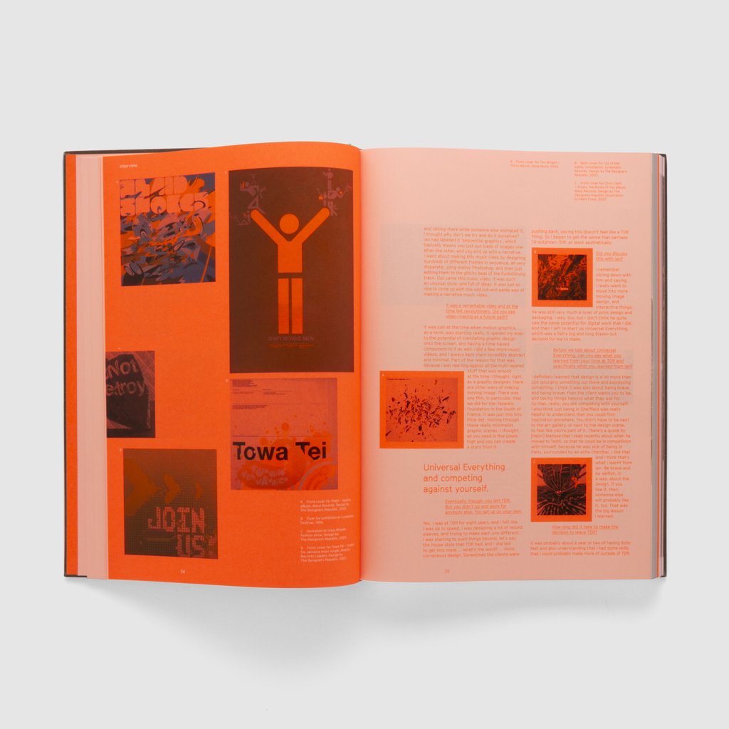
Emerging from the North of England, and nominated in 1993 by Why Not Associates as the most up and coming British graphic designer in Creative Review magazine’s annual ‘Creative Future’s’ awards, Chris Ashworth achieved design notoriety in the late 1990s at Ray Gunmagazine, the influentialLA-based ‘bible of music and style’. His early schooling in the rigours and principles of Swiss graphic design fused with the gritty vernacular of the street came together to create the sounds of the 90s in visual print form.
He has since worked with pop culture bands and brands from New Order, Michael Stipe (REM), Robbie Robertson and Bush to Nike, Diesel and Adobe as well as spending over 20 years as a Creative Director running in-house creative studios at Microsoft, Nokia and Getty Images.
He recently launched thisisme.art with his partner Nicola which sells high end apparel and one-of-a-kind original art featuring his unique handmade creative approach.
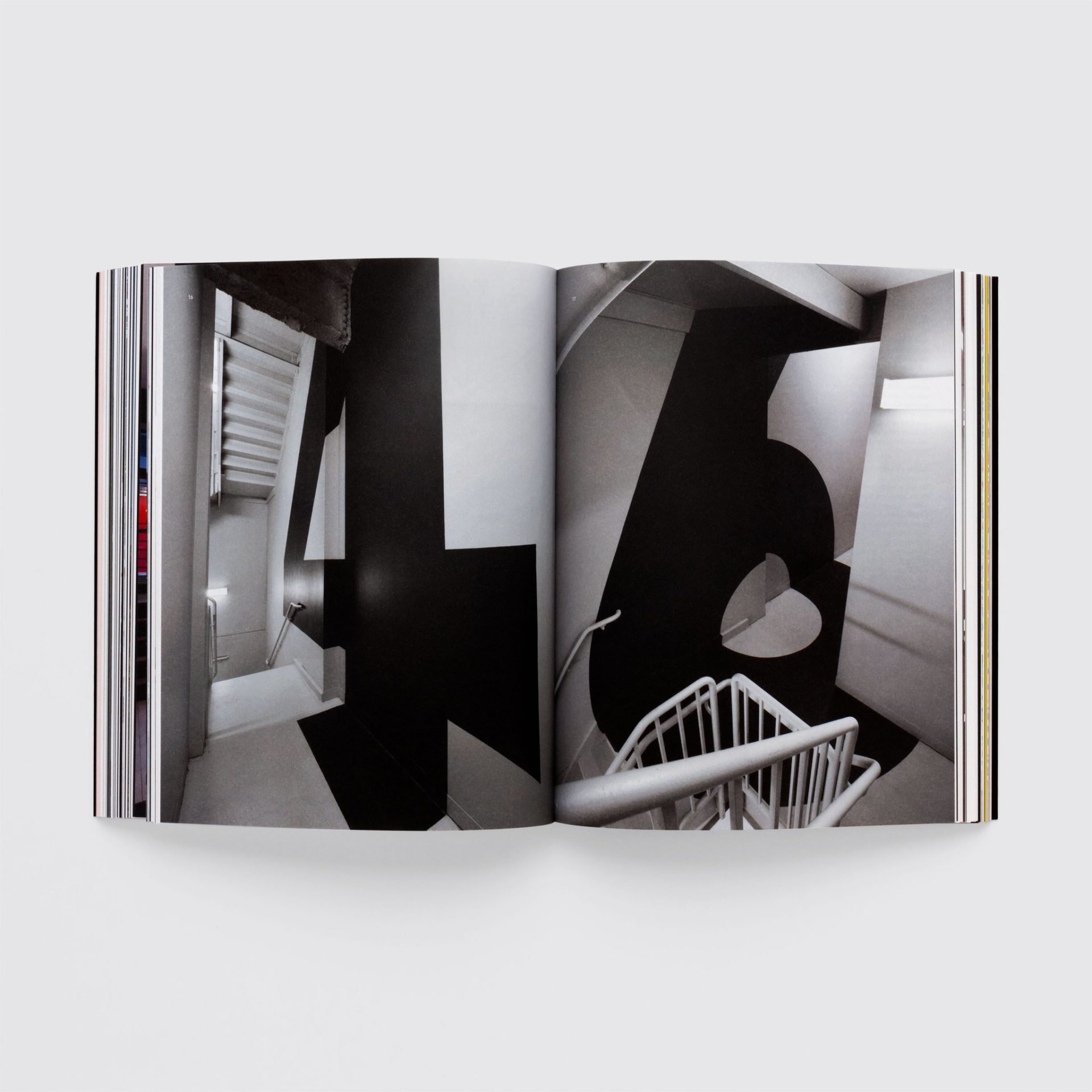
The definitive illustrated history of the cult videogame – a heart-thumping fusion of groundbreaking graphic design, architectural futurism, electronic music and high-speed racing.
Overview
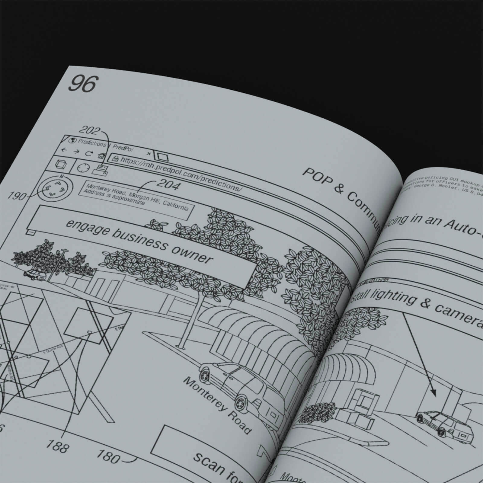
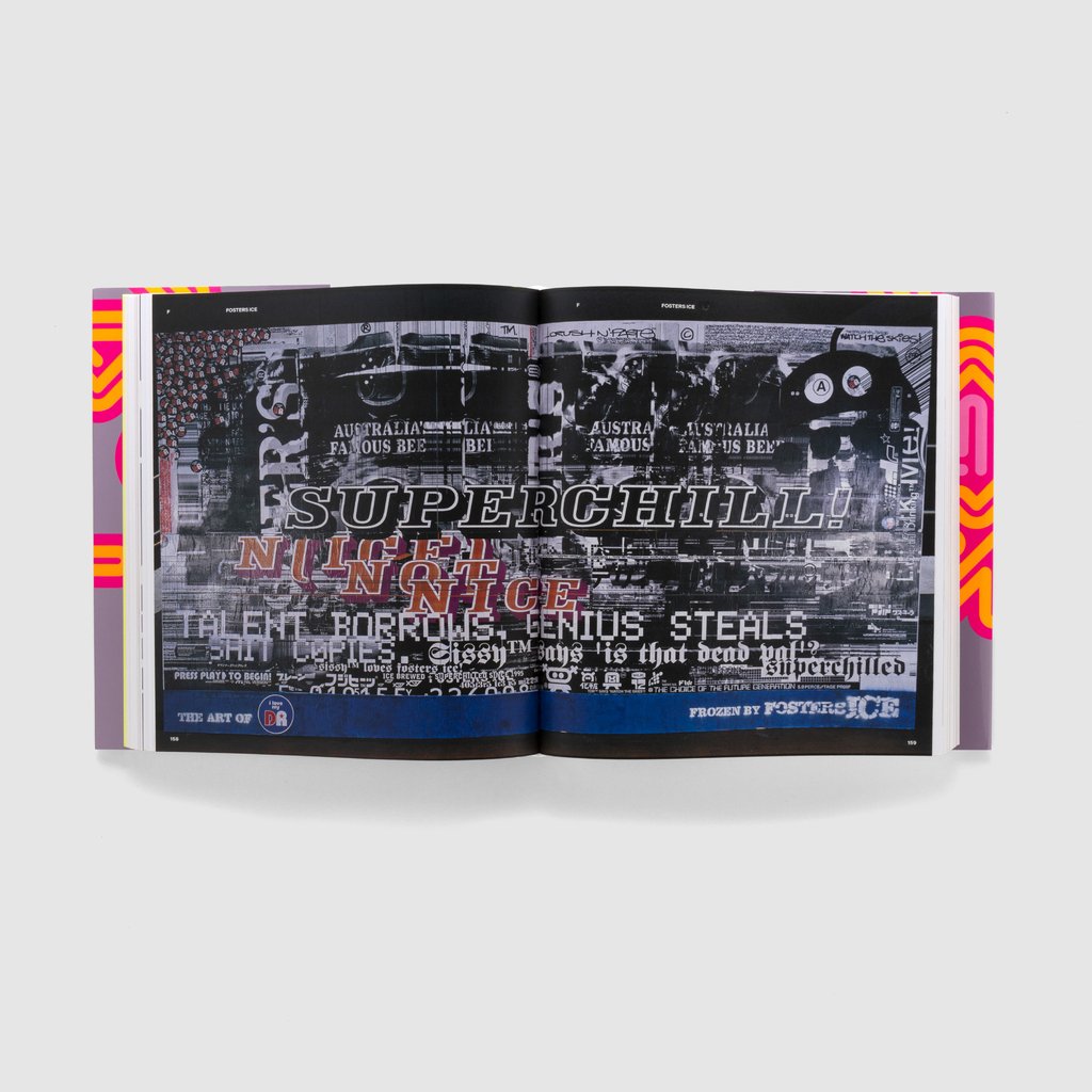
WipEout crashed onto the scene in 1995, shifting games into the cultural fast lane with its unique 3D visual designs. It propelled a wondrous hit of anti-gravity, hyperspeed racing into the heart of the freshly-released PlayStation console and, over time, the series – developed by Psygnosis, later known as Studio Liverpool – grew into a cult phenomenon amongst graphic designers and gamers alike. With its club-land branding – devised by cutting-edge Sheffield agency The Designers Republic, and its on-the-pulse electronic soundtrack featuring artists such as The Chemical Brothers, The Prodigy and Orbital, WipEout was not only a racing game – it was a vehicle for art.
WipEout: Futurism chronicles the iconic game’s vision, struggles and achievements – from first conception to future plans, in a distinctive union of trailblazing artwork and graphic design. The extraordinary, and rarely seen, concept art created for the game is beautifully reproduced throughout the book, while The Designers Republic’s peerless vision for an alternative future – with its roots planted in the rich earth of sci-fi iconography – weaves its way throughout the pages, making this publication a densely packed expansion to the beloved series.
Created by Read-Only Memory and art-directed by The Designers Republic alumni Michael C Place / Studio Build, this book is for those who are well-acquainted with the delights of WipEout and for whom this futuristic, epoch-defining creation is yet to be discovered.
The Book
Working its way through the fascinating creation story and cultural footprint of the WipEout game series, WipEout: Futurism offers unprecedented access to the game’s visual archives and reveals the creative processes behind the teams, tracks, vehicles and iconography that define the series. Within these pages you will find original concept art, promotional materials, in-game photography, the monumental graphic design work of The Designers Republic and much more.
The book also includes exclusive interviews with electronic duo Orbital’s Paul Hartnoll, sound designer Loïc Couthier, writer Damon Fairclough, game director Stuart Tilley and more.
The layout showcases a specially-crafted, WipEout-inspired design – with art direction by Michael C Place, whose graphic-design roots lie in tDR during the years WipEout was created.
HOLO emerged in 2012 to explore these entanglements—first with a periodical, now across an expanded platform. Set up in the grey zones between art, science, and technology, it frames scientific research and emerging technologies as being more than sites of invention and innovation—as epicentres of critical creative practice, radical imagination, and activism. The artists and designers working with related materials—algorithms and microcontrollers, meteoroids and fungi, data and archives—aren’t just updating notions of craft for the twenty-first century, they are researchers and cultural critics.
Learn more about the making of HOLO 3 via the development diary. It’s an instance of ‘thinking in public,’ where Guest Editor Nora N. Khan and Team HOLO documented their process from start to finish, be it excerpts of Khan’s research conversations with Peli Grietzer, erudite introductions of themes and contributors, or design mockups and schematics.
Guest editor Nora N. Khan and fifteen luminaries question our problematic faith in and deference to AI. Exploring the limits of knowledge, prediction, language, and abstraction in computation, their collected essays and artworks measure the gap between machine learning hypotheticals and the mess of lived experience.
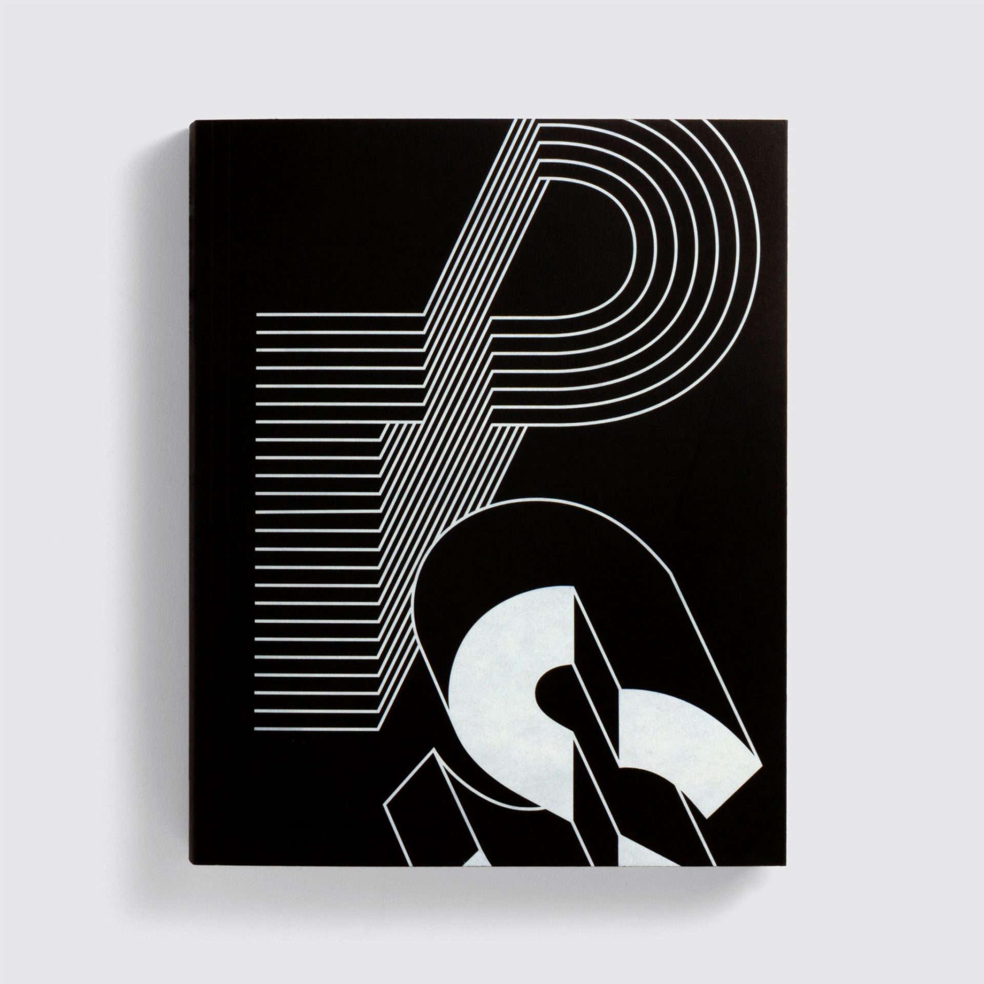
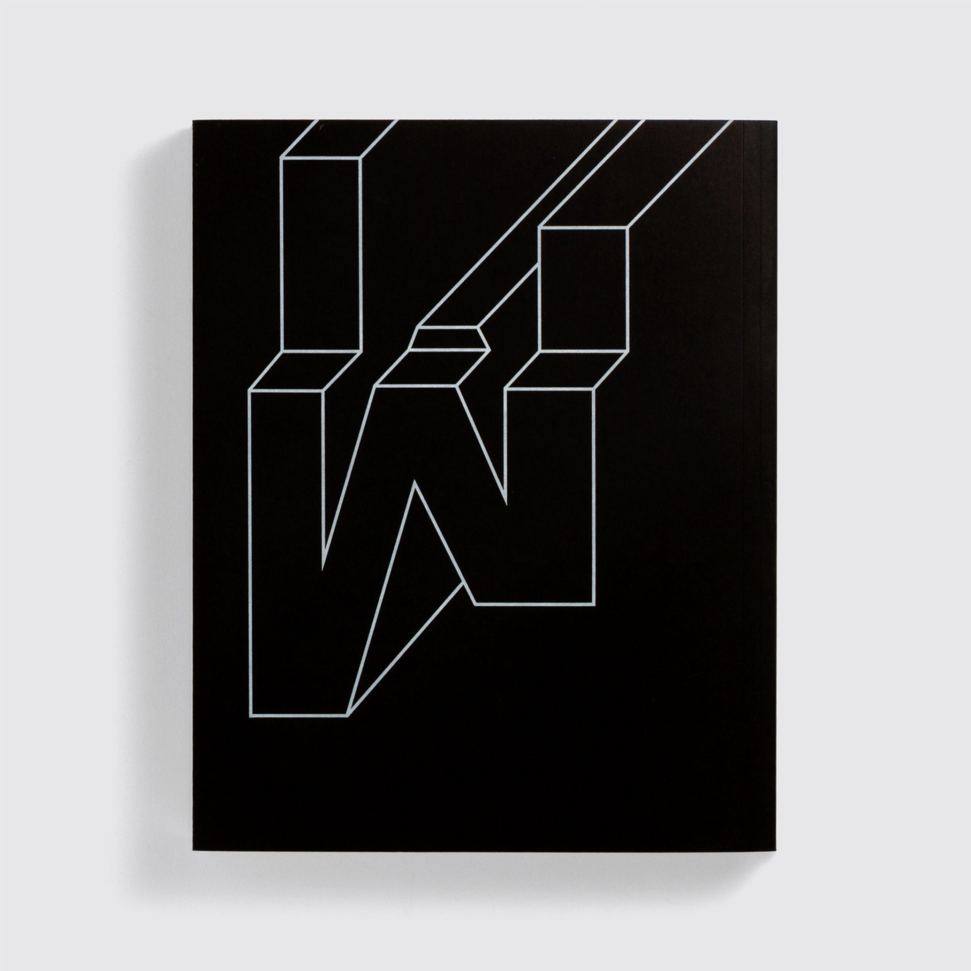
The ultimate typographic experiment – 7,762,392 typefaces from one of the world’s foremost typography studios.
MuirMcNeil makes typefaces that work in mysterious but mathematical ways. Using methods that are entirely contemporary, though they can seem arcane, they explore ‘parametric design systems’. And there is something about their commitment to a punchy, practical, systems-based approach that communicates far and wide.
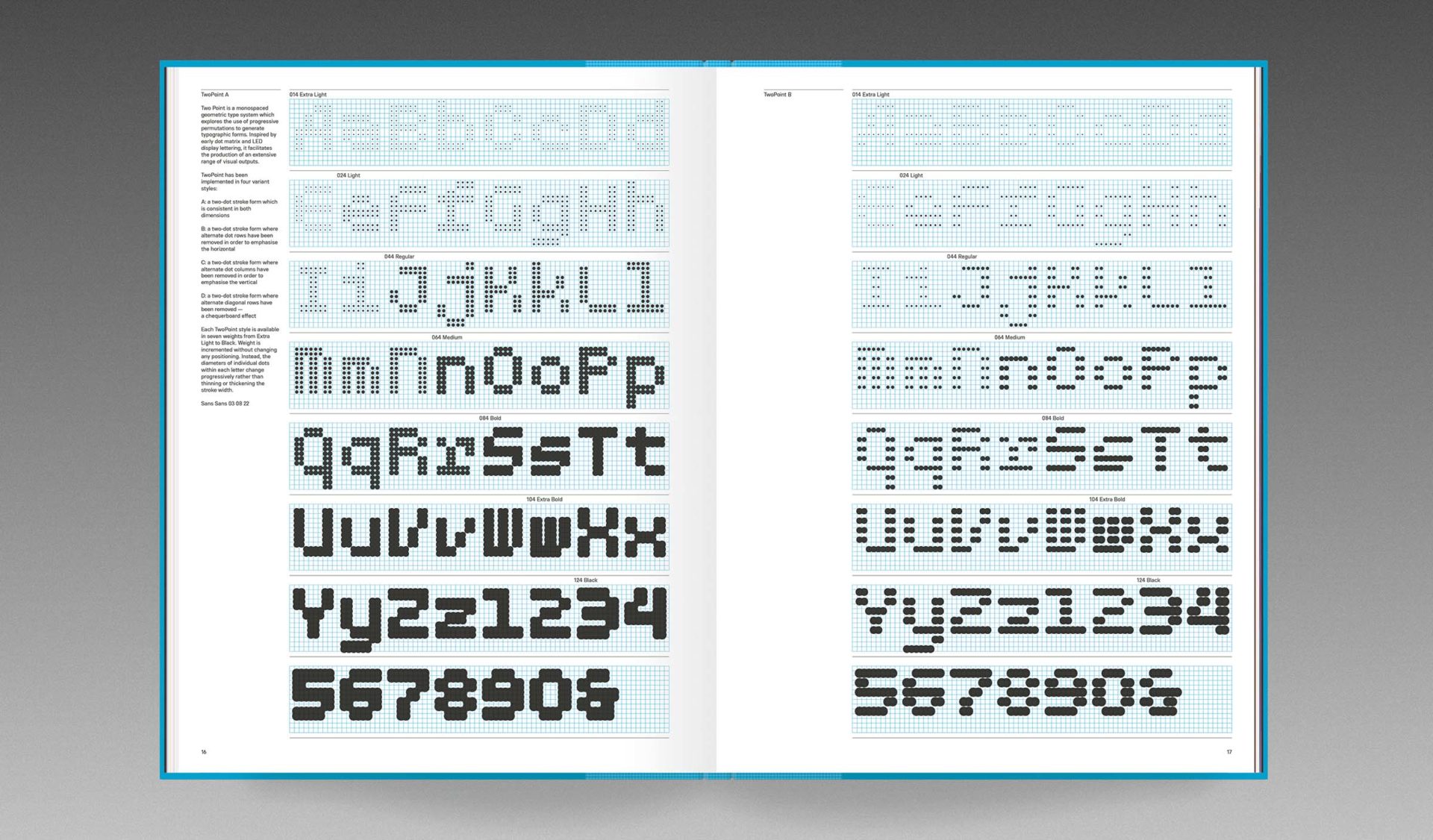
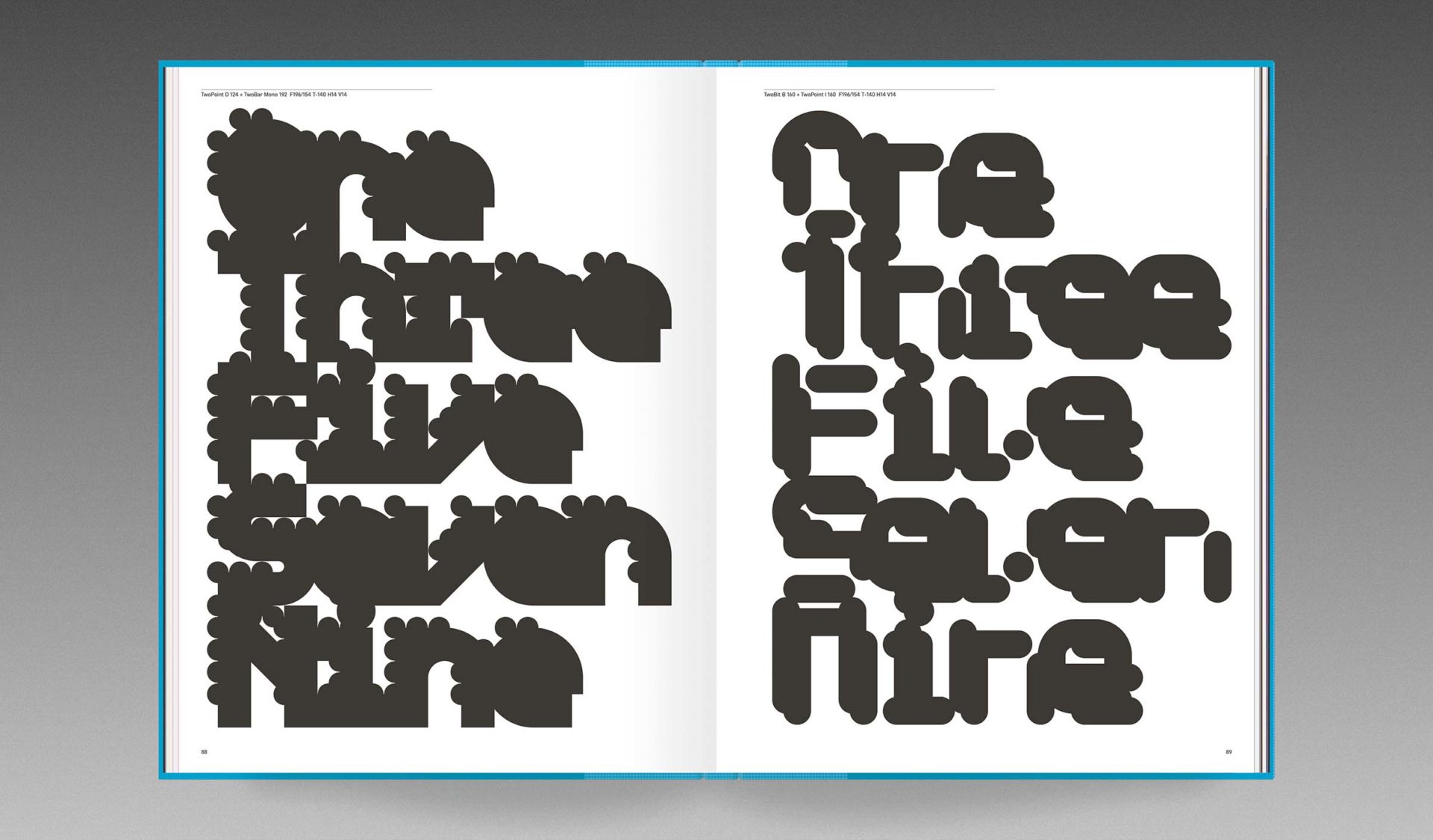
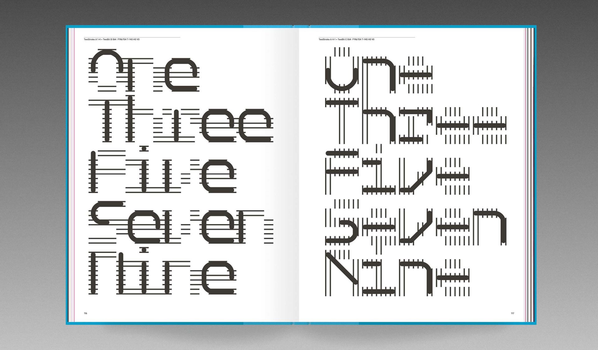
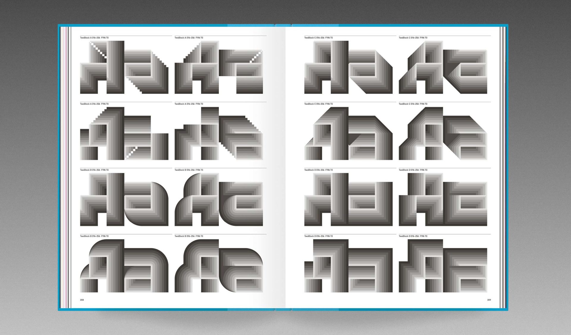
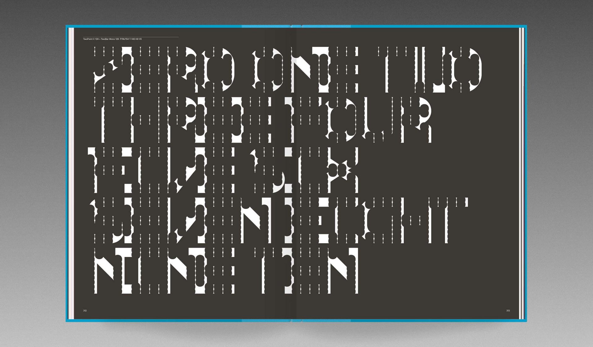
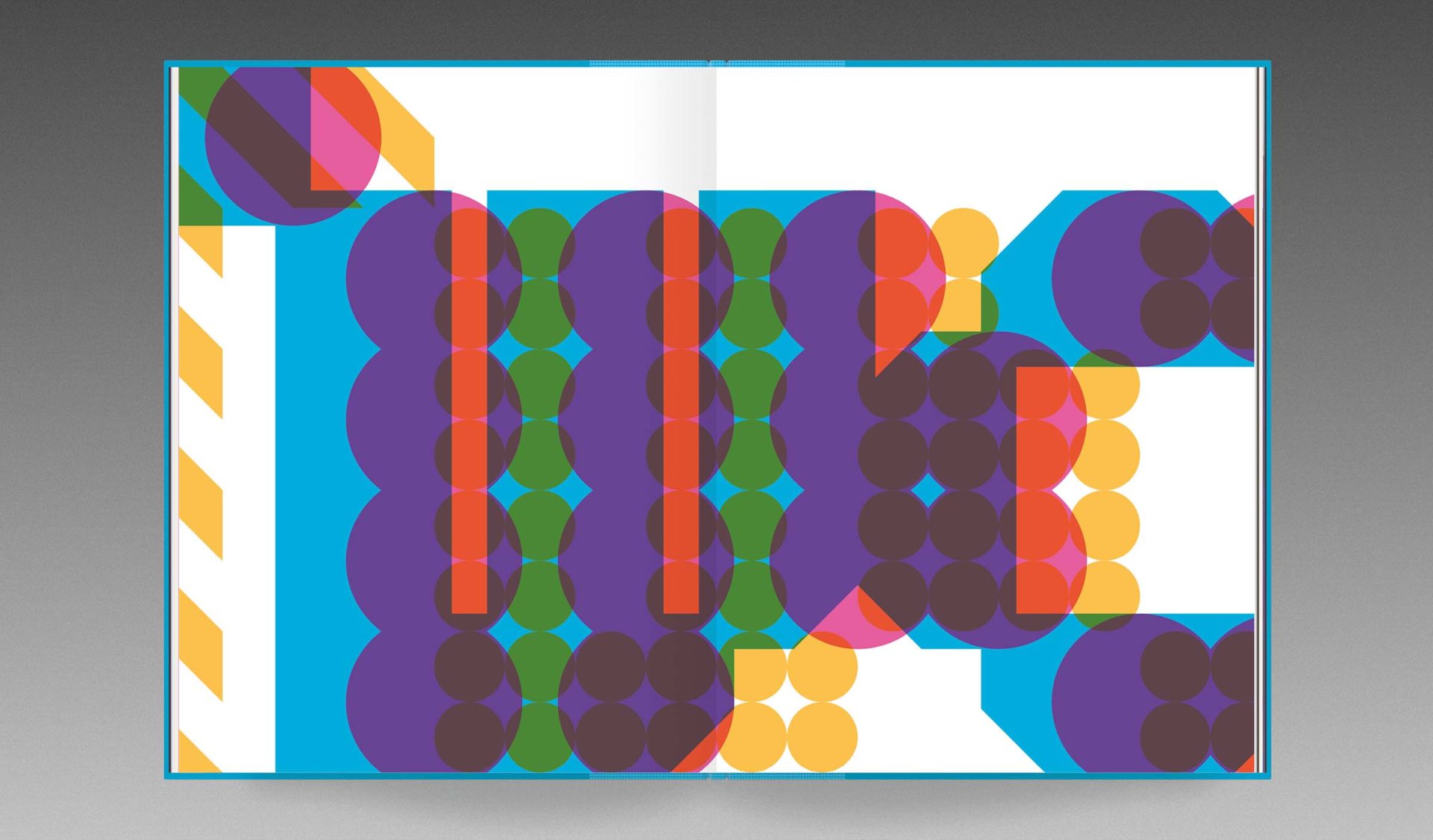
Founded in 2009 by Paul McNeil and Hamish Muir, MuirMcNeil was established to explore the use of systematic methods in graphic design, typography and moving image. Their first publication, System Process Form, is a detailed survey of their Two type system, an extensive collection of geometric alphabets in which every stroke, shape, letterform and word is designed to correspond and collaborate in close harmony. Far from a mere catalogue of typefaces, this publication is a powerful demonstration of the beauty of analytical approaches to form-giving for visual communication, one that embraces both micro and macro views, and one whose end results can be as spectacular as they are unexpected.
Driven by numbers, rules, conditions and permutations as well as design decisions and collisions, the Two type system is a continuously evolving body of work both analog and digital, algorithmic and fortuitous, predefined and wildly unpredictable. The system comprises eight family groups, designed not as independent alphabets but as features of an expansive design space in which individual glyphs interact as variable components. A standard grid determines positioning for both shapes and spaces with every element aligning precisely, so that the superimposition of any pair of the system’s 198 modular fonts will result in a single unique instance from 39,204 possible combinations. Selected examples of these combined forms are displayed in System Process Form, along with many even more exuberant outputs composed from the millions of options afforded by the combinations of three layers.
In the editions here, exclusive to Volume, System Process Form reveals how design can be liberated from the narrow confines of individual ideas, intentions or expressions, leaving the designer free to discover infinite new organisms rather than being obliged to invent them.
Aesthetics are usually considered a set of principles concerned with the nature of beauty, but for both of us, systems are aesthetically beautiful in themselves.
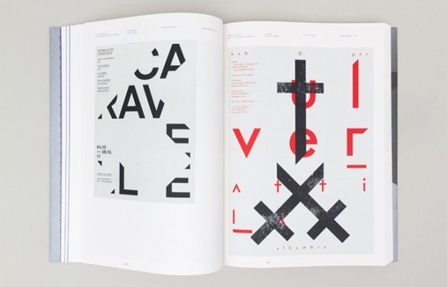
The Designers Republic, led by founder and born rebel Ian Anderson, has shaped graphic communication over the past 30 years. It has done this through gravity-defying client work, revolutionary self-initiated projects, and provocative gestures.
Under Anderson’s idiosyncratic leadership, TDR™ pioneered the idea of a design group with attitude. More like a band than a design studio, they changed the dynamic between client and design group, and uniquely, they acquired a following beyond the graphic design tribe.
Now, for the first time in book form, Ian Anderson explores his studio’s output, its concepts, its processes and its influence on a generation of graphic designers.
Dismissed by some as “stylists”, Anderson demonstrates how the work of TDR™ is underpinned by conceptual thinking. The book delivers a unique insight into why TDR™ work looks the way it does, and provides a guide to the studio’s modus operandi.
I was lucky enough to grab a bundle from KickStarter and have my name featured in the book!
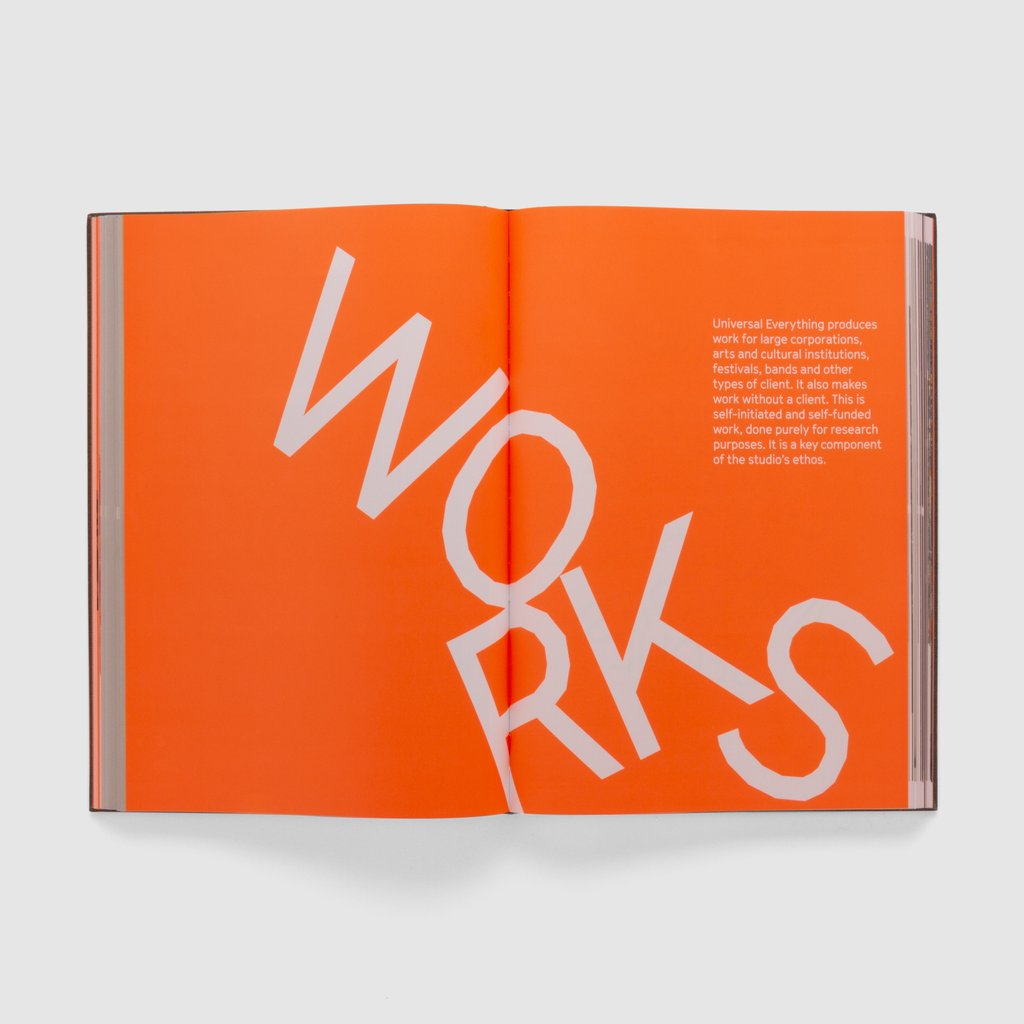
Matt Pyke, founder and creative director of Universal Everything, calls his studio a “digital art and design collective”. And after 15 years of revolutionary work in the digital realm, UE has its first book – What is Universal Everything?
Considered one of of most influential graphic designers in the world, Paula Scher served as the first female principle at Pentagram.
If you are a fan Unit Editions have an amazing Mongraph covering Paula’s early days in the music industry through to her logos for global corporations and cultural institutions.
Looks like another stunning book from Unit editions. I have just pre-ordered this as an addition to the studio bookcase.
Type Only celebrates a current trend in typography: type unsupported by illustration or photography. In other words, typography and letterforms on their own – solus.
Through the work of around 100 graphic designers from around the world, Type Only explores the communicative and emotive power of type when used in isolation.
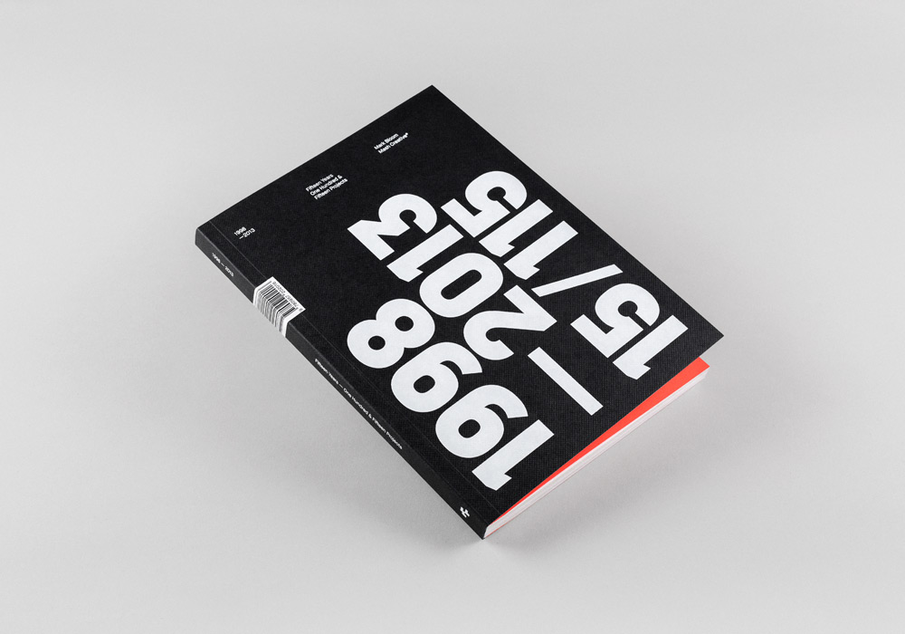
I can feel a purchase coming on! 15/115 (15 Years,115 Projects) is a collection of 115 projects spanning Mark Bloom’s, aka Mash Creative 15 year career to date. Divided into three chapters: 15 x Posters, 80 x Logos and 25 x Case studies, the book also features a foreword from designer and author David Airey.
—
Beautifully printed by Screaming Colour on an enticing mix of GFSmith papers, the book features a blind debased and white foiled cover and thread sewn spine for lay-flay spreads. Printed full colour throughout with fluorescent orange ink and logo throw out page.
—
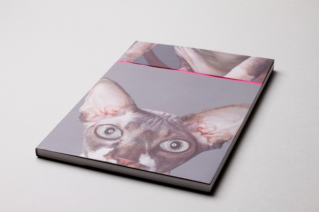
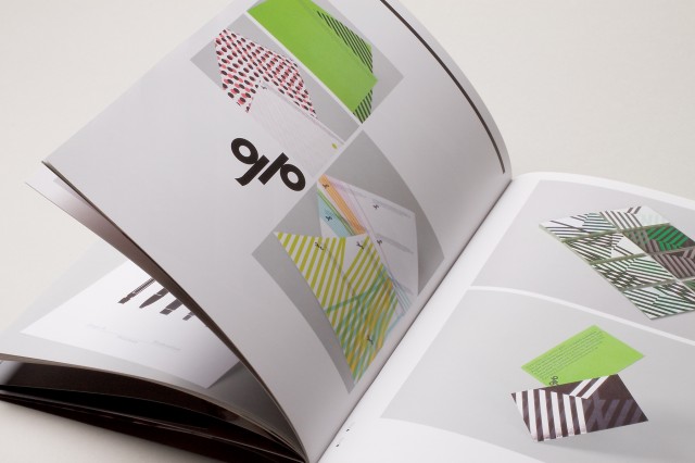
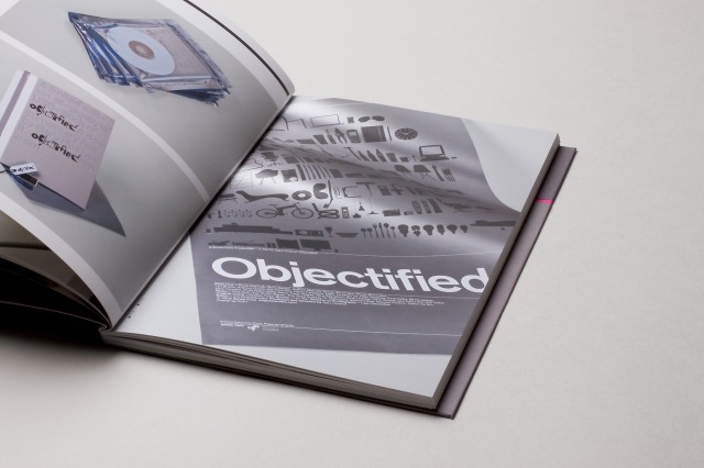
The reprint of Build—Works (01) is now available to buy at a special pre-sale price of £20.
Printed on an enticing mixture of papers, the book is a collection of Build work both old and new, with a selection of arresting images of the Build sphynx cats Brockmann & Betty exquisitely photographed by Jason Tozer interleaved throughout.
Beautifully printed by Generation Press. Invest now.
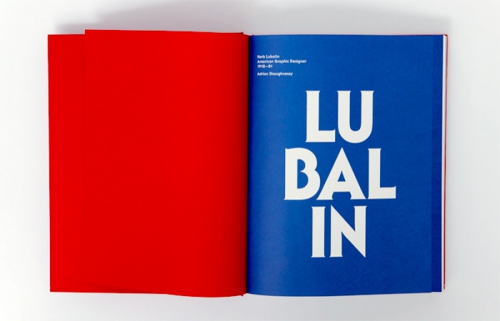
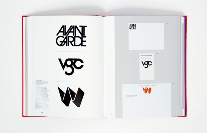
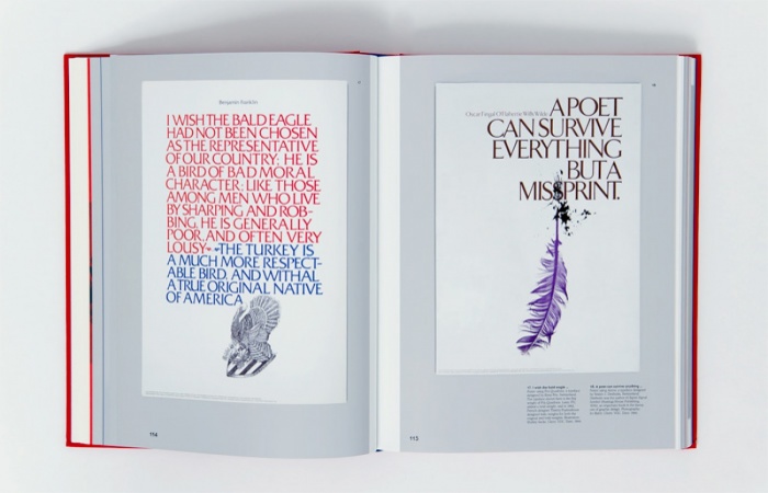
I was pleased to get my hands on a ltd edition packaged copy of Herb Lubalin – American Graphic Designer 1918—81.
A monograph of the legendary Herb Lubalin, one of the foremost graphic designers of the 20th century. Along with Saul Bass and Paul Rand, Herb Lubalin forms a trio of American graphic design greatness.
This meticulously researched book offers a complete career overview of Herb Lubalin, beginning with his early days as one of the original Mad Men in the New York advertising world of the 50s and 60s, and continuing into the years of his greatest achievements as one of the world’s most influential typographers and graphic designers.
A collaborative book project put together by The Designers Republic to celebrate the 5th birthday of Sheffield-based printers Evolution Print who took care of the printing.
“This isn’t a book about graphic design. This is a book by The Designers Republic™ for Evolutionprint’s 5th Birthday full of creative responses, collabs & conversations from friends, fellow travellers & co-conspirators. This is a book about connections made, bridges being built & the potential of everything multiplied by everything else, by people making their mark, sowing seeds and leaving something to grow. This isn’t a book about graphic design. Maybe it’s not really a book at all.”
The book features contributions from several well-known designers, including Vaughn Oliver, Erik Spiekermann and Neville Brody to name a few.
Strictly limited edition of 500 and not for general sale. The Designers Republic™ have released 50 signed and stamped copies of the book.